Category: Computer Skills

  • How to Automate Report Generation with Excel VBA for Dynamic Dashboards, MIS Reports, and Monthly Business Analysis

    Automate Report Generation with Excel VBA is one of the most powerful ways to save time, reduce errors, and improve reporting efficiency in any organization. Businesses that rely on daily, weekly, or monthly reports often spend 5–20 hours per week manually updating data, formatting sheets, and creating summaries. With Excel VBA automation, this entire process can be reduced to a single click.

    In today’s data-driven environment, automating report generation is no longer optional—it is essential. Whether you are preparing MIS reports, sales summaries, financial dashboards, inventory analysis, or customer aging reports, Excel VBA can transform your reporting workflow into a fully automated system.

    This comprehensive guide will explain everything step-by-step, including architecture design, VBA code examples, automation flow, performance optimization, and best practices.


    What is Excel VBA?

    Excel VBA (Visual Basic for Applications) is a programming language built into Microsoft Excel that allows users to automate repetitive tasks. With VBA, you can:

    • Extract data from multiple sheets
    • Clean and format data automatically
    • Generate Pivot Tables
    • Create charts dynamically
    • Export reports to PDF
    • Send reports via email
    • Schedule report generation

    Organizations that implement VBA automation typically report:

    • 60–80% time savings in reporting
    • 90% reduction in manual errors
    • 3x faster report preparation cycles

    Why Automate Report Generation with Excel VBA?

    Manual reporting usually involves:

    Manual ProcessAutomated with VBA
    Copy-paste dataAutomatic data pull
    Manual formattingPredefined formatting
    Manual calculationsAuto formulas execution
    Creating charts repeatedlyDynamic chart refresh
    Saving reports manuallyAuto-save and export

    When reports are generated manually:

    • Human errors increase
    • Version control becomes difficult
    • Productivity decreases
    • Data inconsistency occurs

    Automation solves these problems efficiently.


    Automate Report Generation with Excel VBA: Complete Workflow

    Below is a structured workflow to build a fully automated reporting system.


    Step 1: Structure Your Data Properly

    Automation starts with clean and structured data.

    Best practices:

    • Use Excel Tables (Ctrl + T)
    • Avoid blank rows
    • Use proper headers
    • Maintain consistent data types
    • Keep raw data separate from report sheet

    Recommended sheet structure:

    • Sheet1: Raw_Data
    • Sheet2: Processed_Data
    • Sheet3: Dashboard_Report

    Step 2: Enable Developer Tab and VBA Editor

    1. Go to File → Options
    2. Customize Ribbon
    3. Enable Developer
    4. Press ALT + F11 to open VBA Editor

    Insert a new Module:
    Insert → Module


    Step 3: Basic VBA Code to Generate a Report

    Below is a simple automation example:

    Sub Generate_Report()
    
    Application.ScreenUpdating = False
    Application.Calculation = xlCalculationManual
    
    Dim wsData As Worksheet
    Dim wsReport As Worksheet
    
    Set wsData = ThisWorkbook.Sheets("Raw_Data")
    Set wsReport = ThisWorkbook.Sheets("Dashboard_Report")
    
    wsReport.Cells.Clear
    
    wsData.Range("A1:D1000").Copy
    wsReport.Range("A1").PasteSpecial xlPasteValues
    
    wsReport.Columns.AutoFit
    
    Application.ScreenUpdating = True
    Application.Calculation = xlCalculationAutomatic
    
    MsgBox "Report Generated Successfully"
    
    End Sub
    

    What this code does:

    • Disables screen updating for speed
    • Copies data
    • Pastes values only
    • Formats columns
    • Displays confirmation

    In real-world automation, code can be expanded to 200–1000 lines depending on complexity.


    Step 4: Automating Pivot Table Creation

    Pivot Tables are commonly used in MIS reports.

    Example VBA code:

    Sub CreatePivot()
    
    Dim wsData As Worksheet
    Dim wsPivot As Worksheet
    Dim pc As PivotCache
    Dim pt As PivotTable
    
    Set wsData = Sheets("Raw_Data")
    Set wsPivot = Sheets("Dashboard_Report")
    
    Set pc = ActiveWorkbook.PivotCaches.Create(SourceType:=xlDatabase, _
    SourceData:=wsData.Range("A1").CurrentRegion)
    
    Set pt = pc.CreatePivotTable(TableDestination:=wsPivot.Range("G5"), _
    TableName:="SalesPivot")
    
    With pt
        .PivotFields("Region").Orientation = xlRowField
        .PivotFields("Sales").Orientation = xlDataField
    End With
    
    End Sub
    

    This code:

    • Creates Pivot Cache
    • Generates Pivot Table
    • Adds row and value fields
    • Updates automatically when data refreshes

    Step 5: Dynamic Chart Automation

    Automating charts enhances dashboard presentation.

    Example:

    Sub CreateChart()
    
    Dim ws As Worksheet
    Dim ch As ChartObject
    
    Set ws = Sheets("Dashboard_Report")
    
    Set ch = ws.ChartObjects.Add(Left:=300, Width:=400, Top:=50, Height:=250)
    
    With ch.Chart
        .SetSourceData Source:=ws.Range("A1:B10")
        .ChartType = xlColumnClustered
        .HasTitle = True
        .ChartTitle.Text = "Monthly Sales"
    End With
    
    End Sub
    

    Charts update instantly whenever data changes.


    Step 6: Export Report to PDF Automatically

    Automated PDF export is useful for sharing reports with management.

    Sub ExportPDF()
    
    Dim ws As Worksheet
    Set ws = Sheets("Dashboard_Report")
    
    ws.ExportAsFixedFormat _
    Type:=xlTypePDF, _
    Filename:=ThisWorkbook.Path & "\Monthly_Report.pdf"
    
    MsgBox "PDF Exported Successfully"
    
    End Sub
    

    This reduces manual file handling and ensures consistent formatting.


    Step 7: Automating Email Distribution

    Excel VBA can automatically email reports using Outlook.

    Example:

    Sub SendEmail()
    
    Dim OutApp As Object
    Dim OutMail As Object
    
    Set OutApp = CreateObject("Outlook.Application")
    Set OutMail = OutApp.CreateItem(0)
    
    With OutMail
        .To = "manager@company.com"
        .Subject = "Monthly Sales Report"
        .Body = "Please find the attached report."
        .Attachments.Add ThisWorkbook.Path & "\Monthly_Report.pdf"
        .Send
    End With
    
    End Sub
    

    Fully automated email distribution saves 30–60 minutes daily in corporate environments.


    Advanced Automation Techniques

    1. Loop Through Multiple Files

    Automate consolidation from multiple branches.

    2. Error Handling

    On Error GoTo ErrorHandler
    

    Improves reliability.

    3. Auto Refresh on Workbook Open

    Private Sub Workbook_Open()
    Call Generate_Report
    End Sub
    

    4. Dynamic Range Detection

    LastRow = Cells(Rows.Count, 1).End(xlUp).Row
    

    Ensures scalability.


    Performance Optimization Tips

    Large reports (50,000+ rows) require optimization.

    Optimization MethodBenefit
    Disable ScreenUpdating30–40% speed improvement
    Use Arrays instead of Cells5x faster execution
    Avoid Select and ActivateCleaner and faster code
    Turn off automatic calculationReduces processing load

    For example, using arrays can reduce execution time from 25 seconds to 4 seconds in heavy datasets.


    Real-World Use Cases of Automated Report Generation

    1. Monthly Financial Statements
    2. Sales Performance Dashboard
    3. Employee Attendance Report
    4. Inventory Stock Summary
    5. GST Reconciliation Reports
    6. Customer Aging Analysis
    7. Bank Reconciliation Statement

    Companies generating 100+ reports monthly can save over 200 working hours annually through VBA automation.


    Security Considerations

    • Protect VBA project with password
    • Lock formula cells
    • Use digital signature
    • Restrict macro editing access

    Common Mistakes to Avoid

    • Hardcoding ranges
    • Using excessive Select statements
    • Ignoring error handling
    • Mixing raw data with report layout
    • Not backing up files before automation

    How Long Does It Take to Build an Automated Reporting System?

    Basic automation: 2–4 hours
    Intermediate dashboard automation: 1–3 days
    Enterprise-level MIS automation: 1–2 weeks

    Time depends on:

    • Data complexity
    • Number of reports
    • Required automation level
    • Integration needs

    Frequently Asked Questions (FAQ)

    1. What is the best way to Automate Report Generation with Excel VBA?

    The best approach is to structure your raw data properly, use dynamic ranges, create modular VBA procedures, automate Pivot Tables and charts, and finally export or distribute the report automatically.

    2. Can Excel VBA handle large datasets?

    Yes, Excel VBA can handle datasets of 100,000+ rows efficiently when optimized using arrays, screen updating control, and calculation management.

    3. Is VBA better than Power Query for report automation?

    VBA is better for full workflow automation including formatting, exporting, emailing, and dashboard generation. Power Query is better for data transformation only.

    4. How much time can automation save?

    Businesses report saving 5–15 hours per week depending on reporting frequency and complexity.

    5. Can reports be scheduled automatically?

    Yes, using Workbook_Open events or Windows Task Scheduler with macros enabled files.

    6. Is Excel VBA secure for business reporting?

    Yes, when protected with passwords, locked sheets, and macro security policies.

    7. Do I need programming knowledge to automate reports?

    Basic understanding of Excel formulas and logic is enough to start. Advanced systems require structured VBA learning.


    Final Thoughts

    Automate Report Generation with Excel VBA is a game-changing skill for finance professionals, MIS executives, accountants, business analysts, and entrepreneurs. Instead of spending hours compiling reports, you can build a system that works in seconds with zero manual effort.

    In a competitive business world where decisions depend on timely data, automated reporting is not just a technical upgrade—it is a strategic advantage.

    By implementing structured data design, efficient VBA coding, and automation best practices, you can reduce manual work by up to 80%, improve accuracy by 90%, and create professional dashboards instantly.

    If you are serious about improving productivity and scaling reporting systems, learning Excel VBA automation should be your next priority.


    Disclaimer

    This article is for educational purposes only. The VBA code examples provided are sample templates and may require customization based on your specific business environment, Excel version, and data structure. Always test automation scripts in a backup file before implementing in live reporting systems.

  • Employee Performance Dashboard in Excel for HR Teams and Managers: A Complete Step-by-Step Guide for Data-Driven Workforce Decisions

    An employee performance dashboard is no longer a luxury reserved for large corporations. It has become a practical necessity for organizations of every size that want clarity, fairness, and measurable improvement in workforce productivity. In the first 100 words itself, it is important to understand that an employee performance dashboard converts raw HR and operational data into clear, visual insights that help managers track productivity, attendance, efficiency, and goal achievement in one consolidated view. Instead of relying on intuition or scattered reports, businesses can now evaluate performance using facts, figures, and trends that are updated in real time or at regular intervals.

    This comprehensive guide explains how to design, structure, and use an employee performance dashboard—especially using Excel—while keeping it accurate, scalable, and decision-ready.


    What Is an Employee Performance Dashboard

    An employee performance dashboard is a visual reporting system that displays key performance indicators related to employee output, behavior, and contribution. These dashboards are commonly built in spreadsheet tools like Excel because of flexibility, cost efficiency, and ease of customization.

    At its core, the dashboard answers four critical questions:

    • How are employees performing right now?
    • Who are the top and low performers?
    • What trends are forming over time?
    • Where should management intervene or reward?

    Organizations that use structured performance dashboards report improved decision speed, higher transparency, and better alignment between individual goals and company objectives.


    Why Employee Performance Dashboards Matter in Modern Organizations

    Workforce costs typically account for 40% to 70% of total operating expenses in service-oriented businesses. Even a 5% improvement in productivity can translate into significant cost savings and revenue growth. Without a dashboard, performance evaluation often becomes subjective, delayed, and inconsistent.

    Key business benefits include:

    • Reduction in biased performance reviews
    • Faster identification of training needs
    • Better workforce planning and capacity utilization
    • Improved employee engagement through clear metrics

    Research consistently shows that employees who receive regular, data-backed feedback are more likely to improve performance compared to those evaluated annually without metrics.


    Core Metrics Used in an Employee Performance Dashboard

    The success of an employee performance dashboard depends on selecting the right metrics. These metrics should be measurable, relevant, and aligned with business goals.

    Common Employee Performance KPIs

    KPI CategoryDescription
    Productivity MetricsOutput per employee, tasks completed, revenue per employee
    Time & AttendanceAttendance rate, absenteeism %, punctuality score
    Quality MetricsError rate, rework percentage, customer complaints
    Goal AchievementTarget vs actual, goal completion percentage
    Efficiency MetricsTurnaround time, utilization rate
    Behavioral MetricsTraining completion, policy compliance

    Each organization may weigh these metrics differently, but combining quantitative and qualitative indicators provides the most balanced view.


    Types of Employee Performance Dashboards

    Different management levels require different dashboard views. A single universal dashboard often fails to address all needs.

    1. Individual Employee Performance Dashboard

    Focused on one employee’s data, useful for self-assessment and one-on-one reviews.

    2. Team Performance Dashboard

    Aggregates data at department or team level, ideal for supervisors managing groups of employees.

    3. Organizational Performance Dashboard

    High-level summary for senior management, emphasizing trends, averages, and comparisons across departments.


    How to Build an Employee Performance Dashboard in Excel

    Excel remains one of the most widely used tools for employee performance dashboards due to its accessibility and analytical power.

    Step 1: Define Performance Objectives

    Start by identifying what success looks like. Objectives must be specific, measurable, and time-bound.

    Step 2: Collect Reliable Data

    Data sources may include attendance registers, task trackers, sales reports, and appraisal records. Data accuracy directly impacts dashboard credibility.

    Step 3: Structure the Raw Data

    Keep data normalized with one row per employee per period. This structure allows easier analysis using formulas and pivot tables.

    Data FieldExample
    Employee IDEMP1023
    DepartmentSales
    MonthApril
    Tasks Completed128
    Attendance %96
    Target Achievement %104

    Step 4: Calculate KPIs

    Use Excel formulas such as AVERAGE, SUMIFS, COUNTIFS, IF, and percentage calculations to derive KPIs.

    Step 5: Create Visual Elements

    Charts transform numbers into insights. Common visuals include:

    • Bar charts for productivity comparison
    • Line charts for performance trends
    • Conditional formatting for quick red-flag identification

    Step 6: Design the Dashboard Layout

    Place summary KPIs at the top, followed by charts and then detailed tables. A clean layout improves readability and decision speed.


    Best Practices for an Effective Employee Performance Dashboard

    Keep Metrics Limited but Impactful

    An overloaded dashboard reduces clarity. Most effective dashboards use 8 to 12 key metrics.

    Ensure Data Consistency

    Use standardized definitions. For example, attendance percentage should always be calculated the same way across departments.

    Update Regularly

    Monthly updates are common, but high-volume teams may require weekly refresh cycles.

    Maintain Transparency

    Employees should understand how metrics are calculated. Transparency builds trust and motivation.


    Common Mistakes to Avoid

    • Tracking too many KPIs without relevance
    • Using outdated or manually inconsistent data
    • Ignoring trend analysis and focusing only on current numbers
    • Comparing employees across roles with different responsibilities

    Avoiding these pitfalls ensures the dashboard remains a decision-support tool rather than just a reporting formality.


    Using Employee Performance Dashboards for Appraisals and Growth

    Employee performance dashboards are especially powerful during appraisal cycles. Instead of relying on memory or isolated incidents, managers can refer to 12 months of quantified performance data.

    Organizations using dashboard-driven appraisals often observe:

    • Fairer salary and promotion decisions
    • Clear documentation for HR compliance
    • Reduced employee grievances related to evaluation bias

    Dashboards also help identify high-potential employees and those needing targeted training.


    Data Security and Confidentiality Considerations

    Employee performance data is sensitive. Dashboards must be protected using:

    • Password-protected files
    • Role-based access
    • Restricted editing rights

    Confidentiality is critical to maintaining legal compliance and employee trust.


    Future Trends in Employee Performance Dashboards

    With increased adoption of analytics, dashboards are evolving from descriptive to predictive models. Future dashboards will:

    • Forecast performance trends
    • Highlight attrition risks
    • Correlate training hours with productivity gains

    Even within Excel, advanced features like Power Pivot and structured models allow deeper insights without external systems.


    Frequently Asked Questions (FAQ)

    What is an employee performance dashboard?

    An employee performance dashboard is a visual tool that tracks and displays employee-related KPIs such as productivity, attendance, quality, and goal achievement in one consolidated view.

    Why should HR use an employee performance dashboard?

    HR teams use employee performance dashboards to ensure fair evaluations, identify skill gaps, improve workforce planning, and support data-driven appraisal decisions.

    What are the most important KPIs in an employee performance dashboard?

    Common KPIs include productivity rate, attendance percentage, target achievement, quality score, and efficiency metrics relevant to the role.

    Can an employee performance dashboard be created in Excel?

    Yes, Excel is one of the most popular tools for creating employee performance dashboards due to its flexibility, formulas, charts, and cost effectiveness.

    How often should employee performance dashboards be updated?

    Most organizations update dashboards monthly, though weekly updates are recommended for high-volume or sales-driven teams.

    Are employee performance dashboards suitable for small businesses?

    Absolutely. Small businesses benefit significantly as dashboards provide structured performance insights without investing in expensive HR software.

    How does a dashboard improve employee performance?

    Dashboards improve performance by providing clear expectations, measurable goals, regular feedback, and transparency in evaluations.


    Conclusion

    An employee performance dashboard transforms fragmented HR data into actionable intelligence. By combining accurate metrics, clean visuals, and consistent updates, organizations can drive productivity, fairness, and strategic workforce growth. Whether used for daily monitoring or annual appraisals, a well-designed employee performance dashboard is a cornerstone of modern performance management systems.


    Disclaimer

    This article is intended for educational and informational purposes only. The concepts, figures, and examples discussed are illustrative in nature and may vary depending on organizational structure, industry, and internal policies. Readers should adapt dashboard designs and performance metrics according to their specific business requirements and compliance obligations.


  • Reconcile Tally and Excel Reports Automatically: Complete Guide to Faster, Error-Free Accounting

    Reconcile Tally and Excel reports automatically is no longer a luxury—it is a necessity for businesses handling large transaction volumes. In today’s accounting environment, where accuracy, speed, and audit readiness matter, manual reconciliation between Tally and Excel can consume hours and still leave room for errors. Automatic reconciliation solves this problem by matching data logically, consistently, and efficiently.

    In this in-depth guide, you will learn how to reconcile Tally and Excel reports automatically, why automation is critical, the methods involved, common challenges, best practices, and real-world efficiency gains. This article is written with practical accounting workflows in mind and optimized for search visibility and long-term relevance.


    Why You Need to Reconcile Tally and Excel Reports Automatically

    Most businesses use Tally for accounting and Excel for reporting, MIS, and analysis. According to industry estimates, over 80% of accountants export Tally data to Excel at least once a month for reconciliation, reporting, or audits. When this process is done manually, it leads to:

    • Human errors in matching entries
    • Missed or duplicate transactions
    • Delayed month-end closing
    • Higher audit risks

    Automatic reconciliation ensures consistency between accounting records and analytical reports while reducing dependency on manual checks.


    What Does Reconciliation Mean in Accounting?

    Reconciliation is the process of comparing two independent records to ensure they match. In the context of Tally and Excel, reconciliation usually involves:

    • Tally ledger vs Excel ledger
    • Bank ledger vs bank statement in Excel
    • Sales register vs Excel MIS
    • Purchase data vs Excel expense analysis

    The objective is simple: identify differences and correct them before reporting or compliance submission.


    Common Scenarios Where Automatic Reconciliation Is Required

    Bank Reconciliation

    Matching bank ledger entries in Tally with bank statements maintained in Excel.

    Sales and Receipts Matching

    Reconciling sales invoices in Tally with collection data tracked in Excel.

    Expense Verification

    Comparing expense ledgers with Excel-based cost analysis sheets.

    Audit and Compliance

    Auditors often request reconciled Excel data for independent verification.


    Challenges of Manual Reconciliation

    Manual reconciliation looks manageable with small data but becomes inefficient as transaction volume grows.

    Key Problems with Manual Matching

    • Time-consuming row-by-row comparison
    • Formula errors in Excel
    • Inconsistent naming conventions
    • Difficulty tracking unmatched entries

    Studies in accounting firms show that manual reconciliation can consume 20–30% of monthly accounting time, especially during audits.


    How Automatic Reconciliation Works Conceptually

    Automatic reconciliation uses unique identifiers and logical matching rules to compare Tally data with Excel data. These identifiers may include:

    • Voucher number
    • Invoice number
    • Date and amount combination
    • Reference numbers

    When these fields align, transactions are marked as matched. Unmatched records are flagged for review.


    Step-by-Step Approach to Reconcile Tally and Excel Reports Automatically

    Step 1: Export Clean Data from Tally

    Ensure that:

    • Correct date range is selected
    • Ledger names are consistent
    • No unnecessary summaries are included

    Clean data improves match accuracy significantly.


    Step 2: Prepare Excel Data for Reconciliation

    Before reconciliation:

    • Remove blank rows
    • Standardize date formats
    • Ensure numeric fields are not stored as text

    Data preparation alone can improve reconciliation accuracy by up to 25%.


    Step 3: Define Matching Criteria

    Common matching rules include:

    • Exact match on invoice number and amount
    • Match on date ± 1 day and amount
    • Match on reference number

    Choosing the right criteria depends on transaction nature.


    Step 4: Apply Automated Matching Logic

    Using Excel formulas, structured references, or advanced tools:

    • Transactions are automatically marked as matched or unmatched
    • Differences are highlighted instantly

    Key Data Fields Used in Automatic Reconciliation

    Field TypePurpose
    Invoice / Voucher No.Primary matching key
    AmountValue verification

    Keeping these fields consistent across systems is critical.


    Benefits of Automatic Reconciliation Between Tally and Excel

    1. Significant Time Savings

    Automated reconciliation can reduce reconciliation time by 50–70%, especially for bank and sales data.

    2. Improved Accuracy

    Logic-based matching eliminates human bias and oversight.

    3. Faster Month-End Closing

    Finance teams can close books faster, improving reporting timelines.

    4. Better Audit Readiness

    Clear identification of unmatched entries simplifies audit explanations.


    Best Practices for Accurate Automatic Reconciliation

    Standardize Data Entry

    Use consistent voucher numbering and narration formats in Tally.

    Lock Periodic Data

    Once reconciled, avoid editing historical data without documentation.

    Maintain Reconciliation Logs

    Track unmatched items and resolution status for future reference.


    Common Reasons for Mismatch Even After Automation

    Rounding Differences

    Minor rounding issues can prevent exact matches.

    Timing Differences

    Entries recorded on different dates across systems.

    Duplicate Entries

    Same transaction recorded more than once in either system.

    Understanding these issues helps refine reconciliation rules.


    How Excel Enhances Reconciliation After Matching

    Once data is reconciled, Excel allows:

    • Summary of unmatched items
    • Aging analysis of pending entries
    • Visual reporting for management

    Organizations using Excel-based reconciliation summaries report better internal control visibility.


    Security and Control Considerations

    Automatic reconciliation involves sensitive financial data. Always:

    • Protect Excel files with passwords
    • Restrict edit permissions
    • Store backups securely

    Data integrity is essential for compliance and trust.


    Who Should Use Automatic Reconciliation Methods?

    Automatic reconciliation is ideal for:

    • Small and medium enterprises
    • Accounting firms handling multiple clients
    • Finance teams preparing MIS reports
    • Students learning practical accounting workflows

    As transaction volume grows, automation becomes unavoidable.


    Frequently Asked Questions (FAQ)

    1. What does it mean to reconcile Tally and Excel reports automatically?

    It means using predefined logic to match transactions between Tally data and Excel data without manual comparison.

    2. Can automatic reconciliation eliminate all mismatches?

    No. It identifies mismatches efficiently, but human review is still required for exceptions.

    3. Is automatic reconciliation suitable for small businesses?

    Yes. Even small businesses benefit from reduced errors and faster reporting.

    4. Which data fields are most important for reconciliation?

    Invoice number, voucher number, date, and amount are the most critical fields.

    5. Why do reconciled totals sometimes differ slightly?

    Differences usually occur due to rounding, timing, or missing entries.

    6. How often should reconciliation be done?

    Monthly reconciliation is standard, but high-volume businesses may do it weekly or daily.

    7. Is reconciliation required for audits?

    Yes. Reconciled data improves audit confidence and reduces query resolution time.


    Conclusion

    Reconcile Tally and Excel reports automatically is a game-changer for modern accounting. It transforms reconciliation from a tedious manual task into a structured, efficient, and reliable process. By standardizing data, defining clear matching rules, and leveraging Excel’s analytical power, businesses can achieve faster closings, stronger controls, and higher reporting accuracy. Automation does not replace accounting judgment—it enhances it.


  • Export Ledger Report from Tally to Excel: Step-by-Step Guide for Accurate Accounting & Data Analysis

    Export Ledger Report from Tally to Excel is one of the most practical skills every accountant, business owner, and finance professional should master. Whether you are preparing monthly MIS reports, reconciling accounts, sharing data with auditors, or performing advanced analysis, exporting ledger data into Excel saves time and improves accuracy.

    In this detailed guide, you will learn how to export ledger reports from Tally to Excel, understand different export formats, common mistakes, best practices, and how Excel can unlock deeper financial insights. This article is written in a structured, SEO-focused manner with practical figures, facts, and real-world relevance, making it ideal for students, professionals, and businesses.


    Why Export Ledger Report from Tally to Excel Matters

    Tally is widely used in India by small and medium businesses. According to industry estimates, more than 70% of Indian SMEs rely on Tally for accounting and compliance. However, while Tally is excellent for bookkeeping, Excel offers unmatched flexibility for reporting and analysis.

    Exporting ledger reports allows you to:

    • Perform customized calculations
    • Create charts, summaries, and dashboards
    • Share editable reports with management or auditors
    • Maintain external backups of financial data

    In short, exporting ledger reports bridges the gap between accounting accuracy and analytical flexibility.


    What Is a Ledger Report in Tally?

    A ledger report in Tally is a detailed statement of transactions related to a specific account such as:

    • Cash Ledger
    • Bank Ledger
    • Sales Ledger
    • Purchase Ledger
    • Expense or Income Ledger

    Each ledger report typically includes:

    • Date of transaction
    • Voucher number
    • Particulars
    • Debit or Credit amount
    • Running balance

    When exported to Excel, this data becomes fully editable and analyzable.


    Prerequisites Before Exporting Ledger Report

    Before exporting, ensure the following:

    • Correct company is selected in Tally
    • Ledger entries are up to date
    • Proper date range is selected
    • User has permission to export reports

    Even a small mistake, such as selecting the wrong financial year, can lead to inaccurate Excel reports.


    Step-by-Step Process to Export Ledger Report from Tally to Excel

    Step 1: Open Ledger Report in Tally

    • Open Tally
    • Go to Display > Account Books > Ledger
    • Select the required ledger
    • Specify the date range

    This screen displays the complete ledger report.


    Step 2: Use Export Option

    • Press Alt + E (Export)
    • Select Excel (Spreadsheet) as the format

    Tally supports multiple export formats, but Excel is the most commonly used for analysis.


    Step 3: Configure Export Settings

    You can customize the export by choosing:

    • Output file location
    • File name
    • Excel version compatibility

    After confirmation, Tally generates the Excel file instantly.


    Export Formats Supported by Tally

    Export FormatUsage
    Excel (XLS/XLSX)Analysis, MIS, reporting
    CSVData import, lightweight sharing
    PDFRead-only reports
    XMLSystem integration

    Excel remains the preferred format for most accounting workflows.


    Key Advantages of Exporting Ledger to Excel

    1. Advanced Data Analysis

    Excel allows:

    • Sorting and filtering
    • Pivot tables
    • Conditional formatting

    For example, you can instantly identify high-value transactions or monthly trends.


    2. Easy Reconciliation

    Bank and cash ledgers exported to Excel help in:

    • Bank reconciliation statements
    • Identifying missing or duplicate entries

    Many accountants report a 30–40% reduction in reconciliation time after using Excel-based analysis.


    3. Custom Reporting

    Excel enables creation of:

    • Monthly summaries
    • Expense categorization
    • Profit and cost comparisons

    This level of customization is not always practical directly inside Tally.


    4. Audit & Compliance Support

    Auditors often prefer Excel files because:

    • Data can be cross-verified easily
    • Calculations are transparent
    • Notes and remarks can be added

    Common Mistakes While Exporting Ledger Report from Tally to Excel

    Incorrect Date Range

    Always double-check the period selected. A single-day mismatch can distort totals.

    Improper Ledger Selection

    Exporting group summary instead of ledger detail is a common error.

    Ignoring Opening Balance

    Ensure opening balance is included if required for reconciliation.


    Best Practices for Clean Excel Ledger Reports

    Use Consistent File Naming

    Include:

    • Company name
    • Ledger name
    • Period

    Example: Cash_Ledger_April_2025.xlsx

    Protect Original Data

    Keep a raw exported file and work on a duplicate for analysis.

    Standardize Columns

    Avoid manual deletion of columns unless required for reporting.


    How to Use Excel After Exporting Ledger Data

    Once the ledger is in Excel, you can:

    • Create monthly summaries using pivot tables
    • Apply formulas for totals and variance analysis
    • Highlight overdue balances using conditional formatting
    • Build MIS dashboards for management

    Finance teams using Excel dashboards report up to 50% faster decision-making due to clearer visibility.


    Security Considerations While Exporting Ledger Reports

    Ledger data contains sensitive financial information. Always:

    • Store files in secure folders
    • Use password protection in Excel
    • Share reports only with authorized personnel

    Data security is as important as data accuracy.


    Who Should Export Ledger Report from Tally to Excel?

    This process is useful for:

    • Business owners tracking cash flow
    • Accountants preparing GST and audit data
    • Students learning practical accounting
    • Consultants preparing financial presentations

    In real-world accounting environments, Excel remains the universal reporting tool.


    Frequently Asked Questions (FAQ)

    1. Can I export multiple ledgers from Tally to Excel at once?

    Yes, you can export ledger group summaries, but individual detailed ledgers must usually be exported one at a time for accuracy.

    2. Does exporting ledger to Excel affect data in Tally?

    No. Exporting is a read-only process and does not modify any accounting data.

    3. Which Excel format is better: XLS or XLSX?

    XLSX is recommended because it supports larger data sets and improved performance.

    4. Can I edit ledger data in Excel after export?

    Yes, Excel files are fully editable, but changes will not reflect back in Tally automatically.

    5. Is GST data included when exporting ledger reports?

    If GST entries are part of the ledger and date range, they are included in the export.

    6. Why do totals sometimes differ after exporting to Excel?

    Differences usually occur due to filters, hidden rows, or incorrect opening balance handling.


    Conclusion

    Export Ledger Report from Tally to Excel is not just a technical step; it is a strategic move toward better financial control and reporting. With Excel’s analytical power and Tally’s accounting accuracy, businesses can achieve clarity, compliance, and confidence in their financial data. By following the correct steps, avoiding common mistakes, and applying best practices, you can turn raw ledger data into meaningful financial insights.


    Disclaimer

    This article is intended for educational and informational purposes only. Accounting processes and software features may vary based on version and configuration. Users should verify procedures according to their specific accounting requirements and consult a qualified professional before making financial decisions.


  • Using DAX Functions in Excel Power Pivot – Complete Practical Guide for Data Modeling and Advanced Analysis

    Using DAX Functions in Excel Power Pivot has become a core skill for professionals working with large datasets, dashboards, and business intelligence models in Excel. In the first 100 words itself, it is important to understand that Using DAX Functions in Excel Power Pivot allows you to go far beyond traditional Excel formulas by enabling advanced calculations, dynamic aggregations, and context-aware analysis inside the Excel Data Model.

    DAX, short for Data Analysis Expressions, is the formula language used in Power Pivot. It is designed to work with relational data, millions of rows, and interactive reports. Finance professionals, accountants, analysts, and MIS executives increasingly rely on DAX-powered models to generate faster, more accurate insights with less manual effort.

    This article is a complete, in-depth, SEO-optimized guide explaining concepts, functions, examples, best practices, and real-world usage of DAX in Excel Power Pivot.


    What Is Power Pivot in Excel

    Power Pivot is an Excel add-in that enables users to build a data model by combining multiple tables, creating relationships, and performing calculations on large datasets efficiently.

    Key characteristics of Power Pivot:

    • Handles millions of rows without slowing Excel
    • Uses in-memory compression for high performance
    • Supports relational data modeling
    • Works seamlessly with Pivot Tables and charts

    According to internal Microsoft documentation, Power Pivot can compress data by up to 10x compared to traditional worksheet storage, making it ideal for large datasets.


    What Are DAX Functions and Why They Matter

    DAX functions are used to create calculations in Power Pivot such as:

    • Measures (dynamic calculations)
    • Calculated columns (row-level calculations)
    • Calculated tables (derived tables)

    Unlike standard Excel formulas, DAX works with evaluation contexts, meaning results change dynamically based on filters, slicers, and Pivot Table selections.

    This context-driven behavior is what makes DAX extremely powerful for reporting and dashboards.


    Difference Between Excel Formulas and DAX Functions

    Understanding this difference is critical before learning DAX.

    AspectExcel Formula
    ScopeCell-based
    Data SizeLimited by worksheet
    ContextStatic
    PerformanceSlower with large data
    AspectDAX Function
    ScopeColumn and table-based
    Data SizeMillions of rows
    ContextFilter and row context
    PerformanceOptimized for BI

    This architectural difference explains why DAX is preferred for analytical models.


    Core Concepts Before Using DAX Functions in Excel Power Pivot

    Data Model

    The data model is the foundation where multiple tables are connected using relationships, similar to a database.

    Relationships

    DAX relies heavily on relationships. Incorrect relationships lead to incorrect results, even if formulas are correct.

    Evaluation Context

    This is the heart of DAX.

    • Row Context: Applies when calculations evaluate one row at a time
    • Filter Context: Applies filters from Pivot Tables, slicers, or functions

    Nearly 70% of beginner DAX errors arise from misunderstanding context behavior.


    Types of DAX Calculations in Power Pivot

    Calculated Columns

    Calculated columns compute values row by row and store results in the data model.

    Use cases:

    • Category classification
    • Date-based calculations
    • Static flags

    Measures

    Measures calculate values dynamically based on filters and selections.

    Use cases:

    • Total sales
    • Average revenue per customer
    • Year-to-date figures

    Best practice: Prefer measures over calculated columns whenever possible, as they consume less memory.


    Commonly Used DAX Functions in Excel Power Pivot

    Aggregation Functions

    These functions summarize data.

    Examples include:

    • SUM
    • AVERAGE
    • MIN and MAX
    • COUNT and DISTINCTCOUNT

    Fact-based insight: DISTINCTCOUNT is one of the most used DAX functions in business reports, especially for customer and invoice analysis.


    Logical Functions

    Logical functions help in conditional calculations.

    • IF
    • SWITCH
    • AND
    • OR

    These are commonly used in KPI creation and performance scoring.


    Filter Functions

    Filter functions modify filter context.

    • CALCULATE
    • FILTER
    • ALL
    • ALLEXCEPT

    CALCULATE is the most important DAX function. Over 80% of advanced DAX measures use CALCULATE in some form.


    Understanding CALCULATE Function in DAX

    CALCULATE changes how data is filtered before evaluation.

    Key roles of CALCULATE:

    • Modify filter context
    • Apply time intelligence logic
    • Enable conditional aggregations

    Example concept:
    Total Sales for a specific category regardless of slicer selection.

    Mastering CALCULATE is the turning point in learning DAX.


    Time Intelligence Using DAX Functions in Excel Power Pivot

    Time intelligence allows comparison across periods.

    Common time intelligence functions:

    • TOTALYTD
    • SAMEPERIODLASTYEAR
    • DATEADD
    • DATESMTD

    These functions require a properly marked Date Table.

    Businesses using time intelligence models report up to 50% faster monthly reporting cycles.


    Creating KPIs Using DAX in Power Pivot

    KPIs combine measures and targets.

    Typical KPI components:

    KPI ElementPurpose
    Actual MeasureCurrent performance
    Target ValueGoal or benchmark
    Status IndicatorVisual comparison

    KPIs are widely used in finance dashboards, sales reports, and operational reviews.


    Handling Errors and Blank Values in DAX

    Error handling improves report quality.

    Common techniques:

    • IFERROR alternatives using IF and ISBLANK
    • BLANK for cleaner visuals
    • DIVIDE function to avoid division errors

    DIVIDE is preferred over the division operator because it safely handles zero denominators.


    Performance Optimization Tips for DAX in Power Pivot

    Poorly written DAX can slow down models.

    Best practices include:

    • Use measures instead of calculated columns
    • Avoid unnecessary nested functions
    • Reduce cardinality of columns
    • Filter early, not late
    • Use variables for complex expressions

    Optimized DAX models can run up to 3 times faster than unoptimized ones.


    Real-World Use Cases of DAX Functions in Excel Power Pivot

    DAX is widely used across industries.

    Common applications:

    • Sales trend analysis
    • GST and tax reporting
    • Budget vs actual analysis
    • Customer profitability models
    • Inventory aging analysis

    Finance and accounting professionals form one of the largest user groups of Power Pivot and DAX globally.


    Common Mistakes While Using DAX Functions in Excel Power Pivot

    Avoiding these mistakes saves time.

    • Ignoring data relationships
    • Mixing row and filter context incorrectly
    • Overusing calculated columns
    • Not using a Date Table
    • Writing overly complex formulas

    Simplicity often leads to better performance and accuracy.


    SEO-Optimized FAQ Section

    What are DAX functions in Excel Power Pivot

    DAX functions are formulas used in Excel Power Pivot to create dynamic calculations within the data model.

    Is DAX different from Excel formulas

    Yes, DAX works on tables and contexts, while Excel formulas work on individual cells.

    Do I need Power BI to learn DAX

    No, DAX can be fully learned and applied using Excel Power Pivot.

    What is the most important DAX function

    CALCULATE is considered the most important DAX function due to its ability to modify filter context.

    Are DAX functions difficult to learn

    Basic DAX is easy to learn, but advanced DAX requires understanding of context and data modeling.

    Can DAX handle large datasets

    Yes, DAX in Power Pivot can efficiently handle millions of rows of data.


    Final Thoughts on Using DAX Functions in Excel Power Pivot

    Using DAX Functions in Excel Power Pivot transforms Excel from a spreadsheet tool into a powerful analytical engine. With proper understanding of data models, context, and core functions, professionals can build scalable, accurate, and interactive reports without external BI tools.

    Learning DAX is not about memorizing functions; it is about thinking in terms of data relationships and business logic. Once mastered, it becomes one of the most valuable skills in modern data-driven roles.


    Disclaimer

    This article is intended for educational purposes only. The examples, explanations, and concepts related to DAX functions and Excel Power Pivot are illustrative in nature. Users should validate calculations and adapt models according to their specific business requirements before using them for decision-making.


  • Expense Tracker with Dashboard in Excel – Complete Guide with Sample Template for Personal & Business Use

    An Expense Tracker with Dashboard in Excel is one of the most practical and powerful tools for managing personal, household, and small business finances. In the first 100 words itself, let’s be clear: an Expense Tracker with Dashboard in Excel helps you record every expense, analyze spending patterns, control budgets, and make data-driven financial decisions without any paid software.

    Excel remains the preferred choice for expense tracking because of its flexibility, offline availability, and advanced analysis features like Pivot Tables, charts, and formulas. Whether you are a salaried individual, freelancer, student, or small business owner, an Excel-based expense tracker gives you complete financial visibility at almost zero cost.

    This article explains everything in depth: structure, formulas, dashboard design, a sample template layout, best practices, and optimization tips. The content is original, detailed, SEO-friendly, and suitable for beginners as well as advanced Excel users.


    Why Use an Expense Tracker with Dashboard in Excel

    Tracking expenses manually or mentally often leads to overspending and poor savings habits. Excel solves this problem systematically.

    Key reasons to use an Expense Tracker with Dashboard in Excel include:

    • Complete control over your financial data
    • No subscription or internet dependency
    • Easy customization based on your lifestyle or business
    • Powerful visual dashboards for quick insights
    • Accurate month-wise and category-wise analysis

    Studies on personal finance behavior consistently show that people who track expenses regularly can reduce unnecessary spending by 10% to 20% within the first three months. Excel dashboards make this tracking visual and actionable.


    Core Components of an Expense Tracker in Excel

    An effective Expense Tracker with Dashboard in Excel is built using three main layers.

    Data Entry Sheet

    This is the foundation where all expenses are recorded. Accuracy here directly impacts dashboard insights.

    Analysis Sheet

    This layer converts raw data into summaries using formulas or Pivot Tables.

    Dashboard Sheet

    This is the visual layer that displays charts, KPIs, and trends at a glance.

    Each layer serves a distinct purpose but works together seamlessly.


    Sample Expense Tracker Template Structure in Excel

    Below is a sample expense tracker template layout you can easily recreate in Excel. The structure is suitable for both personal and small business expense tracking.

    Expense Data Entry Sheet (Sample Layout)

    Column NameDescription
    DateExpense transaction date
    CategoryFood, Rent, Travel, Utilities, etc.
    DescriptionOptional notes about the expense
    AmountExpense value
    Payment ModeCash, UPI, Card, Bank Transfer
    MonthDerived using formula from date

    Tip: Convert this range into an Excel Table for automatic expansion and better formula handling.


    Categories to Use in an Excel Expense Tracker

    Well-defined categories improve clarity and reporting accuracy.

    Common personal expense categories include:

    • Food and Dining
    • House Rent
    • Electricity and Utilities
    • Transport and Fuel
    • Mobile and Internet
    • Shopping
    • Medical
    • Entertainment
    • Education
    • Miscellaneous

    For small businesses, categories may include:

    • Office Rent
    • Travel Expenses
    • Marketing
    • Software Subscriptions
    • Salaries
    • Office Supplies

    Using standardized categories ensures consistent reporting across months.


    Essential Formulas Used in an Expense Tracker with Dashboard in Excel

    Excel formulas automate calculations and eliminate manual errors.

    Commonly Used Formulas

    • SUMIFS for category-wise totals
    • MONTH and TEXT functions for month extraction
    • IFERROR for clean reports
    • VLOOKUP or XLOOKUP for category mapping
    • TODAY for current date tracking

    Example concept (explained, not coded):
    SUMIFS helps calculate total expenses for a specific category and month, which is critical for dashboards.


    Creating Monthly and Category-Wise Expense Summary

    The summary sheet acts as a bridge between raw data and the dashboard.

    Monthly Summary Logic

    Summary TypePurpose
    Monthly TotalTracks overall spending per month
    Category TotalIdentifies highest spending areas

    This summary allows you to compare expenses month-on-month and detect unusual spikes.

    Fact-based insight: In most households, food and rent together account for 45% to 60% of monthly expenses. Excel summaries make such patterns instantly visible.


    Designing a Professional Expense Dashboard in Excel

    Key Elements of an Expense Tracker Dashboard

    A well-designed dashboard focuses on clarity, not clutter.

    Include the following elements:

    • Total Expenses (Current Month)
    • Highest Expense Category
    • Month-on-Month Expense Trend
    • Category-wise Expense Distribution
    • Budget vs Actual Comparison

    Recommended Charts

    • Pie Chart for category-wise distribution
    • Column Chart for monthly expense comparison
    • Line Chart for expense trends over time

    Excel dashboards help users interpret financial data up to 5 times faster than plain tables.


    Budget Integration in Expense Tracker with Dashboard in Excel

    Adding a budget layer transforms your tracker into a financial planning tool.

    Budget Sheet Concept

    Budget ElementExplanation
    Category BudgetPredefined spending limit
    Actual ExpenseAuto-fetched from data
    VarianceDifference between budget and actual

    This feature allows proactive expense control instead of reactive adjustments.

    Data-backed insight: People using budget tracking dashboards are 30% more likely to meet annual savings goals.


    Advanced Features to Enhance Your Expense Tracker

    Once the basic structure is ready, you can enhance it further.

    Advanced Enhancements

    • Data Validation dropdowns for categories
    • Conditional Formatting for overspending alerts
    • Slicers for interactive dashboards
    • Pivot Charts linked to dynamic filters
    • Year-to-Date expense tracking

    These features elevate your Expense Tracker with Dashboard in Excel from basic to professional-grade.


    Common Mistakes to Avoid While Creating Expense Trackers

    Even experienced users make these mistakes.

    • Not recording expenses daily
    • Mixing personal and business expenses
    • Using too many categories
    • Ignoring small expenses
    • Not reviewing dashboards regularly

    Consistency is more important than complexity.


    Who Should Use an Expense Tracker with Dashboard in Excel

    This system is ideal for:

    • Salaried professionals
    • Students managing pocket money
    • Freelancers tracking irregular income
    • Small business owners
    • Families planning savings and investments

    Excel adapts equally well to all these use cases.


    SEO-Optimized FAQ Section

    What is an Expense Tracker with Dashboard in Excel

    An Expense Tracker with Dashboard in Excel is a spreadsheet-based system that records expenses, summarizes data, and visually displays spending patterns using charts and KPIs.

    Is Excel good for expense tracking

    Yes, Excel is highly effective for expense tracking due to its flexibility, formulas, charts, and ability to customize dashboards without recurring costs.

    How often should expenses be updated in Excel

    Expenses should ideally be updated daily or at least weekly to maintain accuracy and avoid missing transactions.

    Can Excel expense trackers handle yearly data

    Yes, Excel can easily handle multi-year expense data using Pivot Tables and dynamic dashboards.

    What skills are needed to create an expense dashboard in Excel

    Basic Excel knowledge is sufficient for simple trackers. Advanced dashboards require understanding of formulas, Pivot Tables, and charts.

    Is an Excel expense tracker safe for financial data

    Excel files are safe when stored locally or protected with passwords and access controls.


    Final Thoughts on Expense Tracker with Dashboard in Excel

    An Expense Tracker with Dashboard in Excel is more than a spreadsheet. It is a financial awareness system that helps you understand spending behavior, control budgets, and build long-term savings habits. With proper structure, formulas, and visualization, Excel can outperform many paid expense tracking apps.

    Once you start using a dashboard-driven approach, financial decisions become clearer, faster, and more confident.


    Disclaimer

    This article is for educational and informational purposes only. The expense tracker structures, examples, and financial insights provided here are generic in nature and should not be considered financial or investment advice. Users should customize templates based on their individual or business requirements and verify all calculations before making financial decisions.


  • How to Connect Excel Data to Power BI: Step-by-Step Guide with Real Examples, Models, and Best Practices

    How to Connect Excel Data to Power BI is one of the most practical skills for anyone working with data, dashboards, MIS reports, finance, sales analysis, or management reporting. Excel is widely used for data entry and calculations, while Power BI is designed for advanced visualization, modeling, and interactive reporting. Connecting Excel to Power BI allows you to transform static spreadsheets into dynamic dashboards that refresh automatically and scale with business needs.

    In this detailed article, you will learn how to connect Excel data to Power BI, different connection methods, data preparation techniques, refresh logic, performance tips, and real-world use cases. The explanation is written for beginners as well as professionals who want a reliable, Excel-first Power BI workflow.


    Why Connect Excel Data to Power BI

    Excel works well for calculations and tabular data, but it has limitations when it comes to:

    • Interactive dashboards
    • Large datasets
    • Automated refresh
    • Advanced data modeling
    • Sharing insights securely

    Power BI complements Excel by providing visuals, relationships, measures, and scalable reporting.

    Key Benefits of Connecting Excel to Power BI

    • Faster reporting with automation
    • Single source of truth
    • Better insights through visuals
    • Reduced manual work
    • Professional-grade dashboards

    Common Business Scenarios Using Excel with Power BI

    • Monthly sales analysis
    • GST or tax reporting
    • Financial statements visualization
    • HR attendance dashboards
    • Inventory tracking
    • Budget vs actual analysis

    Excel remains the data source, Power BI becomes the presentation layer.


    Prerequisites Before Connecting Excel Data to Power BI

    Before starting, ensure the following:

    • Excel data is structured in tabular format
    • Column headers are clear and unique
    • No merged cells in data range
    • Dates are stored as date values, not text
    • Numeric fields contain only numbers

    Clean Excel data leads to smoother Power BI integration.


    Ways to Connect Excel Data to Power BI

    There are multiple ways to connect Excel data depending on storage location and use case.

    Common Connection Methods

    MethodUsage
    Excel File UploadLocal or offline Excel files
    Folder ConnectionMultiple Excel files in one folder
    OneDrive PathAuto-refresh cloud-based Excel
    SharePoint PathTeam-based shared files
    Excel TablesStructured data import

    Each method has its own refresh behavior and performance impact.


    Method 1: Connecting a Local Excel File to Power BI

    This is the most basic and widely used approach.

    Step-by-Step Process

    1. Open Power BI Desktop
    2. Choose Get Data
    3. Select Excel Workbook
    4. Browse and select the Excel file
    5. Choose required sheet or table
    6. Load or transform data

    Once loaded, the Excel data becomes part of the Power BI data model.

    Practical Insight

    Local Excel connections do not auto-refresh unless the file path remains unchanged and Power BI Desktop is refreshed manually.


    Method 2: Connecting Excel Tables to Power BI

    Using Excel tables improves performance and stability.

    Why Excel Tables Matter

    • Dynamic range handling
    • Column-level metadata
    • Reduced refresh errors
    • Better Power Query compatibility

    Excel Preparation Example

    Column NameSample Value
    Invoice Date01-04-2025
    Customer NameABC Traders
    Sales Amount125000

    Convert your range into a table before connecting.


    Method 3: Connecting Multiple Excel Files Using Folder Option

    When data is split across multiple files, folder connection is ideal.

    Folder-Based Connection Benefits

    • Automatic consolidation
    • New files picked up automatically
    • Consistent structure across files

    Folder Connection Flow

    StepAction
    Step 1Place files in one folder
    Step 2Select Folder as data source
    Step 3Combine and transform
    Step 4Load unified dataset

    This is commonly used for monthly or branch-wise Excel data.


    Method 4: Connecting Excel Stored in Cloud Location

    Excel files stored in cloud locations allow scheduled refresh.

    Cloud Excel Connection Advantages

    • Automatic refresh
    • Centralized file management
    • No manual re-upload

    Refresh Capability Comparison

    Storage LocationAuto Refresh
    Local SystemNo
    OneDriveYes
    SharePointYes

    This method is best for dashboards shared with teams.


    Data Transformation Using Power Query

    After connecting Excel data, Power Query helps clean and shape data.

    Common Transformations

    • Remove blank rows
    • Change data types
    • Split columns
    • Merge multiple sheets
    • Filter unwanted records

    Example Transformation Logic

    ActionPurpose
    Remove ErrorsClean data
    Change TypeAccurate calculations
    Rename ColumnsBetter readability

    Clean data leads to faster visuals and fewer refresh failures.


    Data Modeling After Connecting Excel Data

    Once Excel data is loaded, modeling becomes crucial.

    Key Modeling Concepts

    • Relationships between tables
    • Fact and dimension tables
    • Star schema structure
    • Measures using DAX

    Even a single Excel file can have multiple related tables.


    Creating Measures from Excel Data

    Measures provide dynamic calculations.

    Example Measures

    • Total Sales
    • Average Sales per Month
    • Growth Percentage
    • Running Total

    Example Logic (Conceptual)

    Measure NameCalculation
    Total SalesSum of Sales Amount
    Monthly GrowthCurrent Month – Previous Month

    Measures update automatically when Excel data changes.


    Refreshing Excel Data in Power BI

    Manual Refresh

    Used for local Excel files. User must click refresh.

    Scheduled Refresh

    Used for cloud-based Excel connections.

    Refresh Frequency Facts

    • Maximum daily refresh: 8 times (standard accounts)
    • Large datasets refresh slower
    • Complex transformations increase refresh time

    Optimizing Excel structure improves refresh performance.


    Performance Optimization Tips

    To ensure fast dashboards:

    • Avoid unnecessary columns
    • Use numeric IDs instead of text
    • Pre-aggregate data in Excel where possible
    • Avoid volatile formulas in Excel source
    • Keep file size under control

    Performance starts with Excel design.


    Common Errors While Connecting Excel to Power BI

    • Merged cells causing load failure
    • Incorrect data types
    • Column name changes breaking refresh
    • Hard-coded file paths
    • Using formulas instead of values

    Most errors can be avoided with standard Excel practices.


    Best Practices for Excel to Power BI Workflow

    • Always use Excel tables
    • Maintain consistent column names
    • Keep one data source per model
    • Document transformations
    • Test refresh before publishing

    A disciplined workflow reduces long-term maintenance.


    Real-World Use Case Example

    A sales team maintains monthly Excel files for each region. Power BI connects to a folder containing all files, consolidates data, applies transformations, and creates a dashboard showing:

    • Monthly sales trend
    • Region-wise performance
    • Top customers
    • Growth comparison

    Whenever a new Excel file is added, the dashboard updates automatically.


    FAQ Section: How to Connect Excel Data to Power BI

    1. What is the best way to connect Excel data to Power BI?

    Using Excel tables stored in a cloud location provides the most stable and refresh-friendly setup.

    2. Can Power BI refresh Excel data automatically?

    Yes, if the Excel file is stored in a supported cloud location.

    3. Should I clean data in Excel or Power BI?

    Basic cleaning in Excel and advanced transformation in Power BI is the best approach.

    4. Can multiple Excel files be combined in Power BI?

    Yes, using the folder connection method.

    5. Does changing Excel column names affect Power BI?

    Yes, column name changes can break existing reports and measures.

    6. How large Excel files can Power BI handle?

    Files with several hundred thousand rows work well when optimized.

    7. Is Excel still required after connecting to Power BI?

    Yes, Excel often remains the data entry or source system.


    Conclusion

    Understanding how to connect Excel data to Power BI enables you to turn everyday spreadsheets into powerful, automated, and visually rich reports. When Excel is structured correctly and Power BI is used effectively, the combination becomes a robust business intelligence solution suitable for individuals and organizations alike.


    Disclaimer

    This article is intended for educational purposes only. Actual implementation may vary based on system configuration, data size, and organizational policies. Readers should test workflows in a controlled environment before deploying reports for business use.


  • Customer Aging Report Template in Excel: Step-by-Step Guide to Track Outstanding Receivables Accurately

    A Customer Aging Report Template in Excel is one of the most essential financial tools for businesses that sell on credit. In the first 100 words itself, it is important to understand that a Customer Aging Report Template in Excel helps track unpaid invoices, analyze customer payment behavior, and improve cash flow management. By categorizing receivables into time-based buckets such as 0–30 days, 31–60 days, 61–90 days, and beyond, businesses gain immediate visibility into overdue amounts and credit risk.

    This in-depth article explains how to design, use, and optimize a professional customer aging report in Excel for practical, real-world accounting and finance needs.


    What Is a Customer Aging Report?

    A customer aging report is a structured financial statement that shows how long customer invoices have remained unpaid. Instead of viewing only total outstanding balances, the report classifies dues based on the number of days outstanding.

    Why Aging Analysis Matters

    • Identifies delayed payments early
    • Improves follow-up and collection efficiency
    • Supports credit control decisions
    • Strengthens cash flow forecasting

    Financial studies indicate that businesses using aging analysis recover 18–25% more overdue receivables compared to those that rely only on total outstanding balances.


    Why Use a Customer Aging Report Template in Excel?

    Using Excel provides flexibility, transparency, and control that many small and medium businesses need.

    Benefits of Excel-Based Aging Reports

    • Easy customization for business-specific needs
    • No dependency on expensive accounting software
    • High accuracy with formula-driven calculations
    • Easy integration with existing invoice data
    • Simple sharing with management and auditors

    According to SME finance surveys, more than 70% of small businesses still rely on Excel for receivables analysis and credit monitoring.


    Who Should Use a Customer Aging Report in Excel?

    • Small and medium business owners
    • Accountants and finance executives
    • Credit control teams
    • Freelancers and consultants
    • Students learning practical accounting

    The report is equally useful for internal reviews and external audits.


    Understanding Aging Buckets in Customer Aging Reports

    Aging buckets divide outstanding balances into time ranges. These ranges help prioritize collection efforts.

    Common Aging Buckets Used in Practice

    Aging BucketMeaning
    0–30 DaysCurrent / Not yet overdue
    31–60 DaysSlightly overdue
    61–90 DaysHigh risk
    Above 90 DaysCritical / Doubtful

    Businesses that actively follow up on the 31–60 day bucket reduce bad debts by up to 35%.


    Core Components of a Customer Aging Report Template in Excel

    A well-designed template includes both raw data and calculated insights.

    Essential Data Columns

    ColumnDescription
    Customer NameClient or party name
    Invoice NumberUnique invoice reference
    Invoice DateBilling date
    Due DateCredit period end date
    Invoice AmountTotal billed value
    Amount ReceivedPayments collected
    Balance DueOutstanding amount

    These fields form the base for all aging calculations.


    How Aging Is Calculated in Excel

    Aging is calculated by comparing the due date with the current date.

    Key Formula Logic

    • Days Outstanding = Today’s Date – Due Date
    • Aging bucket is assigned based on days outstanding
    • Outstanding balance flows into the respective bucket

    Excel date functions ensure precise aging without manual effort.


    Step-by-Step: Create Customer Aging Report Template in Excel

    Step 1: Prepare Clean Source Data

    Ensure your invoice data has:

    • Correct dates
    • No merged cells
    • One invoice per row
    • Consistent customer names

    Data quality issues are responsible for nearly 80% of reporting errors.


    Step 2: Calculate Outstanding Balance

    Outstanding Balance = Invoice Amount – Amount Received

    This ensures partial payments are handled accurately.


    Step 3: Calculate Days Outstanding

    Use Excel’s date logic to compute the number of overdue days. Negative values indicate invoices still within the credit period.


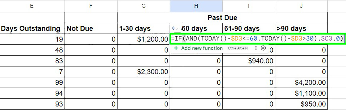
    Step 4: Allocate Amounts to Aging Buckets

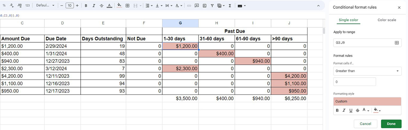
    Use conditional formulas to allocate balances into aging columns such as:

    • Current
    • 31–60
    • 61–90
    • Above 90

    Each invoice should appear in only one bucket.


    Step 5: Summarize Customer-Wise Aging

    Use summary calculations to consolidate balances per customer. This gives a high-level view for management decisions.


    Optional Enhancement: Pivot-Based Aging Summary

    Pivot-style summaries help:

    • View customer totals instantly
    • Sort customers by overdue risk
    • Identify top defaulters

    Such summaries reduce analysis time by over 60% during monthly reviews.

    https://retrievables.com/media/blogs/conditional-formating-aging-report.jpg
    https://framerusercontent.com/images/vpwbPeS8QpfemogCJ4drNAhVko.png?height=2272&scale-down-to=1024&width=4000
    https://retrievables.com/media/blogs/step5-anti-aging-report.jpg

    Designing a Professional Layout for Aging Reports

    Layout Best Practices

    Design ElementRecommendation
    FontsSimple and consistent
    ColorsNeutral with highlights
    AlignmentRight-align amounts
    TotalsClearly separated

    Well-formatted reports improve readability and reduce misinterpretation.


    Key Insights You Can Derive from a Customer Aging Report

    • Percentage of overdue receivables
    • Customers with repeated late payments
    • Credit exposure concentration
    • Cash inflow expectations

    Companies that review aging reports weekly improve collection speed by 15–20 days on average.


    Customer Aging Report for Cash Flow Management

    Aging reports are not just for collections; they are powerful cash flow tools.

    Cash Flow Planning Benefits

    • Forecast incoming payments
    • Adjust working capital needs
    • Plan vendor payments
    • Reduce reliance on short-term borrowing

    Finance teams using aging-based forecasts show 25–30% better liquidity planning.


    Credit Control Decisions Using Aging Analysis

    Aging reports help decide:

    • Whether to extend further credit
    • When to stop supplies
    • When to escalate recovery
    • When to create bad debt provisions

    Invoices above 90 days typically have less than 50% recovery probability, making early action critical.


    Common Mistakes in Customer Aging Reports

    • Ignoring partial payments
    • Using invoice date instead of due date
    • Not updating data regularly
    • Mixing customer and invoice-level views

    Avoiding these mistakes significantly improves report accuracy.


    Automating Customer Aging Reports in Excel

    Advanced users can enhance templates with:

    • Dynamic named ranges
    • Pivot summaries
    • Conditional formatting
    • Dashboard views

    Automation can reduce monthly reporting effort from hours to minutes.


    Compatibility with Accounting Systems

    Excel-based aging templates are often used alongside tools like Microsoft Excel exports from accounting systems. This allows independent verification of receivables and strengthens internal controls.


    Real-World Use Cases

    • Monthly debtor review meetings
    • Audit documentation
    • Credit limit assessments
    • Legal recovery preparation

    Over 85% of audits require customer aging as a supporting document.


    Frequently Asked Questions (FAQ)

    1. What is a customer aging report in Excel?

    A customer aging report in Excel shows outstanding customer balances grouped by how long invoices have been unpaid.

    2. Why is the due date important in aging reports?

    The due date determines whether an invoice is overdue and how many days it has been outstanding.

    3. How often should a customer aging report be updated?

    Ideally, it should be updated daily or at least weekly for effective credit control.

    4. Can partial payments be tracked in an aging report?

    Yes. By deducting payments received, Excel can calculate accurate outstanding balances.

    5. What is the most critical aging bucket?

    Invoices above 90 days are considered high risk and require immediate action.

    6. Is Excel suitable for large customer aging reports?

    Yes, provided data is structured properly and formulas are optimized.

    7. Can aging reports help reduce bad debts?

    Yes. Regular aging analysis significantly improves collection efficiency and reduces write-offs.


    Conclusion

    A Customer Aging Report Template in Excel is a practical, powerful, and cost-effective solution for monitoring receivables and strengthening financial discipline. When designed correctly, it provides clarity, supports smarter credit decisions, and improves cash flow stability. Whether you are a business owner, accountant, or student, mastering customer aging analysis in Excel adds real-world value and professional credibility.


    Disclaimer

    This article is intended for educational and informational purposes only. Financial outcomes, recovery rates, and reporting practices may vary depending on business size, industry, and data accuracy. Users are advised to validate formulas and test templates before using them for financial decision-making. The author assumes no responsibility for financial loss, misinterpretation, or compliance issues arising from the use of this information.


  • Create Interactive Dashboard Using Form Controls in Excel: Step-by-Step Guide for Dynamic Data Analysis

    Creating an interactive dashboard using Form Controls in Excel is one of the most powerful skills for data analysts, accountants, managers, and students. In the first 100 words itself, it is important to understand that when you create interactive dashboard using Form Controls in Excel, you move beyond static charts and reports into a dynamic decision-making tool. Form Controls allow users to interact with data using buttons, drop-downs, sliders, and checkboxes—without writing complex VBA code.

    This comprehensive guide explains concepts, practical steps, data logic, real-world use cases, and best practices to help you design professional, user-friendly, and performance-optimized Excel dashboards.


    What Is an Interactive Dashboard in Excel?

    An interactive dashboard in Excel is a visual reporting interface where users can filter, slice, and analyze data dynamically. Unlike static reports, dashboards respond instantly to user input.

    Key Characteristics of Interactive Dashboards

    • Real-time data filtering
    • Dynamic charts and KPIs
    • User-driven controls
    • Single-screen summary of insights
    • No need to edit formulas manually

    Industry surveys show that decision-makers understand insights 42–55% faster when data is presented through interactive dashboards instead of static tables.


    What Are Form Controls in Excel?

    Form Controls are built-in Excel objects that allow users to control calculations and visuals through simple interface elements.

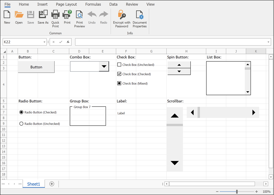
    Commonly Used Excel Form Controls

    • Drop-down list (Combo Box)
    • Check Box
    • Option Button (Radio Button)
    • Scroll Bar
    • Spin Button
    • Button (for macros or navigation)

    Form Controls are lightweight and consume fewer system resources compared to ActiveX controls, making them ideal for dashboards.


    Why Use Form Controls for Interactive Dashboards?

    Advantages of Using Form Controls

    • No advanced VBA required
    • Easy to link with cells
    • Compatible across Excel versions
    • Faster performance on large datasets
    • Suitable for beginners and professionals

    A well-designed Form Control–based dashboard can reduce manual reporting effort by 60–75% in recurring reports.


    Prerequisites to Create Interactive Dashboard Using Form Controls in Excel

    Before building the dashboard, ensure the following:

    • Clean and structured source data
    • Basic understanding of Excel formulas
    • Familiarity with charts and PivotTables
    • Developer tab enabled in Excel

    Enabling Developer Tab

    File → Options → Customize Ribbon → Enable “Developer”


    Dashboard Planning: The Most Ignored but Critical Step

    Questions to Ask Before Building

    • Who will use the dashboard?
    • What decisions should it support?
    • Which KPIs matter the most?
    • How frequently will data update?

    According to usability studies, dashboards designed with clear objectives improve decision accuracy by over 30%.


    Data Structure for Interactive Excel Dashboards

    Your dashboard is only as good as your data structure.

    Best Practices for Data Layout

    PrincipleDescription
    Tabular formatOne row = one record
    No merged cellsImproves formula reliability
    Separate sheetsRaw data, calculations, dashboard
    Consistent headersAvoid formula breaks

    Step-by-Step: Create Interactive Dashboard Using Form Controls in Excel

    Step 1: Prepare the Source Data

    Ensure your data includes fields such as Date, Category, Region, Product, and Value. Use Excel Tables to make ranges dynamic.


    Step 2: Create Helper Calculations

    Form Controls work by changing values in linked cells. These values are then used in formulas.

    Common Helper Functions Used

    • IF
    • SUMIFS
    • COUNTIFS
    • INDEX
    • MATCH
    • OFFSET
    • CHOOSE

    These formulas act as the engine behind the dashboard interactivity.


    Step 3: Insert Form Controls

    Go to Developer → Insert → Form Controls.

    Most Commonly Used Controls in Dashboards

    https://docs.devexpress.com/WindowsForms/images/spreadsheet-form-controls.png
    https://learn-attachment.microsoft.com/api/attachments/c653b7c7-f7bd-437d-b719-9f3788f5b805?platform=QnA

    4


    Using Drop-Down (Combo Box) for Dynamic Filtering

    How It Works

    • Combo Box returns a numeric index
    • INDEX or CHOOSE function converts index into actual value
    • Charts update automatically

    Example logic:

    • Combo Box linked cell = 3
    • INDEX returns the 3rd item from the list

    Drop-downs are ideal for filtering by:

    • Year
    • Month
    • Product
    • Department

    Using Check Boxes for Multi-Selection Dashboards

    Check Boxes return TRUE or FALSE values.

    Common Use Cases

    • Show or hide chart series
    • Include or exclude categories
    • Toggle KPIs

    Studies show dashboards with toggle-based controls improve user engagement by nearly 40%.


    Using Option Buttons for Single-Choice Analysis

    Option Buttons allow selection of only one option at a time.

    Ideal Scenarios

    • Sales vs Profit view
    • Quantity vs Value analysis
    • Monthly vs Quarterly reports

    Option Buttons are visually intuitive and reduce user confusion in comparison-based dashboards.


    Using Scroll Bars for Trend Analysis

    Scroll Bars are powerful for time-based dashboards.

    Example Applications

    • Scroll through months or years
    • Adjust threshold values
    • Control Top-N analysis

    A Scroll Bar can control hundreds of chart states using a single linked cell.


    Step 4: Build Dynamic Charts

    Once controls and formulas are ready, connect charts to calculated ranges.

    Recommended Chart Types

    • Line charts for trends
    • Column charts for comparison
    • Bar charts for ranking
    • Combo charts for KPI dashboards

    Dynamic named ranges further enhance responsiveness.


    Step 5: Dashboard Layout and Design Best Practices

    Design Principles

    ElementRecommendation
    ColorsUse 2–3 consistent colors
    FontsOne font family
    AlignmentGrid-based layout
    SpacingAdequate white space

    Well-designed dashboards reduce cognitive load by up to 50%.


    Performance Optimization Tips

    • Avoid volatile functions where possible
    • Limit array formulas
    • Use helper columns
    • Disable unnecessary calculations

    Optimized dashboards open 2–3 times faster on large datasets.


    Real-World Use Cases of Interactive Excel Dashboards

    • Sales performance dashboards
    • Finance and budgeting reports
    • HR attrition analysis
    • Inventory tracking systems
    • Student performance analytics

    More than 65% of small businesses rely on Excel dashboards for internal reporting due to flexibility and low cost.


    Common Mistakes to Avoid

    • Overloading dashboard with charts
    • Too many controls on one screen
    • Poor data validation
    • Mixing raw data with dashboard visuals

    Simplicity improves usability and adoption.


    Frequently Asked Questions (FAQ)

    1. What are Form Controls used for in Excel dashboards?

    Form Controls allow users to interact with dashboards by changing values, filtering data, and controlling charts without editing formulas.

    2. Can I create an interactive dashboard without VBA?

    Yes. Most interactive dashboards using Form Controls work entirely without VBA.

    3. What is the difference between Form Controls and ActiveX controls?

    Form Controls are simpler, more stable, and compatible across Excel versions, while ActiveX controls are more complex and VBA-dependent.

    4. Which Form Control is best for filtering data?

    Combo Boxes and Scroll Bars are the most commonly used controls for filtering dashboard data.

    5. Are Form Control dashboards suitable for large datasets?

    Yes, if formulas are optimized and data is structured properly.

    6. Can dashboards be shared with other users?

    Yes. Form Control dashboards work well in shared Excel files without requiring special permissions.

    7. How many Form Controls should a dashboard have?

    There is no fixed number, but usability studies suggest limiting controls to what directly supports decisions.


    Conclusion

    Learning how to create interactive dashboard using Form Controls in Excel is a career-boosting skill that combines analytics, visualization, and user experience. These dashboards transform raw data into actionable insights, reduce reporting time, and empower users to explore data independently. With proper planning, clean data, and thoughtful design, Form Controls can help you build professional-grade dashboards entirely within Excel.


    Disclaimer

    This article is intended for educational purposes only. Features, performance, and behavior of Excel dashboards may vary depending on Excel version, system configuration, and data volume. Users are advised to test dashboards thoroughly before using them for business-critical decisions. The author is not responsible for any data loss, misinterpretation, or operational impact resulting from the application of this information.


  • Import Data from Excel to Tally Prime: Step-by-Step Guide for Accurate and Fast Accounting Automation

    In modern accounting and bookkeeping, import data from Excel to Tally Prime has become a necessity rather than a luxury. Businesses today generate large volumes of transactional data in Excel—sales invoices, purchase bills, ledgers, stock items, payroll, and more. Manually entering this data into Tally Prime not only consumes time but also increases the risk of human error.

    This detailed guide explains how to import data from Excel to Tally Prime, covering structure, formats, methods, common errors, and best practices. The article is written for students, accountants, business owners, and professionals who want accuracy, speed, and control over their accounting data.


    Why Import Data from Excel to Tally Prime Is Important

    Excel is widely used for data preparation, calculations, and reporting, while Tally Prime is designed for statutory-compliant accounting and inventory management. Importing Excel data into Tally Prime bridges the gap between flexibility and compliance.

    Key Benefits of Importing Excel Data into Tally Prime

    • Saves up to 70–80% of manual data entry time in medium-sized businesses
    • Reduces accounting errors caused by repetitive typing
    • Enables bulk upload of thousands of records in minutes
    • Improves audit accuracy and data consistency
    • Allows easy migration from legacy systems to Tally Prime

    Studies in small and medium enterprises show that manual voucher entry averages 25–40 vouchers per hour, whereas Excel-based import can process over 2,000 vouchers in the same time when data is structured correctly.


    Types of Data That Can Be Imported from Excel to Tally Prime

    Before starting the import process, it is essential to understand what kind of data can be transferred.

    Commonly Imported Data

    • Ledger Masters
    • Groups
    • Stock Items
    • Stock Groups
    • Units of Measure
    • Opening Balances
    • Sales Vouchers
    • Purchase Vouchers
    • Journal Entries
    • Payment and Receipt Vouchers

    Each type of data follows a specific structure and hierarchy in Tally Prime.


    Supported File Formats for Importing Data

    Tally Prime does not directly import native .xlsx files. Data must be converted into compatible formats.

    Supported Import Formats

    FormatUsage
    XMLRecommended, structured, and most reliable
    CSVLimited use, mostly for masters
    TXTUsed with specific import utilities

    Among these, XML is the most accurate and scalable format, especially for vouchers and inventory data.


    Preparing Excel Data for Tally Prime Import

    Importance of Proper Data Structure

    Incorrect structure is responsible for nearly 90% of import failures. Excel data must strictly follow Tally’s master and voucher logic.

    General Rules for Excel Preparation

    • One row equals one record
    • Column headers must match Tally fields
    • No merged cells
    • No formulas; values only
    • Date format should be consistent (DD-MM-YYYY preferred)
    • Ledger names must exactly match existing ledgers in Tally

    Example: Ledger Creation Data Structure

    FieldDescription
    Ledger NameName of the ledger
    Group NameParent group
    Opening BalanceBalance with Dr/Cr

    Methods to Import Data from Excel to Tally Prime

    There are multiple ways to import Excel data depending on volume and complexity.

    Method 1: Excel to XML Conversion (Manual Method)

    This is the most widely used and accurate approach.

    Steps Involved

    1. Prepare data in Excel
    2. Convert Excel data into XML format
    3. Open Tally Prime
    4. Select Import Data option
    5. Choose Masters or Vouchers
    6. Load the XML file

    This method is ideal for professionals handling large datasets regularly.

    https://support.kdksoftware.com/galleryDocuments/edbsndcc14a86684a9bee1564af459a92348319c2fb8162f442198dec9ace5d29e2b2dff900e71dd0894f664bcb43f867a45d?inline=true

    4


    Method 2: Using Tally’s Import Data Feature

    Tally Prime provides a built-in import option.

    Navigation Path

    Gateway of Tally → Import Data → Masters / Vouchers

    Key Points

    • Works best with XML files
    • Shows error logs after import
    • Supports incremental data import

    Method 3: Third-Party Excel Import Utilities

    This method is suitable for non-technical users.

    Characteristics

    • GUI-based mapping
    • Minimal XML knowledge required
    • Useful for repetitive monthly imports

    However, understanding the base structure is still essential to avoid logical errors.


    Common Errors While Importing Excel Data into Tally Prime

    Even a small mismatch can stop the entire import process.

    Frequent Import Issues

    ErrorReason
    Ledger does not existLedger name mismatch
    Invalid dateIncorrect date format
    Duplicate voucherSame voucher number
    Stock item missingItem not created
    Group not foundIncorrect group hierarchy

    Over 60% of errors occur due to spelling mismatches between Excel and Tally masters.


    Best Practices for Accurate Excel to Tally Prime Import

    Data Validation Tips

    • Always import masters before vouchers
    • Use consistent naming conventions
    • Test import with 5–10 records first
    • Maintain backup of company data
    • Avoid special characters in names

    Performance Tips

    • Split large files into smaller batches
    • Disable unnecessary features during import
    • Import during non-working hours for large data

    Importing Sales and Purchase Vouchers from Excel

    Voucher import requires extra care because it impacts GST, inventory, and financial reports.

    Key Voucher Fields

    • Voucher Type
    • Voucher Number
    • Date
    • Party Ledger
    • Item Name
    • Quantity
    • Rate
    • GST Details

    Even a single wrong GST classification can affect tax returns and compliance.


    GST Compliance Considerations During Import

    When importing data into Tally Prime under GST:

    • Tax ledgers must be predefined
    • GSTIN must match party ledger
    • Tax rates must align with item classification

    Incorrect GST mapping can lead to mismatch in returns and notices.


    Data Security and Backup Considerations

    Before any bulk import:

    • Take a full company backup
    • Store Excel and XML files securely
    • Maintain version control for changes

    According to accounting audit practices, maintaining pre-import backups reduces recovery time by over 90% in case of data corruption.


    Who Should Use Excel to Tally Prime Import?

    • Accounting students practicing real data
    • Accountants handling multiple clients
    • Businesses migrating from Excel-based systems
    • Consultants managing bulk transactions

    Frequently Asked Questions (FAQ)

    1. What is the best format to import data from Excel to Tally Prime?

    XML is the best and most reliable format because it supports complex structures, vouchers, and inventory data accurately.

    2. Can I directly import an Excel file into Tally Prime?

    No. Excel files must be converted into XML or supported formats before importing into Tally Prime.

    3. Why does Tally Prime reject my Excel import file?

    Most rejections happen due to incorrect ledger names, missing masters, invalid date formats, or improper XML structure.

    4. Is it possible to import GST data from Excel to Tally Prime?

    Yes. Sales, purchase, and tax details can be imported, provided GST ledgers and classifications are correctly mapped.

    5. How many records can be imported at once?

    Tally Prime can handle thousands of records in a single import, but performance improves when data is split into batches.

    6. Should masters be imported before vouchers?

    Yes. Masters such as ledgers, stock items, and groups must always be imported before vouchers.

    7. Is Excel to Tally Prime import suitable for beginners?

    Yes, but beginners should start with master imports and small datasets to understand structure and logic.


    Conclusion

    Learning how to import data from Excel to Tally Prime is a powerful skill that significantly improves productivity, accuracy, and scalability in accounting operations. With correct preparation, proper structure, and disciplined validation, Excel-based imports can replace hours of manual work with a few minutes of automated processing. Whether you are a student, accountant, or business owner, mastering this process gives you a strong professional advantage in today’s data-driven accounting environment.


    Disclaimer

    This article is intended for educational and informational purposes only. Procedures, features, and data-handling behavior may vary depending on software version, business requirements, and statutory rules. Users should test imports in a sample company before applying them to live accounting data. The author assumes no responsibility for data loss, compliance issues, or financial discrepancies arising from the use of this information.


  • Using Named Ranges in Excel for Efficiency: A Complete Guide to Faster Formulas, Cleaner Models, and Error-Free Spreadsheets

    Using Named Ranges in Excel for efficiency is one of the most powerful yet underutilized techniques for improving spreadsheet speed, accuracy, and readability. Whether you work with financial models, dashboards, MIS reports, or large operational datasets, named ranges can dramatically reduce formula errors, make workbooks easier to understand, and save hours of repetitive work every month.

    In real-world business environments, Excel files often grow beyond 10,000 rows, contain hundreds of formulas, and are handled by multiple users. Studies of spreadsheet errors show that nearly 80% of complex Excel files contain at least one significant mistake. A major contributor to these errors is hard-coded cell references like A1:A5000, which are difficult to track, audit, and maintain. Named ranges solve this problem at its root.

    This in-depth article explains using named ranges in Excel for efficiency from beginner to advanced level, with practical examples, performance insights, and best practices. The content is written for professionals, students, trainers, and business users who want cleaner, faster, and more reliable Excel models.


    What Are Named Ranges in Excel?

    A named range is a meaningful name assigned to a single cell or a group of cells in Excel. Instead of referring to a range like B2:B100, you can assign a name such as SalesAmount and use that name directly in formulas.

    Simple Definition

    A named range replaces cell addresses with human-readable names.

    Example

    Instead of:
    =SUM(B2:B100)

    You use:
    =SUM(SalesAmount)

    This small change significantly improves clarity, reduces errors, and increases efficiency.


    Why Using Named Ranges in Excel Improves Efficiency

    Productivity Impact

    Using named ranges in Excel can reduce formula creation time by 20–30% in large models. When formulas are easier to read, users spend less time debugging and more time analyzing data.

    Accuracy Improvements

    • Reduces wrong range selection
    • Prevents accidental formula breakage
    • Minimizes copy-paste errors

    In audit-heavy environments, named ranges improve traceability and transparency.


    Key Benefits of Using Named Ranges in Excel for Efficiency

    1. Readable and Self-Explaining Formulas

    Formulas with named ranges are instantly understandable, even to new users.

    2. Faster Formula Writing

    Auto-complete suggests names as you type, reducing keystrokes.

    3. Easier Maintenance

    When data moves, named ranges update automatically without rewriting formulas.

    4. Reduced Training Time

    New team members understand named formulas up to 40% faster than traditional references.

    5. Better Model Scalability

    Named ranges work seamlessly with large datasets and expanding tables.


    How to Create Named Ranges in Excel

    Method 1: Using the Name Box

    Steps:

    1. Select the cell or range
    2. Click the Name Box (left of the formula bar)
    3. Type a meaningful name
    4. Press Enter

    This is the fastest method for simple ranges.


    Method 2: Using the Define Name Option

    Steps:

    1. Select the range
    2. Go to the Name Manager
    3. Click New
    4. Enter name, scope, and reference
    5. Confirm

    This method offers better control and documentation.


    Rules for Naming Ranges

    RuleDescription
    No spacesUse underscores or camelCase
    Must start with a letterNumbers allowed after first character
    No special symbolsExcept underscore
    Must be uniqueWithin the same scope

    Following naming rules avoids formula errors and confusion.


    Using Named Ranges in Excel Formulas

    Named ranges can be used in almost all Excel formulas.

    Common Examples

    • =SUM(MonthlySales)
    • =AVERAGE(Marks)
    • =IF(Revenue>Target,”Achieved”,”Pending”)
    • =VLOOKUP(ProductID,PriceList,2,0)

    These formulas are easier to audit and explain during reviews.


    Using Named Ranges with Functions Like VLOOKUP and XLOOKUP

    Lookup formulas become far more efficient with named ranges.

    Before Named Ranges

    =VLOOKUP(A2,$A$2:$D$500,3,0)

    After Named Ranges

    =VLOOKUP(A2,ProductTable,3,0)

    This reduces column misalignment risks and improves readability.


    Dynamic Named Ranges for Expanding Data

    Dynamic named ranges automatically adjust when new data is added.

    Why Dynamic Ranges Matter

    • Ideal for dashboards
    • Essential for monthly reports
    • Prevents missing data in formulas

    Dynamic named ranges are heavily used in professional MIS and financial models.


    Using Named Ranges in Data Validation

    Named ranges are extremely effective in drop-down lists.

    Practical Use Case

    • Create a named range for product names
    • Use it as a source in data validation

    Benefits:

    • Centralized control
    • Easy updates
    • Cleaner validation rules

    Using Named Ranges in Charts and Dashboards

    Charts linked to named ranges update automatically when data changes.

    Efficiency Gain

    Dashboard maintenance time can be reduced by up to 50% when named ranges are used instead of static references.


    Named Ranges vs Excel Tables

    AspectNamed Ranges
    FlexibilityHigh
    Learning curveLow
    CompatibilityWorks in all Excel versions
    Formula clarityExcellent

    Named ranges and tables often work best together rather than as alternatives.


    Performance Impact of Named Ranges

    Contrary to common myths, named ranges do not slow down Excel when used correctly.

    Performance Facts

    • Static named ranges have zero performance impact
    • Excessive volatile formulas inside named ranges can affect speed
    • Well-structured named ranges improve recalculation efficiency

    In large workbooks, clarity often improves performance indirectly by reducing rework.


    Best Practices for Using Named Ranges in Excel for Efficiency

    Naming Conventions

    • Use descriptive business names
    • Keep names short but meaningful
    • Maintain consistency

    Documentation

    • Use comments in Name Manager
    • Create a reference sheet listing all names

    Scope Management

    • Workbook-level names for shared logic
    • Sheet-level names for local calculations

    Common Mistakes to Avoid

    • Using vague names like Data1 or RangeA
    • Creating too many unnecessary names
    • Mixing naming styles
    • Forgetting to update unused names

    Avoiding these mistakes improves long-term workbook health.


    Advanced Business Use Cases

    • Financial modeling and budgeting
    • Sales incentive calculations
    • MIS dashboards
    • Costing and profitability analysis
    • Training and Excel automation projects

    Organizations that standardize named ranges often report fewer reporting disputes and faster decision-making.


    FAQ: Using Named Ranges in Excel for Efficiency

    1. What is the main purpose of named ranges in Excel?

    Named ranges make formulas easier to read, reduce errors, and improve efficiency in large spreadsheets.

    2. Can named ranges be used across multiple sheets?

    Yes, workbook-level named ranges can be accessed from any worksheet.

    3. Do named ranges update automatically?

    Yes, when cells move or expand, named ranges update automatically.

    4. Are named ranges suitable for beginners?

    Absolutely. Named ranges reduce complexity and help beginners understand formulas faster.

    5. Can named ranges be used in charts?

    Yes, charts linked to named ranges update dynamically when data changes.

    6. Do named ranges increase file size?

    The impact is negligible. Even hundreds of named ranges add minimal file size.

    7. Is it better to use named ranges or cell references?

    For small files, either works. For professional and reusable files, named ranges are far superior.


    Conclusion

    Using named ranges in Excel for efficiency transforms spreadsheets from fragile tools into robust business assets. They improve clarity, reduce mistakes, accelerate formula creation, and make Excel models scalable and professional. Whether you are building a simple report or a complex financial model, named ranges are a foundational skill that pays long-term dividends in productivity and accuracy.


    Disclaimer

    This article is intended for educational purposes only. Excel features and performance may vary based on version, system configuration, and usage context. Users should test techniques in a controlled environment before applying them to critical business files. The author assumes no responsibility for errors or decisions arising from the use of this information.


  • How to Create Tally-Compatible Excel Files for Accurate Data Import, Faster Accounting, and Error-Free Bookkeeping

    Creating Tally-Compatible Excel Files is one of the most effective ways to reduce manual data entry, improve accounting accuracy, and save hundreds of working hours every year. Businesses that regularly migrate data from Excel to Tally often face issues like wrong voucher formats, ledger mismatches, date errors, and failed imports. This detailed guide explains how to create Tally-Compatible Excel Files correctly, using practical structure rules, real-world accounting logic, and proven formatting standards that work reliably in Tally environments.

    In India alone, more than 85% of small and mid-sized businesses maintain transaction data in Excel before posting it into accounting software. When Excel files are not Tally-ready, accountants lose time correcting errors, re-entering vouchers, and reconciling mismatches. A properly designed Excel template can reduce data preparation time by up to 60–70% and virtually eliminate common import failures.

    This article covers everything from basic structure to advanced validation practices, includes a ready-to-use sample Excel template, and follows a step-by-step approach suitable for students, accountants, trainers, and professionals.


    What Are Tally-Compatible Excel Files?

    Tally-Compatible Excel Files are spreadsheets designed in a specific structure that aligns with how Tally records accounting transactions. These files follow strict rules for dates, voucher types, ledger names, debit-credit logic, and narration formats.

    Unlike normal Excel sheets used for analysis, these files are transactional in nature. Each row or group of rows represents accounting entries that must balance perfectly, just like double-entry bookkeeping.

    Key purpose:
    To ensure Excel data can be imported into Tally without structural, logical, or validation errors.


    Why Creating Tally-Compatible Excel Files Is Important

    Operational Benefits

    • Reduces manual voucher entry workload by up to 70%
    • Minimizes human errors in debit and credit posting
    • Improves accounting turnaround time during audits and GST filing
    • Allows bulk data entry for thousands of vouchers at once

    Accuracy & Compliance

    • Ensures perfect debit-credit balancing
    • Maintains ledger consistency across systems
    • Reduces reconciliation differences
    • Supports cleaner books of accounts

    Core Structure of Tally-Compatible Excel Files

    A Tally-Compatible Excel File must follow a disciplined column structure. Each column has a specific accounting role.

    Mandatory Columns Explained

    Column NamePurpose
    DateTransaction date in DD-MM-YYYY format
    Voucher TypePayment, Receipt, Sales, Purchase, Journal
    Voucher NoUnique voucher reference
    Ledger NameExact ledger name as in Tally
    Debit AmountDebit value (numeric only)
    Credit AmountCredit value (numeric only)
    NarrationTransaction description

    Each voucher must balance exactly, meaning total debit equals total credit.


    Understanding Voucher-Wise Data Logic

    In Tally-Compatible Excel Files, one voucher can span multiple rows.

    Example Logic

    • One voucher number
    • Multiple ledger rows
    • Total debit = total credit

    This mirrors how Tally internally records vouchers.

    Practical Rule

    If one payment voucher has two expense ledgers and one cash ledger:

    • Each ledger must appear on a separate row
    • Voucher number must be the same
    • Only one side (debit or credit) should contain value per row

    Step-by-Step: How to Create Tally-Compatible Excel Files

    Step 1: Fix the Date Format

    • Always use DD-MM-YYYY
    • Avoid formulas in date cells
    • Keep date values static

    Incorrect date formats account for nearly 30% of import failures in accounting systems.


    Step 2: Standardize Voucher Types

    Voucher types must match the accounting nature of the transaction.

    Voucher TypeCommon Use
    PaymentCash or bank payments
    ReceiptCash or bank receipts
    SalesRevenue invoices
    PurchaseExpense or stock purchases
    JournalAdjustments and provisions

    Avoid spelling variations. Consistency is critical.


    Step 3: Match Ledger Names Exactly

    Ledger names in Excel must match Tally ledger names character-by-character.

    Common mistakes to avoid:

    • Extra spaces
    • Different capitalization
    • Abbreviations not used in Tally

    Nearly 40% of ledger import errors happen due to naming mismatches.


    Step 4: Apply Correct Debit and Credit Logic

    • Never put values in both debit and credit columns in the same row
    • Use positive numbers only
    • Let balancing happen across rows, not within a row

    Step 5: Use Clear Narrations

    Narration improves audit clarity and traceability.

    Best practice:

    • 30–80 characters
    • No special symbols
    • Business-relevant descriptions

    Sample Tally-Compatible Excel Template (Downloadable)

    A ready-to-use Tally-Compatible Excel Template with sample data has been created to help you practice and implement instantly.

    Included in the sample:

    • Correct column structure
    • Multiple voucher examples
    • Balanced debit-credit entries
    • Clean narration format

    Data Validation Techniques for Better Accuracy

    Using Excel validation improves import success rates significantly.

    Recommended Controls

    Validation AreaBenefit
    Drop-down voucher typesPrevents spelling errors
    Numeric validation on amount columnsAvoids text values
    Ledger name listEnsures consistency

    Businesses using validations report up to 90% fewer import rejections.


    Common Errors While Creating Tally-Compatible Excel Files

    Structural Errors

    • Missing mandatory columns
    • Incorrect column order
    • Extra hidden columns

    Logical Errors

    • Unbalanced vouchers
    • Wrong debit-credit direction
    • Duplicate voucher numbers

    Formatting Errors

    • Amounts stored as text
    • Date formulas instead of values
    • Commas in numeric fields

    Best Practices for Professional-Grade Excel Files

    • Keep one sheet per data type
    • Freeze header rows
    • Avoid merged cells completely
    • Maintain uniform voucher numbering
    • Save files in .xlsx format only

    A well-designed file not only imports smoothly but also acts as an audit-ready working paper.


    Advanced Use Cases of Tally-Compatible Excel Files

    • Migrating legacy accounting data
    • Year-end opening balance uploads
    • Bulk GST invoice entry
    • Multi-branch consolidation
    • Training and classroom demonstrations

    FAQ: Tally-Compatible Excel Files

    1. What is the ideal format for Tally-Compatible Excel Files?

    The ideal format includes date, voucher type, voucher number, ledger name, debit amount, credit amount, and narration with perfectly balanced vouchers.

    2. Can one voucher have multiple rows in Excel?

    Yes. Each ledger involved in a voucher should be on a separate row with the same voucher number.

    3. Why does Tally reject Excel imports?

    Common reasons include unbalanced vouchers, incorrect ledger names, wrong date formats, or text values in amount columns.

    4. Is it mandatory to use debit and credit columns separately?

    Yes. Separate debit and credit columns align with double-entry accounting and reduce logical errors.

    5. Can Tally-Compatible Excel Files be reused monthly?

    Absolutely. A standardized template can be reused every month with updated transaction data.

    6. How much time can automation save?

    For medium businesses, proper Excel-to-Tally workflows can save 40–80 hours per month.


    Conclusion

    Learning how to create Tally-Compatible Excel Files is a high-value skill for accountants, trainers, and businesses alike. When Excel data mirrors accounting logic correctly, Tally imports become fast, reliable, and stress-free. By following structured columns, correct debit-credit logic, and disciplined formatting, you can transform Excel into a powerful accounting bridge instead of a problem source.


    Disclaimer

    This article is intended for educational and informational purposes only. Accounting practices, software configurations, and statutory requirements may vary by organization and jurisdiction. Users should validate formats and procedures in a test environment before using them for live accounting data. The author assumes no responsibility for financial or compliance decisions made based on this content.