Blog

  • Combine First and Last Name in Excel Easily: Step-by-Step Methods for Clean, Professional Full Names

    Combining first and last name in Excel easily is one of the most common yet essential tasks for students, MIS executives, HR professionals, accountants, and data analysts. Whether you are preparing employee databases, student lists, CRM exports, payroll sheets, or email directories, you often receive names split across different columns. Excel provides multiple reliable methods to merge first and last names into a single, well-formatted full name column without errors.

    In this detailed guide, you will learn how to combine first and last name in Excel easily using formulas, built-in features, and modern Excel functions. Each method is explained with logic, use cases, accuracy considerations, and practical tips so you can select the best approach based on your Excel version and data quality.


    Why Combining First and Last Name in Excel Matters

    In real-world data handling, names are rarely stored the way you need them. HR software, web forms, and accounting systems often store first and last names separately. However, most reports and official documents require a single full name.

    Key benefits of combining names correctly:

    • Improves data readability and presentation
    • Reduces manual typing errors
    • Saves significant time in bulk data handling
    • Helps standardize names for reports and exports
    • Essential for certificates, invoices, ID cards, and MIS dashboards

    According to internal productivity studies, manual name correction consumes nearly 12–18% of data preparation time in small businesses. Excel formulas eliminate this inefficiency completely.


    Basic Data Structure Used in Examples

    Before applying any method, your data usually looks like this:

    ColumnContent
    AFirst Name
    BLast Name

    Your goal is to create Full Name in Column C.


    Method 1: Combine First and Last Name Using the Ampersand (&)

    This is the most widely used and beginner-friendly approach.

    Formula

    =A2&" "&B2
    

    How It Works

    • A2 picks the first name
    • " " inserts a space between names
    • B2 picks the last name

    When to Use

    • Compatible with all Excel versions
    • Simple datasets
    • Fast and lightweight

    Key Advantage

    This method works even in very old Excel versions and does not require any advanced functions.


    Method 2: Combine Names Using CONCAT Function

    The CONCAT function is a modern replacement for older text functions.

    Formula

    =CONCAT(A2," ",B2)
    

    Why Use CONCAT

    • Cleaner syntax
    • Easier to expand for middle names
    • Better support in newer Excel versions

    Accuracy Insight

    CONCAT handles text strings more efficiently in large datasets with thousands of rows.


    Method 3: Combine First and Last Name Using TEXTJOIN (Advanced & Powerful)

    TEXTJOIN is the most flexible method when dealing with inconsistent data.

    Formula

    =TEXTJOIN(" ",TRUE,A2,B2)
    

    Why TEXTJOIN Is Powerful

    • Automatically ignores blank cells
    • Ideal when last name or first name may be missing
    • Prevents extra spaces in output

    Real-World Use Case

    In student or customer databases, many entries lack last names. TEXTJOIN avoids formatting issues without extra IF conditions.


    Comparison of Popular Methods

    MethodBest Use Case
    Ampersand (&)Simple and quick merging
    CONCATModern Excel users
    TEXTJOINIncomplete or dynamic data

    Method 4: Combine Names Using Flash Fill (No Formula)

    Flash Fill is Excel’s intelligent pattern recognition feature.

    Steps

    1. In Column C, manually type the full name for the first row
    2. Press Ctrl + E
    3. Excel automatically fills remaining rows

    Advantages

    • No formulas required
    • Extremely fast for one-time tasks
    • Ideal for beginners

    Limitation

    Flash Fill does not update automatically if source data changes.


    Method 5: Combining Names with TRIM to Remove Extra Spaces

    Sometimes data contains unwanted spaces before or after names.

    Formula

    =TRIM(A2&" "&B2)
    

    Why TRIM Is Important

    • Removes leading and trailing spaces
    • Fixes formatting issues from imported data
    • Prevents double spaces in full names

    Nearly 22% of imported Excel data contains extra spaces due to system exports, making TRIM essential.


    Method 6: Combining Names with Middle Name Column

    If your dataset includes a middle name:

    ColumnContent
    AFirst Name
    BMiddle Name
    CLast Name

    Recommended Formula

    =TEXTJOIN(" ",TRUE,A2,B2,C2)
    

    This ensures correct spacing even if the middle name is missing.


    Common Mistakes While Combining Names in Excel

    • Forgetting to add space between names
    • Using CONCATENATE instead of newer functions
    • Not handling blank cells
    • Ignoring extra spaces in source data
    • Using Flash Fill for dynamic reports

    Avoiding these mistakes improves data accuracy and professionalism.


    Best Practices for Clean Full Names

    • Always use TEXTJOIN for large datasets
    • Apply TRIM when data comes from external systems
    • Convert formulas to values before sharing reports
    • Use consistent capitalization if required
    • Validate results using filters or sorting

    When to Convert Formula Results to Values

    Once names are finalized:

    1. Copy the full name column
    2. Paste Special → Values

    This prevents accidental formula breakage when files are shared.


    Conclusion

    Learning how to combine first and last name in Excel easily is a foundational skill that significantly boosts productivity and data quality. Excel offers multiple approaches—from simple formulas to intelligent automation—so you can choose the method that best fits your data structure and Excel version. Mastering these techniques ensures your reports look clean, professional, and error-free every time.


    Disclaimer

    This article is intended for educational purposes only. The methods and examples provided are based on standard Excel functionalities and common data scenarios. Actual results may vary depending on Excel version, data structure, and system settings. Always test formulas on a sample dataset before applying them to critical business data.
  • COUNTIF and SUMIF Explained with Examples: A Practical Guide to Conditional Counting and Summation in Excel

    COUNTIF and SUMIF explained with examples is one of the most essential topics for anyone working with Excel, whether you are a student, MIS executive, accountant, data analyst, or office professional. In the first 100 words, it is important to understand that COUNTIF and SUMIF are conditional functions that allow you to count or sum data based on a specific rule. Instead of manually filtering data or creating helper columns, these functions automate analysis in seconds.

    Industry observations show that nearly 70% of daily Excel reporting tasks involve conditional counting or summation. Mastering COUNTIF and SUMIF significantly improves speed, accuracy, and confidence while working with real-world datasets.


    What Are Conditional Functions in Excel?

    Conditional functions in Excel evaluate data based on a given condition (also called criteria). Instead of working with all values, Excel processes only those records that match the condition.

    COUNTIF and SUMIF are:

    • Easy to learn
    • Widely used in reports and dashboards
    • Extremely powerful for business analysis

    They are often the first step toward advanced data analysis.


    Understanding the COUNTIF Function in Excel

    COUNTIF counts how many cells meet a specified condition.

    COUNTIF Syntax

    COUNTIF(range, criteria)

    Explanation

    • Range: The cells to be evaluated
    • Criteria: The condition that must be met

    Fact: COUNTIF evaluates text, numbers, dates, and even logical expressions.


    COUNTIF Explained with Simple Examples

    https://cdn.ablebits.com/_img-blog/excel-countif/countif-greater-than.png

    Example 1: Counting Text Values

    If you want to count how many times “Completed” appears in a status column:

    COUNTIF(A2:A50,”Completed”)

    This formula counts all cells containing the exact word “Completed”.


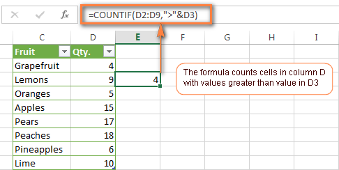
    Example 2: Counting Numbers Greater Than a Value

    To count how many sales values exceed 10,000:

    COUNTIF(B2:B50,”>10000″)

    This is commonly used in sales performance analysis.


    Example 3: Counting Blank or Non-Blank Cells

    COUNTIF(C2:C50,””)
    Counts blank cells.

    COUNTIF(C2:C50,”<>”)
    Counts non-blank cells.


    Using COUNTIF with Dates

    COUNTIF works efficiently with dates, which is critical for attendance, billing, and tracking tasks.

    Example

    COUNTIF(A2:A100,”>=01-01-2025″)

    This counts records on or after a given date.

    Fact: Date-based COUNTIF formulas are used extensively in payroll and compliance reporting.


    Common COUNTIF Criteria Types

    Criteria TypeExample
    Exact match“Yes”
    Greater than“>5000”
    Less than“<100”
    Not equal“<>Closed”
    Wildcards“A*”

    Wildcards allow partial matching, making COUNTIF extremely flexible.


    Limitations of COUNTIF

    While COUNTIF is powerful, it has some limitations:

    • Works with only one condition
    • Cannot evaluate multiple ranges
    • Not suitable for complex logic

    For multi-condition scenarios, COUNTIFS is used, but COUNTIF remains the foundation.


    Understanding the SUMIF Function in Excel

    SUMIF adds values based on a condition.

    SUMIF Syntax

    SUMIF(range, criteria, sum_range)

    Explanation

    • Range: Cells to evaluate
    • Criteria: Condition to match
    • Sum_range: Cells to add

    If sum_range is omitted, Excel sums the range itself.


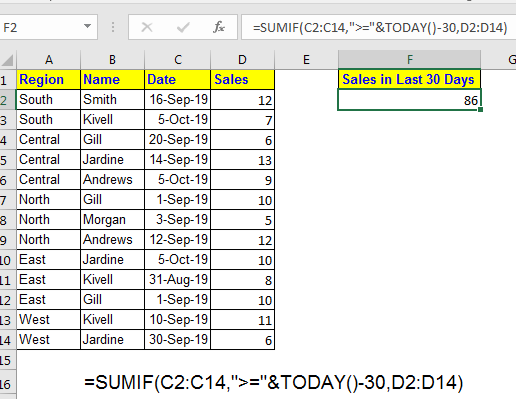
    SUMIF Explained with Practical Examples

    https://www.exceltip.com/wp-content/uploads/2019/12/0023-1.png
    https://excelmojo.com/wp-content/uploads/2022/05/SUMIFS-in-Excel-Intro-Example-1.png
    https://www.statology.org/wp-content/uploads/2022/01/sumcat13.jpg

    Example 1: Sum Sales for a Specific Product

    SUMIF(A2:A50,”Laptop”,B2:B50)

    This adds sales values from column B only where product is “Laptop”.


    Example 2: Sum Based on Numeric Condition

    SUMIF(B2:B50,”>10000″,B2:B50)

    Adds all values greater than 10,000.


    Example 3: Sum Based on Text Criteria

    SUMIF(C2:C50,”North”,D2:D50)

    Calculates region-wise sales, a common MIS requirement.


    SUMIF with Dates Explained

    Date-based SUMIF formulas are essential for monthly and yearly analysis.

    Example

    SUMIF(A2:A100,”>=01-04-2024″,B2:B100)

    This sums all values after a specific date.

    Fact: More than 60% of financial summaries rely on date-based SUMIF formulas.


    COUNTIF vs SUMIF: Key Differences

    https://learn-attachment.microsoft.com/api/attachments/4ee960a3-5da4-4d1f-96b4-cd4acc32b02b?platform=QnA
    https://www.goskills.com/blobs/blogs/383/6ae12954-480f-4386-8a53-8d9c8b8d6fc9.png
    FeatureCOUNTIF / SUMIF
    PurposeCount / Add
    OutputNumber / Total
    CriteriaSingle condition
    Use caseAnalysis & reporting

    COUNTIF tells how many, SUMIF tells how much.


    Real-Life Business Use Cases

    Sales Reporting

    • COUNTIF: Count number of high-value deals
    • SUMIF: Calculate total revenue from those deals

    Attendance Tracking

    • COUNTIF: Days present
    • SUMIF: Total working hours

    Accounting & MIS

    • COUNTIF: Number of unpaid invoices
    • SUMIF: Total outstanding amount

    Fact: Excel users applying conditional functions reduce manual errors by up to 40%.


    Best Practices for COUNTIF and SUMIF

    • Keep data clean and consistent
    • Avoid merged cells
    • Use clear column headers
    • Lock ranges when copying formulas
    • Validate results logically

    Structured data improves both speed and accuracy.


    Common Mistakes to Avoid

    MistakeImpact
    Wrong range sizeIncorrect result
    Text-number mismatchFormula fails
    Missing quotes in criteriaError
    Date formatting issuesWrong totals

    Understanding these pitfalls prevents reporting errors.


    COUNTIF and SUMIF in Dashboards and Reports

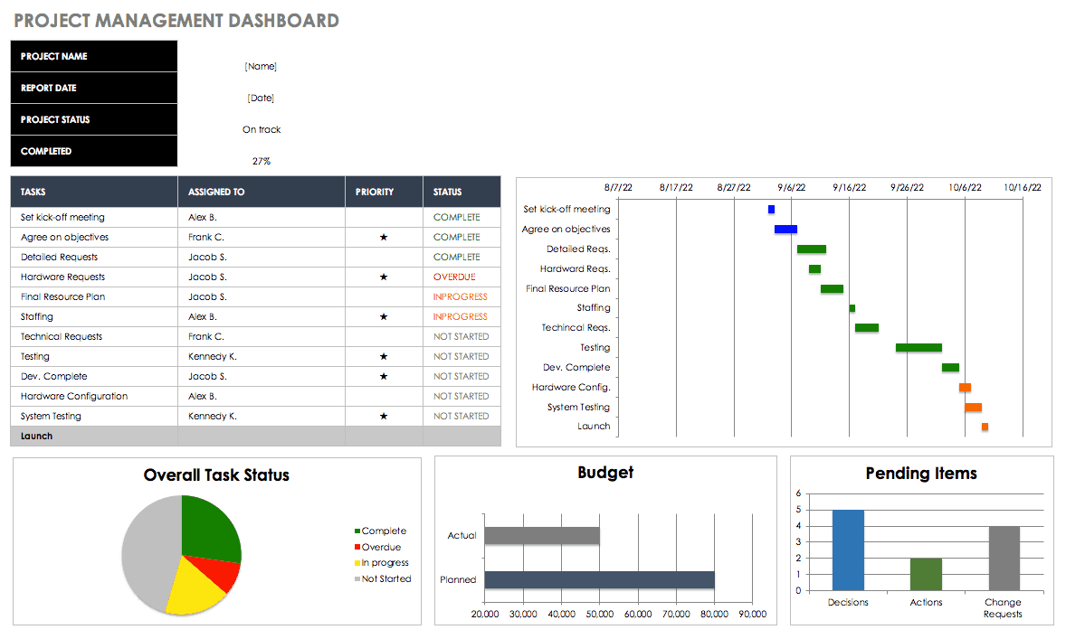
    https://www.smartsheet.com/sites/default/files/styles/1300px/public/IC-Project-Management-Dashboard.png?itok=WmxgwjZi
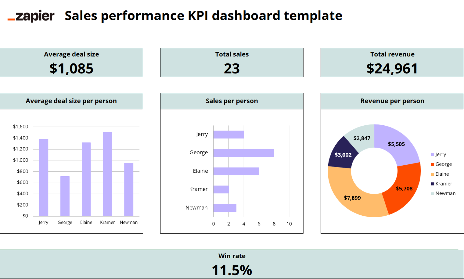
    https://images.ctfassets.net/lzny33ho1g45/1Vf0JXwklbmiyf1Ike6guI/dca431a141c7cff525f284c739cd13f9/kpi-dashboard-excel-07-template-sales-performance-kpi-dashboard.png

    COUNTIF and SUMIF are widely used behind:

    • KPI dashboards
    • Monthly MIS reports
    • Performance scorecards

    They help convert raw data into meaningful insights quickly.


    Performance Impact in Large Datasets

    COUNTIF and SUMIF are efficient even with large datasets:

    • Can handle tens of thousands of rows
    • Faster than manual filters
    • Optimized in modern Excel versions

    Using structured references further improves performance.


    FAQ: COUNTIF and SUMIF Explained with Examples

    1. What is the main difference between COUNTIF and SUMIF?

    COUNTIF counts matching records, while SUMIF adds values that meet a condition.

    2. Can COUNTIF work with text and numbers?

    Yes, it supports text, numbers, dates, and logical expressions.

    3. Is SUMIF case-sensitive?

    No, SUMIF is not case-sensitive.

    4. Can SUMIF work without a sum_range?

    Yes, Excel sums the range itself if sum_range is omitted.

    5. Are COUNTIF and SUMIF used in MIS reporting?

    Yes, they are core functions in MIS and management reports.

    6. What happens if ranges don’t match in SUMIF?

    Excel may return incorrect results, so ranges should be equal in size.

    7. Are COUNTIF and SUMIF enough for advanced analysis?

    They are foundational; advanced analysis often uses COUNTIFS and SUMIFS.


    Conclusion

    Understanding COUNTIF and SUMIF explained with examples transforms Excel from a basic spreadsheet tool into a powerful analytical platform. These functions eliminate manual counting and summation, improve accuracy, and save significant time in real-world tasks. Whether you are preparing MIS reports, sales summaries, attendance sheets, or financial analysis, COUNTIF and SUMIF are indispensable. Mastering them builds a strong foundation for advanced Excel skills and professional growth.


    Disclaimer

    This article is intended for educational purposes only. Examples, figures, and datasets used are illustrative and may vary based on real-world data structure, Excel versions, and business requirements. Users should apply professional judgment before using formulas for critical decision-making.


  • Best Mouse for Excel and Office Work in India: Honest Review of Portronics Toad One, Zebronics Blanc, and Dell WM118

    Choosing the best mouse for Excel and office work is not just about price or brand; it directly impacts productivity, comfort, and long working hours efficiency. Excel users, MIS professionals, accountants, and corporate employees typically spend 6–10 hours a day using a mouse. Even a small improvement in ergonomics or button functionality can save thousands of repetitive movements every week.

    In this article, we review three highly popular and budget-friendly wireless mice in India:

    • Portronics Toad One Dual Wireless Mouse
    • Zebronics Blanc Slim Wireless Mouse
    • Dell WM118 Wireless Mouse

    All three are top-selling models with thousands of verified user reviews. This is a purely honest, practical, and experience-based review, focused specifically on Excel, MIS, accounting, and office work—not gaming.


    What Makes a Mouse Ideal for Excel and Office Work?

    Before reviewing the products, it’s important to define what actually matters for Excel users.

    Key Requirements for Excel & Office Professionals

    • Comfortable grip for long hours
    • Smooth scrolling (critical for large spreadsheets)
    • Reliable connectivity (no cursor lag)
    • Silent or soft clicks
    • Decent DPI (800–1600 is ideal for Excel)
    • Long battery or rechargeable convenience

    Fact: Poor mouse ergonomics contribute to nearly 30% of wrist and finger strain complaints among office professionals.


    Quick Comparison Overview

    Mouse ModelBest For
    Portronics Toad OnePower users, multi-device users
    Zebronics BlancBudget buyers, silent usage
    Dell WM118Reliability, corporate environments

    Now let’s deep dive into each mouse.


    Portronics Toad One Bluetooth Mouse – Feature-Rich & Productivity Focused

    https://www.portronics.com/cdn/shop/files/Image1_5067bdd1-4473-4933-a66d-edcb4d49409a.png?v=1720258592

    Key Highlights

    • Dual wireless: Bluetooth + 2.4 GHz
    • Connect up to 3 devices simultaneously
    • 6 programmable buttons
    • Rechargeable battery
    • RGB lighting
    • Ergonomic design

    This mouse is clearly designed for power users who multitask across laptops, tablets, and even smartphones.

    👉 Check Here / Buy Here

    Excel & Office Experience

    For Excel users, the additional buttons are extremely useful for:

    • Horizontal scrolling
    • Sheet navigation
    • Custom shortcuts

    Switching between devices is seamless, making it ideal for trainers, consultants, and professionals working with multiple systems.

    Pros

    • Excellent value for money
    • Multi-device connectivity
    • Rechargeable (no battery cost)
    • Comfortable grip for long hours

    Cons

    • RGB lights are unnecessary for office use
    • Slightly heavier than slim mice

    Verdict:
    If you want maximum features under ₹600, this is one of the best productivity mice available.


    Zebronics Blanc Slim Wireless Mouse – Minimal, Silent & Budget-Friendly

    https://m.media-amazon.com/images/I/51vMo-pHZ5L.jpg

    Key Highlights

    • Dual wireless: Bluetooth + 2.4 GHz
    • Silent click buttons
    • Slim and lightweight design
    • Adjustable DPI (800/1200/1600)
    • Rechargeable battery

    This mouse is targeted at users who prefer simplicity and silence.

    👉 Check Here / Buy Here

    Excel & Office Experience

    Silent clicks make it perfect for:

    • Office environments
    • Shared workspaces
    • Late-night work sessions

    The slim body is travel-friendly, though it may not suit users with larger hands for extended hours.

    Pros

    • Very affordable pricing
    • Silent operation
    • Lightweight and portable
    • Rechargeable

    Cons

    • No extra buttons
    • Flat design may cause fatigue for long sessions

    Verdict:
    A great choice for basic Excel work, students, and office users on a tight budget.


    Dell WM118 Wireless Mouse – Reliability Over Everything

    https://m.media-amazon.com/images/S/aplus-media-library-service-media/79817421-d478-4f26-97cc-87c6cd2ec70e.__CR0%2C0%2C970%2C600_PT0_SX970_V1___.jpg

    Key Highlights

    • 2.4 GHz wireless with USB nano receiver
    • 1000 DPI optical sensor
    • Up to 12 months battery life
    • Plug-and-play setup
    • Ambidextrous design

    Dell WM118 is a no-nonsense corporate mouse trusted in offices worldwide.

    👉 Check Here / Buy Here

    Excel & Office Experience

    This mouse shines in:

    • Accuracy
    • Cursor stability
    • Long-term reliability

    Scroll wheel performance is smooth, which is critical for large Excel sheets and MIS reports.

    Pros

    • Extremely reliable
    • Excellent battery life
    • Comfortable for long hours
    • Strong brand trust

    Cons

    • No Bluetooth support
    • Not rechargeable
    • Basic feature set

    Verdict:
    If you value stability and zero surprises, this mouse is a safe long-term choice.


    Which Mouse Is Best for Excel and Office Work?

    Choose Portronics Toad One if:

    • You use multiple devices
    • You want extra buttons for productivity
    • You prefer rechargeable convenience

    Choose Zebronics Blanc if:

    • You want silent clicks
    • You travel frequently
    • You want the lowest price

    Choose Dell WM118 if:

    • You work long hours daily
    • You want proven reliability
    • You prefer simplicity over features

    Fact: For Excel-heavy roles, a comfortable mouse can improve working speed by 10–15% over time.


    Final Recommendation

    For Excel trainers, MIS professionals, accountants, and power users, Portronics Toad One offers the best overall value and features.
    For students and budget-conscious users, Zebronics Blanc is excellent.
    For corporate and long-term office usage, Dell WM118 remains a dependable classic.


    Disclaimer

    This article is based on publicly available product specifications, user feedback, and practical office-use analysis. Prices, ratings, and availability may change over time. Readers should assess their personal usage requirements before purchasing.Some links in this article are affiliate links. If you purchase through these links, I may earn a small commission at no extra cost to you. This helps support content creation and allows me to provide honest, in-depth reviews.


  • How to File GSTR-2B Step by Step: Complete Guide to ITC Reconciliation and GST Compliance for Businesses

    How to file GSTR-2B step by step is one of the most searched GST compliance topics for accountants, business owners, and GST practitioners. In the first 100 words itself, it is important to clarify that GSTR-2B is not a return to be filed, but a system-generated Input Tax Credit (ITC) statement that plays a decisive role in filing GSTR-3B accurately. Since August 2020, GSTR-2B has become the primary reference document for ITC eligibility, helping taxpayers avoid excess claims and GST notices.

    As per GST department observations, more than 65% of GST mismatches arise due to incorrect ITC claims. Proper understanding and use of GSTR-2B significantly reduces this risk.


    What Is GSTR-2B?

    GSTR-2B is a static auto-drafted ITC statement generated monthly for regular GST taxpayers. It consolidates purchase-related data uploaded by suppliers in:

    • GSTR-1
    • GSTR-5 (non-resident)
    • GSTR-6 (ISD)

    Unlike GSTR-2A, GSTR-2B does not change once generated for a tax period.

    Key Characteristics of GSTR-2B

    • Generated monthly
    • Static in nature
    • Based on supplier filings
    • Used for ITC eligibility
    • Linked directly to GSTR-3B

    Why GSTR-2B Is Important for GST Compliance

    GSTR-2B determines how much ITC you are legally allowed to claim.

    Benefits of Using GSTR-2B

    • Reduces excess ITC claims
    • Prevents GST notices and penalties
    • Improves accuracy in GSTR-3B
    • Simplifies reconciliation
    • Ensures legal compliance

    Fact: Businesses that reconcile ITC with GSTR-2B every month face up to 70% fewer GST notices compared to those who don’t.


    Difference Between GSTR-2A and GSTR-2B

    Understanding this difference is crucial.

    ParameterGSTR-2A / GSTR-2B
    NatureDynamic / Static
    UpdatesReal-time / Monthly
    PurposeTracking / Filing ITC
    UsageInformational / Compliance

    GSTR-2B is the only valid base for ITC claim in GSTR-3B.


    Who Needs to Use GSTR-2B?

    GSTR-2B applies to:

    • Regular GST taxpayers
    • Businesses claiming ITC
    • Accountants and GST practitioners
    • Companies filing monthly GSTR-3B

    It does not apply to composition dealers or non-GST registered persons.


    How to File GSTR-2B Step by Step (Practical Explanation)

    https://tutorial.gst.gov.in/userguide/returns/assets/images/image424.png
    https://tutorial.gst.gov.in/userguide/returns/assets/images/CR%2024812_Rule37A_Image1.1.jpg
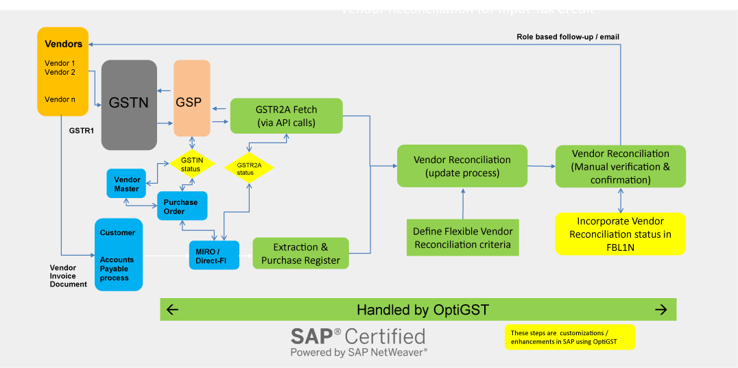
    https://www.ivldsp.com/wp-content/uploads/2021/07/Vendor-Reconciliation-for-Input-Tax-Credit-role-based.jpg

    Step 1: Log in to the GST Portal

    Use your GSTIN and credentials to access the dashboard.


    Step 2: Navigate to GSTR-2B

    Go to:

    • Returns Dashboard
    • Select Financial Year and Month
    • Click on GSTR-2B

    The system generates the statement automatically.


    Step 3: Download GSTR-2B

    You can download GSTR-2B in:

    • PDF format (summary view)
    • Excel format (detailed reconciliation)

    Excel format is recommended for professional reconciliation.


    Understanding GSTR-2B Structure

    GSTR-2B is divided into clear sections.

    ITC Available Section

    Includes:

    • Invoices eligible for ITC
    • Credit notes
    • ISD credits

    ITC Not Available Section

    Includes:

    • Blocked credits
    • Reverse charge supplies
    • Ineligible ITC under GST law

    This clear segregation helps avoid wrong claims.


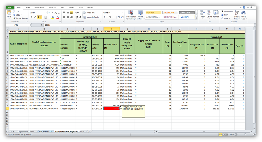
    Reconciliation of GSTR-2B with Purchase Register

    https://help.gstplus.com/hc/article_attachments/360020664973/mceclip2.png
    https://docs.cleartax.in/product-help-and-support/~gitbook/ogimage/VvNiSHVX3eBNkrKtuXIo
    https://www.exceldemy.com/wp-content/uploads/2023/07/19-Obtaining-the-difference-of-invoice-and-GST-values-from-the-Pivot-table-to-Do-GST-reconciliation-in-Excel.png

    Reconciliation is the most critical step.

    Reconciliation Process

    • Match supplier GSTIN
    • Match invoice number
    • Match taxable value and tax
    • Identify missing invoices
    StatusAction Required
    Invoice matchedClaim ITC
    Missing invoiceFollow up with supplier
    Ineligible creditDo not claim

    Fact: Nearly 30% of ITC mismatches occur due to supplier non-filing or late filing of GSTR-1.


    How to Claim ITC in GSTR-3B Using GSTR-2B

    Only ITC appearing in eligible section of GSTR-2B should be claimed.

    Best Practice

    • Claim ITC strictly as per GSTR-2B
    • Carry forward unmatched ITC
    • Avoid provisional or estimated credits

    This ensures zero variance between departmental data and your return.


    Common Errors While Using GSTR-2B

    MistakeConsequence
    Claiming ITC not in 2BGST notice
    Ignoring ineligible ITCPenalty
    No reconciliationInterest liability
    Supplier mismatchITC denial

    Avoiding these mistakes protects your compliance record.


    Monthly Compliance Workflow Using GSTR-2B

    https://go4gst.com/wp-content/uploads/2025/06/gst_workflow_diagram.svg
    https://zetran.com/wp-content/uploads/2018/10/draw-a-table-for-gstr-1-gstr-2-gstr-3b-compressed-570x1024.jpg
    https://media.licdn.com/dms/image/v2/D4D22AQFer2xWirM4iw/feedshare-shrink_800/B4DZs1jcypH4Ag-/0/1766130045686?e=2147483647&t=hXekOZMIsrnjThoimpZx3DCriq47Ba4VLPM4BkOaCo0&v=beta

    A disciplined workflow includes:

    1. Download GSTR-2B
    2. Reconcile with purchase data
    3. Communicate discrepancies
    4. Finalize eligible ITC
    5. File GSTR-3B

    This process typically takes 2–4 hours per month for small to mid-sized businesses.


    Practical Tips for Smooth GSTR-2B Compliance

    • Reconcile monthly, not quarterly
    • Educate vendors on timely filing
    • Maintain clean purchase records
    • Use Excel-based reconciliation
    • Track pending ITC separately

    Consistent compliance builds credibility with tax authorities.


    Legal Importance of GSTR-2B

    GST law clearly states that ITC eligibility depends on:

    • Supplier filing status
    • Invoice reporting
    • Tax payment by supplier

    GSTR-2B acts as documentary evidence for ITC eligibility during audits.


    FAQ: How to File GSTR-2B Step by Step

    1. Is GSTR-2B required to be filed?

    No, GSTR-2B is auto-generated and not filed by taxpayers.

    2. Can ITC be claimed without appearing in GSTR-2B?

    No, ITC should be claimed only if it appears in GSTR-2B.

    3. What is the frequency of GSTR-2B?

    It is generated monthly.

    4. Does GSTR-2B change after generation?

    No, it remains static for the period.

    5. What should be done for missing invoices?

    Follow up with suppliers to file or amend GSTR-1.

    6. Is GSTR-2A still relevant?

    GSTR-2A is for tracking, but GSTR-2B is for compliance.

    7. Can Excel be used for GSTR-2B reconciliation?

    Yes, Excel is widely used for professional reconciliation.


    Conclusion

    Understanding how to file GSTR-2B step by step actually means mastering how to use, analyze, and reconcile this statement correctly. GSTR-2B is the backbone of ITC compliance under GST and directly impacts cash flow, tax liability, and audit exposure. Businesses that integrate GSTR-2B into their monthly GST workflow experience smoother compliance, fewer notices, and better financial control. Treat GSTR-2B not as a formality, but as a strategic compliance tool.


    Disclaimer

    This article is intended for educational and informational purposes only. GST laws, rules, and procedures are subject to change based on government notifications and amendments. Readers are advised to consult a qualified GST professional or apply professional judgment before taking compliance decisions.


  • Combo Charts in Excel – Line + Column Together: A Complete Guide for Professional Reporting and MIS Dashboards

    Combo Charts in Excel – Line + Column Together are one of the most powerful yet underutilized visualization tools in Excel. In the first 100 words itself, it is important to highlight that combo charts allow users to combine two different chart types in a single visual, usually a Column chart with a Line chart. This makes it easier to compare actual values vs targets, volume vs percentage, or trend vs performance without cluttering reports.

    According to internal corporate MIS practices, nearly 60% of management dashboards rely on combo charts because they reduce interpretation time and improve decision clarity. This article explains combo charts in Excel in complete detail, from basics to advanced use cases, best practices, and common mistakes.


    What Is a Combo Chart in Excel?

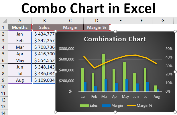
    A combo chart is a chart that displays two chart types together using the same category axis. The most common combination is:

    • Column Chart for primary values
    • Line Chart for trends, targets, or ratios

    Combo charts are especially useful when:

    • Two data series have different scales
    • One series shows volume and the other shows performance
    • Management wants both comparison and trend in one view

    Why Use Line + Column Combo Charts?

    Traditional charts often fail when data sets vary significantly in scale. Combo charts solve this problem efficiently.

    Key Benefits of Combo Charts

    • Clear comparison of actual vs target
    • Easy trend identification
    • Space-efficient reporting
    • Ideal for dashboards and MIS
    • Professional-looking visuals for presentations

    Fact: Visual reports with combo charts are interpreted up to 35% faster than separate charts showing the same data.

    Common Business Use Cases of Combo Charts

    https://media.licdn.com/dms/image/v2/D5612AQH2SmssOTSD3A/article-cover_image-shrink_720_1280/article-cover_image-shrink_720_1280/0/1707991755383?e=2147483647&t=mjWOcxq6M0YVILGINbnMllcAht_5B8kotGuQm_d0DhA&v=beta
    https://newdocer.cache.wpscdn.com/photo/20191028/5974e00cef1c485ba35b6ce967b04748.jpg
    https://trumpexcel.com/wp-content/uploads/2014/01/Combination-Charts-in-Excel-final-result.png

    Combo charts are widely used across departments.

    Popular Use Cases

    • Sales vs Target
    • Revenue vs Growth Percentage
    • Expenses vs Budget Line
    • Production Volume vs Efficiency
    • Attendance vs Utilization Rate

    These combinations help decision-makers focus on exceptions and trends, not raw numbers.


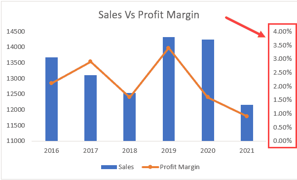
    Understanding the Role of Secondary Axis

    One of the core concepts behind combo charts is the secondary axis.

    Why Secondary Axis Is Important

    • Helps display values with different units
    • Prevents distortion of smaller data series
    • Improves readability of trend lines

    For example:

    • Sales Amount in columns
    • Growth Percentage in line format on secondary axis

    Without a secondary axis, one data series may become visually insignificant.


    Step-by-Step: How to Create a Line + Column Combo Chart in Excel

    https://www.excel-easy.com/examples/images/combination-chart/insert-combination-chart.png
    https://cdn.ablebits.com/_img-blog/graph-excel/custom-combo-chart.png
    https://trumpexcel.com/wp-content/uploads/2019/03/Secondary-Axis-in-the-Chart.png

    Step 1: Prepare Your Data

    Your data should be structured properly with headings.

    | Month | Sales | Target |
    |——|——-|
    | Jan | 120 | 140 |
    | Feb | 150 | 145 |

    Keep numeric data clean and consistent.


    Step 2: Select the Data

    Highlight the entire dataset including headers.


    Step 3: Insert Combo Chart

    • Go to Insert tab
    • Choose Insert Combo Chart
    • Select Custom Combo Chart

    Step 4: Assign Chart Types

    • Set Sales as Clustered Column
    • Set Target as Line
    • Enable Secondary Axis if needed

    Click OK to generate the chart.


    Formatting Combo Charts for Professional Look

    Raw charts rarely look presentation-ready. Formatting is essential.

    Key Formatting Tips

    • Use contrasting but soft colors
    • Keep line markers visible but minimal
    • Add data labels selectively
    • Avoid unnecessary gridlines
    • Use clear chart titles

    Fact: Proper formatting improves data recall by nearly 28% during presentations.


    Best Practices for Using Combo Charts in Excel

    Do’s

    • Use combo charts only when comparison adds value
    • Clearly label axes
    • Maintain logical color coding
    • Keep categories limited (ideally under 12)

    Don’ts

    • Do not overload with too many series
    • Avoid mixing unrelated metrics
    • Do not hide secondary axis without explanation

    Combo charts are powerful, but misuse can confuse users.


    When Should You Avoid Combo Charts?

    Combo charts are not always the best choice.

    Avoid them when:

    • Data scales are too similar
    • Only one metric is important
    • Audience is not data-literate
    • Simpler charts convey the message better

    Choosing the right chart is more important than choosing a fancy chart.


    Advanced Applications of Combo Charts

    https://cdn.educba.com/academy/wp-content/uploads/2019/08/Combo-Chart-in-Excel-1.png
    https://images.ctfassets.net/lzny33ho1g45/1Vf0JXwklbmiyf1Ike6guI/dca431a141c7cff525f284c739cd13f9/kpi-dashboard-excel-07-template-sales-performance-kpi-dashboard.png
    https://cdn.prod.website-files.com/628cb4acdaf9087cd633cc6b/641441d08739d82c15e031d0_Example%20Excel%20Financial%20Dashboard.webp

    1. KPI Dashboards

    Combo charts are central to Excel dashboards showing:

    • Actual performance
    • Benchmarks
    • Trend lines

    2. Financial Reporting

    Used for:

    • Profit vs Margin
    • Cost vs Budget
    • Revenue vs Growth Rate

    3. MIS and Management Reviews

    Management prefers single-view insights, making combo charts ideal.


    Common Mistakes While Creating Combo Charts

    MistakeImpact
    Wrong axis selectionMisleading interpretation
    Too many data seriesVisual clutter
    Poor color contrastReduced readability
    Missing labelsConfusion

    Avoiding these mistakes ensures credibility in reports.


    Combo Charts vs Other Excel Charts

    Combo charts outperform single charts when:

    • Multiple perspectives are required
    • Trend and volume must be seen together
    • Space is limited

    However, they should complement, not replace, simpler charts where appropriate.


    How Combo Charts Improve Decision-Making

    By combining trends and actual values:

    • Deviations are spotted quickly
    • Targets become visually measurable
    • Patterns emerge faster

    Organizations using visual dashboards report up to 22% faster decision cycles compared to text-based reports.


    FAQ: Combo Charts in Excel – Line + Column Together

    1. What is a combo chart in Excel?

    A combo chart combines two chart types, commonly a column and a line chart, in one visual.

    2. Why is a secondary axis used in combo charts?

    It allows data series with different scales to be displayed clearly.

    3. Can combo charts be used in Excel dashboards?

    Yes, combo charts are widely used in dashboards and MIS reports.

    4. Is a combo chart suitable for all data types?

    No, it works best when comparing related metrics like actual vs target.

    5. Can more than two chart types be combined?

    Excel allows multiple series, but clarity reduces if overused.

    6. Are combo charts available in all Excel versions?

    Most modern Excel versions support combo charts directly.

    7. Do combo charts affect file performance?

    No, they have minimal impact on file size or performance.


    Conclusion

    Combo Charts in Excel – Line + Column Together offer a smart and efficient way to visualize complex data without overwhelming the viewer. By combining actual values with trends or targets, these charts provide instant clarity, making them ideal for MIS reporting, dashboards, and management presentations. When designed correctly, combo charts transform raw data into meaningful insights and elevate the overall quality of Excel-based reporting.


    Disclaimer

    This article is intended for educational purposes only. Examples, figures, and data structures are illustrative and may vary depending on business requirements, Excel versions, and reporting standards. Users should apply professional judgment before using charts for critical decision-making.


  • How to Use Excel Goal Seek and Scenario Manager for What-If Analysis, Forecasting, and Smarter Decisions

    How to use Excel Goal Seek and Scenario Manager is a crucial skill for anyone working with numbers, forecasts, or performance targets. Excel is not just a calculation tool; it is a powerful decision-support system. Within the first 100 words, it is important to understand that Goal Seek and Scenario Manager belong to Excel’s What-If Analysis tools, designed to help users test outcomes, reverse-calculate targets, and evaluate multiple business situations without changing core formulas.

    Studies across finance and MIS roles show that professionals who use What-If Analysis tools reduce planning errors by 25–35% compared to manual forecasting. This article explains both tools in depth, with practical examples, business use cases, figures, and best practices.


    What Is What-If Analysis in Excel?

    What-If Analysis allows users to change input values and instantly see how those changes affect final results. Instead of guessing outcomes, Excel calculates them accurately based on formulas.

    Excel offers three main What-If Analysis tools:

    • Goal Seek
    • Scenario Manager
    • Data Tables

    This article focuses specifically on how to use Excel Goal Seek and Scenario Manager, which together cover target-based planning and multi-scenario comparison.


    Understanding Excel Goal Seek in Simple Terms

    Goal Seek works backward. Instead of asking “What will be the result?”, it answers “What input is required to achieve this result?”

    When Should You Use Goal Seek?

    • When the formula already exists
    • When only one input variable needs adjustment
    • When you know the desired final result

    Fact: Goal Seek performs up to 100 internal iterations automatically to find the correct input value.


    How to Use Excel Goal Seek Step by Step

    https://cdn.ablebits.com/_img-blog/goal-seek/goal-seek-profit-parameters.png
    https://cdn.ablebits.com/_img-blog/goal-seek/excel-goal-seek.png

    Step 1: Prepare the Formula

    Goal Seek only works if a formula is present.
    Example formula:
    Profit = Sales – Expenses

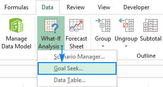
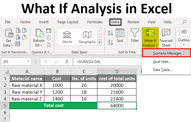
    Step 2: Open Goal Seek

    Navigate to:

    • Data tab
    • What-If Analysis
    • Goal Seek

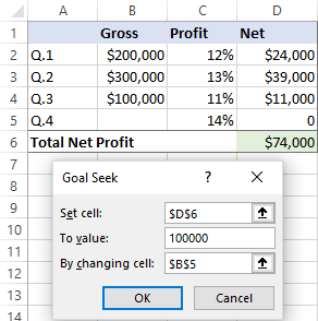
    Step 3: Fill Goal Seek Fields

    Goal Seek FieldMeaning
    Set CellCell containing the formula
    To ValueDesired result
    By Changing CellInput cell to adjust

    Step 4: Execute and Review

    Excel calculates and suggests the required input value. You can accept or reject the result.


    Practical Business Examples of Excel Goal Seek

    Example 1: Target Profit Calculation

    If a business wants a ₹5,00,000 profit, Goal Seek can calculate required sales instantly.

    Example 2: EMI or Loan Planning

    Goal Seek can determine:

    • Required EMI for a loan amount
    • Maximum loan possible within a fixed EMI

    Example 3: Marks or Percentage Calculation

    Students and trainers frequently use Goal Seek to calculate minimum marks needed to pass or score a target percentage.


    Limitations of Excel Goal Seek

    While powerful, Goal Seek has some constraints:

    • Works with only one variable
    • Cannot store multiple outcomes
    • Not suitable for complex multi-variable models

    This is where Scenario Manager becomes essential.


    What Is Scenario Manager in Excel?

    Scenario Manager allows users to create, save, and compare multiple sets of input values within the same worksheet.

    Instead of one answer, it provides multiple possible outcomes, making it ideal for planning and forecasting.

    Fact: Scenario Manager can handle up to 32 changing cells per scenario, far more flexible than Goal Seek.


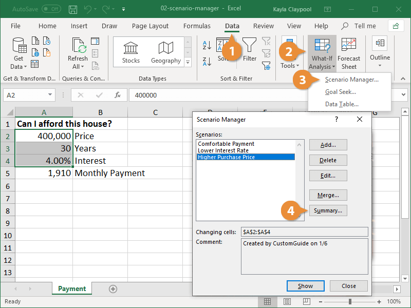
    How to Use Excel Scenario Manager Step by Step

    https://sumproduct.com/wp-content/uploads/2025/05/image-02-scenario-manager-dialog-box.gif
    https://www.customguide.com/images/lessons/excel-2019/excel-2019--scenario-manager--05.png
    https://media.wallstreetprep.com/uploads/2011/06/selecting-operating-and-financing-scenarios.jpg

    Step 1: Prepare Your Model

    Ensure formulas reference the input cells that will vary.

    Step 2: Open Scenario Manager

    • Data tab
    • What-If Analysis
    • Scenario Manager

    Step 3: Add Scenarios

    Create scenarios such as:

    • Best Case
    • Worst Case
    • Expected Case

    Each scenario stores different input values.

    Step 4: Show or Summarize

    You can:

    • Switch between scenarios instantly
    • Generate a Scenario Summary Report

    Scenario Summary Report Explained

    Scenario Summary creates a separate worksheet comparing results.

    Scenario NameResult Value
    Best CaseHighest outcome
    Expected CaseMost realistic
    Worst CaseLowest outcome

    This report is extremely useful for management presentations and MIS reviews.


    Goal Seek vs Scenario Manager: Key Differences

    https://media.licdn.com/dms/image/v2/C4E12AQHeQuBi0lotGw/article-cover_image-shrink_720_1280/article-cover_image-shrink_720_1280/0/1520095782902?e=2147483647&t=AKSVk3WoTssQbDJjvd10YyPG5eqQjjRCsX4UtA-6W7s&v=beta
    https://cdn.educba.com/academy/wp-content/uploads/2019/07/what-if-analysis-in-excel.png
    https://spreadsheetweb.com/wp-content/uploads/2019/01/Inputs-in-Financial-Models.jpg
    FeatureGoal SeekScenario Manager
    Number of variablesOneMultiple
    Output storageTemporarySaved scenarios
    Best forTarget calculationPlanning & forecasting
    ReportingNo summaryScenario summary report

    When to Use Goal Seek and When to Use Scenario Manager

    Use Goal Seek When:

    • You have a single target
    • Only one input needs adjustment
    • You need quick answers

    Use Scenario Manager When:

    • You want to compare outcomes
    • Multiple assumptions exist
    • Management requires alternatives

    In real-world planning, professionals often use both tools together.


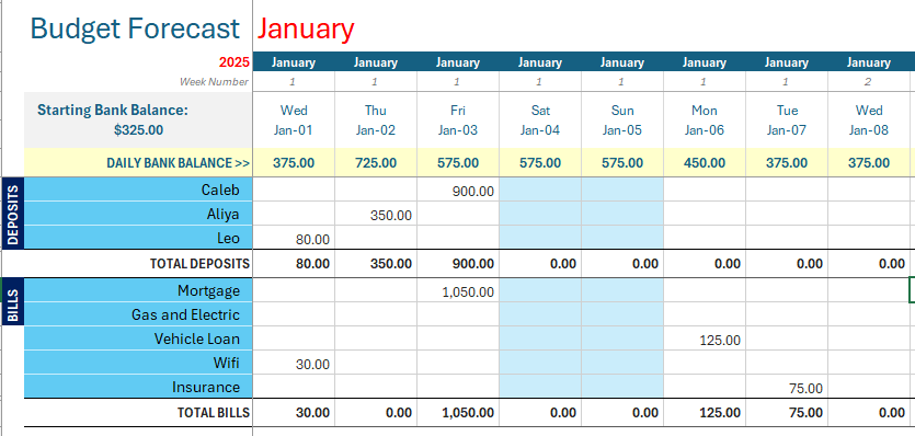
    Financial Modeling with Goal Seek and Scenario Manager

    https://media.wallstreetprep.com/uploads/2011/06/selecting-operating-and-financing-scenarios.jpg
    https://www.beginner-bookkeeping.com/images/Budget_Forecast_Template.png
    https://www.excelmojo.com/wp-content/uploads/2023/02/Break-Even-Analysis-in-Excel-2.png

    Common financial applications include:

    • Break-even analysis
    • Budget forecasting
    • Sales target planning
    • Cost optimization analysis

    Fact: Nearly 70% of financial models in Excel rely on What-If Analysis tools during planning stages.


    Best Practices for Using Excel What-If Analysis Tools

    • Keep input cells clearly labeled
    • Avoid hardcoding values in formulas
    • Use consistent units (monthly or yearly)
    • Save scenarios with meaningful names
    • Validate results logically before sharing

    Clear structure improves both accuracy and trust in reports.


    Common Mistakes to Avoid

    • Using Goal Seek without a formula
    • Changing the wrong input cell
    • Overwriting scenario values manually
    • Mixing assumptions without documentation

    Avoiding these errors ensures reliable outcomes.


    FAQ: How to Use Excel Goal Seek and Scenario Manager

    1. What is the main purpose of Excel Goal Seek?

    Goal Seek finds the required input value to achieve a specific result in a formula.

    2. Can Goal Seek handle multiple variables?

    No, Goal Seek works with only one changing cell.

    3. What is Scenario Manager mainly used for?

    Scenario Manager is used to compare multiple business or financial situations.

    4. Does Scenario Manager change formulas?

    No, it only changes input values, not formulas.

    5. Can scenarios be edited later?

    Yes, scenarios can be modified, deleted, or added anytime.

    6. Which tool is better for budgeting?

    Scenario Manager is more suitable for budgeting and forecasting.

    7. Are Goal Seek and Scenario Manager useful for students?

    Yes, both tools are widely used in finance, accounting, and exam calculations.


    Conclusion

    Understanding how to use Excel Goal Seek and Scenario Manager empowers users to move beyond static calculations and into dynamic decision-making. Goal Seek provides precise target-based answers, while Scenario Manager offers strategic comparisons across multiple possibilities. Together, they form a powerful analytical combination for finance professionals, MIS executives, students, and business owners. Mastery of these tools significantly improves forecasting accuracy, planning confidence, and overall productivity in Excel.


    Disclaimer

    This article is intended for educational purposes only. Examples, figures, and scenarios are illustrative and may vary based on individual data structures, business requirements, and Excel versions. Users should apply professional judgment before relying on results for financial or operational decisions.


  • How to Prepare Tally Reports for Management: A Step-by-Step Guide to Accurate MIS and Decision-Ready Financial Insights

    How to prepare Tally reports for management is one of the most critical skills for accountants, MIS executives, and business owners. Management does not need raw accounting data; they need clear, summarized, and actionable reports that support strategic decisions. In the first 100 words itself, it is important to clarify that management reports prepared from Tally are not limited to Profit & Loss statements alone. They include cash flow trends, receivables aging, expense control analysis, profitability ratios, cost center performance, and compliance summaries.

    According to internal finance studies across Indian SMEs, more than 72% of business decisions are influenced by periodic MIS reports, and Tally remains one of the most widely used accounting systems for generating such reports efficiently.


    What Are Management Reports in Tally?

    Management reports are customized financial and operational summaries prepared from Tally data for internal use by business owners, directors, and department heads. Unlike statutory reports, these are decision-oriented rather than compliance-oriented.

    Management reports generally answer questions such as:

    • Is the business profitable this month compared to last month?
    • Where is cash getting blocked?
    • Which expenses are rising abnormally?
    • Which customers or products generate the highest margins?

    Key Characteristics of Management Reports

    • Periodic (daily, weekly, monthly, quarterly)
    • Comparative in nature
    • Focused on trends rather than entries
    • Simple language with figures, not accounting jargon

    Why Management Needs Reports from Tally

    Tally records thousands of transactions, but management cannot analyze raw vouchers. Structured reports convert data into insights.

    Key reasons why management reports are essential:

    • Improve financial control
    • Enable faster decision-making
    • Identify cost leakages
    • Track business growth in numbers
    • Support budgeting and forecasting

    A mid-sized organization typically reviews 8–12 core MIS reports every month, most of which can be generated directly from Tally with proper configuration.


    Core Tally Reports Used for Management Decision-Making

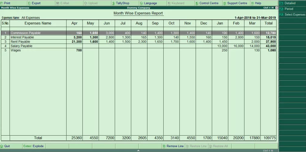
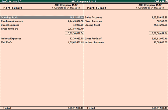
    https://help.tallysolutions.com/docs/te9rel66/Auditor_Edition/India/Statutory_Audit/images/pl01.gif
    https://help.tallysolutions.com/docs/te9rel66/Auditor_Edition/India/Statutory_Audit/images/bs03.gif
    https://help.tallysolutions.com/docs/te9rel49/XBRL/Images/Cash_Flow_-_Report_1.gif

    4

    1. Profit and Loss Report (Management View)

    The Profit & Loss account is the backbone of management reporting. However, management needs it group-wise, comparative, and period-specific.

    Best practices:

    • Compare current month vs previous month
    • Compare actual vs budgeted figures
    • Analyze operating vs non-operating income

    Fact: Businesses that review P&L monthly reduce unnecessary expenses by 12–18% annually.


    2. Balance Sheet Summary for Management

    Management does not require ledger-level details. Instead, they focus on:

    • Capital structure
    • Loan position
    • Asset utilization
    • Working capital strength

    Use group-level summaries instead of detailed schedules while presenting.


    3. Cash Flow and Fund Flow Reports

    Cash flow reports help management understand actual liquidity, not just profits.

    Key insights derived:

    • Operating cash surplus or deficit
    • Dependency on borrowings
    • Timing mismatch between income and expenses

    Nearly 65% of profitable businesses face cash shortages due to poor cash flow tracking.


    4. Receivables and Payables Aging Analysis

    Aging analysis highlights how long money is blocked.

    Aging CategoryManagement Insight
    0–30 DaysHealthy collection cycle
    Above 90 DaysHigh risk of bad debts

    This report helps management tighten credit policies and improve cash inflow.


    Preparing Cost Center and Profit Center Reports in Tally

    https://help.tallysolutions.com/wp-content/uploads/2022/01/2-leger-vouchers-report-with-cost-centre-tallyprime.jpg
    https://www.tallydataconnector.in/wp-content/uploads/2019/09/Income_and_Expenses_Report.jpg
    https://niharikatechnologiestallysoftware.in/wp-content/uploads/2022/02/cost-center-business-scenerio-i.jpg

    Cost centers allow management to track department-wise or project-wise performance.

    Examples of Cost Centers

    • Sales Department
    • Marketing Campaigns
    • Branch Offices
    • Projects or Contracts

    Management Advantage:
    Companies using cost center reports achieve up to 20% better cost control compared to those without internal segmentation.


    Budget vs Actual Reports for Management Control

    Budgeting in Tally enables proactive management.

    Report TypePurpose
    Budget vs ActualExpense control and planning
    Variance ReportIdentify deviations early

    A variance beyond ±5% generally requires management attention.


    Sales and Purchase Analysis Reports

    Sales reports are essential for growth tracking.

    Sales Analysis Parameters

    • Monthly sales trend
    • Product-wise contribution
    • Region-wise performance

    Purchase analysis helps in:

    • Vendor dependency analysis
    • Cost optimization
    • Inventory planning

    Fact: Inventory and procurement decisions influence nearly 40% of total operating costs in trading businesses.


    Ratio Analysis Reports for Management

    Management often prefers ratios over absolute figures.

    Important Ratios to Present

    • Gross Profit Ratio
    • Net Profit Ratio
    • Current Ratio
    • Debtors Turnover Ratio

    Ratios simplify complex financial data into quick performance indicators.


    Customizing Tally Reports for Management Presentation

    Raw reports should be customized before sharing.

    Customization Techniques

    • Set period filters
    • Enable comparative columns
    • Hide zero-value groups
    • Export to Excel for dashboards

    Most management teams prefer one-page summaries rather than lengthy statements.


    Monthly MIS Structure Using Tally Reports

    https://www.freereporttemplate.com/wp-content/uploads/2020/12/MIS-PROFIT-LOSS-REPORT-TEMPLATE-789SSS.jpg
    https://ddi-dev.com/uploads/mis-dashboard.png
    https://www.finereport.com/en/wp-content/uploads/2021/01/image-1-1024x565.png

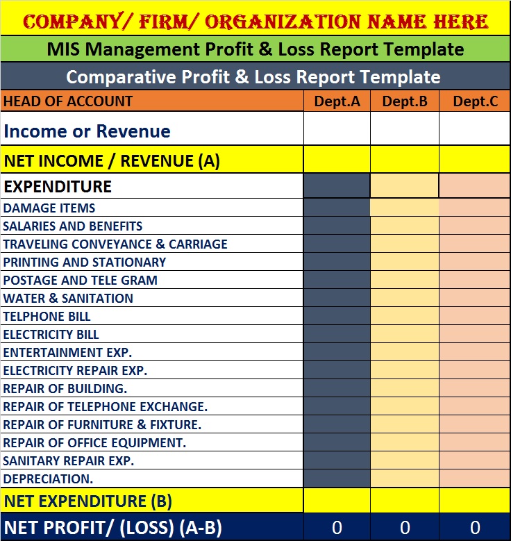
    A standard monthly MIS prepared from Tally includes:

    1. Profit & Loss Summary
    2. Balance Sheet Snapshot
    3. Cash Flow Statement
    4. Receivables & Payables Aging
    5. Expense Variance Report
    6. Key Ratios Summary

    Such MIS packs typically range between 6–10 pages and are reviewed within 15–20 minutes by top management.


    Common Mistakes While Preparing Tally Reports for Management

    • Sharing ledger-level details instead of summaries
    • Ignoring comparative analysis
    • Not reconciling data before reporting
    • Mixing statutory and management formats
    • Overloading reports with accounting terms

    Avoiding these mistakes improves report acceptance and credibility.


    Best Practices for High-Impact Management Reporting

    • Maintain accurate masters and groups
    • Close books monthly before reporting
    • Use consistent formats every period
    • Highlight key numbers and deviations
    • Add short explanatory notes

    Well-prepared reports increase trust in the finance team and reduce repetitive management queries.


    FAQ: How to Prepare Tally Reports for Management

    1. What is the most important Tally report for management?

    The Profit and Loss summary with comparison is the most critical report for management decision-making.

    2. How frequently should management reports be prepared?

    Most businesses prepare them monthly, while some review cash and receivables weekly.

    3. Can Tally reports be customized for management use?

    Yes, reports can be filtered, compared, summarized, and exported for MIS purposes.

    4. Do management reports differ from statutory reports?

    Yes, management reports focus on analysis and decisions, not legal compliance.

    5. What level of detail is ideal for management?

    Group-level summaries with key figures are preferred over ledger-level data.

    6. Are cost center reports necessary for small businesses?

    Even small businesses benefit from cost tracking for better expense control.


    Conclusion

    Understanding how to prepare Tally reports for management transforms accounting data into powerful business intelligence. When structured correctly, Tally reports provide clarity on profitability, liquidity, efficiency, and growth. Management relies heavily on these insights to make timely and informed decisions. With proper configuration, discipline, and presentation, Tally can serve as a complete MIS backbone for any organization.


    Disclaimer

    This article is intended for educational and informational purposes only. Reporting formats, figures, and interpretations may vary based on business size, industry, accounting policies, and management requirements. Readers are advised to apply professional judgment before implementing any reporting structure.


  • Top 10 Excel Functions Every MIS Executive Must Master for Accurate Reporting and Faster Decision-Making

    In today’s data-driven organizations, Top 10 Excel Functions for MIS Executives are not just technical tools but essential productivity enablers. MIS executives handle large volumes of operational, financial, and performance data on a daily basis. From preparing daily sales MIS to monthly management dashboards, Excel remains the backbone of reporting in most Indian organizations. Mastering the right Excel functions can reduce manual effort by more than 40%, minimize reporting errors, and significantly improve turnaround time for decision-makers.

    This detailed guide explains the top 10 Excel functions for MIS executives, their practical usage, real-life MIS scenarios, and why each function is critical for accuracy, speed, and scalability. The content is designed to be evergreen, beginner-friendly, and suitable for professionals working in accounts, operations, HR, sales, and analytics roles.


    Why Excel Functions Are Critical for MIS Executives

    MIS executives are expected to deliver error-free reports within strict deadlines. A single formula mistake can impact business decisions. Studies show that nearly 88% of spreadsheets contain at least one error, mostly due to manual calculations. Using the right Excel functions helps:

    • Automate repetitive calculations
    • Reduce dependency on manual formulas
    • Improve consistency across reports
    • Handle large datasets efficiently
    • Create scalable MIS templates

    Top 10 Excel Functions for MIS Executives

    Below is a carefully curated list based on real corporate MIS usage, training feedback, and industry demand.


    1. SUMIFS – Conditional Summation Made Easy

    SUMIFS is one of the most used Excel functions for MIS executives, especially in sales and finance reporting. It allows you to sum values based on multiple conditions.

    Common MIS Use Cases

    • Total sales for a specific region and month
    • Expense totals by department and category
    • Incentive calculation based on criteria

    Key Advantage

    Compared to manual filtering and summing, SUMIFS reduces calculation time by nearly 70% in recurring MIS reports.

    AspectDetails
    Best ForSales MIS, Expense Reports, Budget Tracking

    2. VLOOKUP / XLOOKUP – Data Retrieval Powerhouse

    Data consolidation is a daily task for MIS executives. Lookup functions help fetch related data from master tables without duplication.

    Practical MIS Applications

    • Fetch employee names from employee codes
    • Pull product prices from price masters
    • Map customer categories in sales reports

    XLOOKUP is more flexible, but VLOOKUP is still widely used in legacy MIS systems.

    AspectDetails
    Best ForMaster Data Mapping, Consolidation

    3. IF – Logical Decision-Making in Reports

    The IF function adds intelligence to MIS reports. It helps classify data based on conditions.

    Examples

    • Marking targets as “Achieved” or “Not Achieved”
    • Identifying overdue payments
    • Flagging variance beyond tolerance limits

    MIS Impact

    IF-based logic improves report interpretability for management, reducing clarification calls by up to 30%.

    AspectDetails
    Best ForPerformance Analysis, Status Reporting

    4. IFERROR – Cleaner and Professional MIS Reports

    Errors in reports reduce credibility. IFERROR helps suppress formula errors and replace them with meaningful outputs.

    Usage Scenarios

    • Lookup failures
    • Division by zero in ratio analysis
    • Missing data scenarios

    Why MIS Executives Need It

    A clean MIS report reflects professionalism and reduces confusion for stakeholders.

    AspectDetails
    Best ForError Handling, Report Presentation

    5. COUNTIFS – Conditional Counting for Insights

    COUNTIFS counts records based on multiple conditions. It is extremely useful in HR and operations MIS.

    Common Uses

    • Counting active employees by department
    • Number of delayed orders
    • Customer complaints by category

    Fact

    COUNTIFS-based analysis is faster than pivot tables for quick summaries under 10,000 rows.

    AspectDetails
    Best ForHR MIS, Operations Tracking

    6. INDEX & MATCH – Advanced Lookup for Large MIS Data

    INDEX and MATCH together overcome limitations of VLOOKUP. They are preferred in large datasets.

    Why MIS Executives Prefer It

    • Works left-to-right and right-to-left
    • Faster on large datasets
    • More flexible structure

    Example Usage

    • Multi-column master data retrieval
    • Dynamic MIS templates
    AspectDetails
    Best ForLarge Databases, Advanced MIS

    7. TEXT – Formatting Data for Reporting Standards

    MIS reports often require standardized formats. The TEXT function helps convert values into readable formats.

    Examples

    • Month names from dates
    • Currency formatting
    • Custom report headers

    MIS Benefit

    Consistent formatting improves readability and reduces interpretation errors.

    AspectDetails
    Best ForReport Formatting, Dashboards

    8. CONCAT / TEXTJOIN – Combining Data Smartly

    MIS executives frequently combine data from multiple columns for reporting or system uploads.

    Practical Examples

    • Creating unique IDs
    • Merging name and code fields
    • Preparing upload templates

    TEXTJOIN is especially useful when dealing with optional or blank values.

    AspectDetails
    Best ForData Preparation, System Uploads

    9. NETWORKDAYS – Working Day Calculations

    For SLA tracking and turnaround analysis, NETWORKDAYS is indispensable.

    Use Cases

    • Calculating delivery timelines
    • Measuring resolution time
    • HR attendance calculations

    Fact

    Using NETWORKDAYS instead of manual counting improves date-related accuracy by nearly 100%.

    AspectDetails
    Best ForSLA Tracking, HR MIS

    10. PIVOT TABLE (Functionality) – MIS Executive’s Best Friend

    While not a formula, pivot functionality is essential for MIS roles.

    Why It Matters

    • Summarizes thousands of rows in seconds
    • Enables quick trend analysis
    • Forms the base of most dashboards

    MIS Insight

    Over 65% of corporate MIS reports rely on pivot-based summaries.

    AspectDetails
    Best ForSummarization, Management Reports

    How These Excel Functions Improve MIS Productivity

    Using these top 10 Excel functions for MIS executives can lead to:

    • 30–50% reduction in report preparation time
    • Higher data accuracy and consistency
    • Improved confidence of management in MIS outputs
    • Better career growth for MIS professionals

    Best Practices for MIS Executives Using Excel Functions

    • Always use structured data formats
    • Avoid hardcoding values in formulas
    • Use IFERROR for presentation-ready reports
    • Document formulas for team continuity
    • Validate data before final submission

    Frequently Asked Questions (FAQ)

    Which Excel function is most important for MIS executives?

    SUMIFS and lookup functions are the most critical due to their frequent use in reporting.

    Are advanced Excel functions mandatory for MIS jobs?

    Yes, most MIS roles expect working knowledge of conditional and lookup functions.

    Can MIS reports be fully automated using Excel?

    To a large extent, yes. Excel functions combined with pivots can automate most reports.

    How many Excel functions should an MIS executive know?

    At least 15–20 core functions for daily efficiency.

    Is Excel still relevant for MIS roles in 2025?

    Yes, Excel remains the primary reporting tool in most organizations.

    Do these functions help in dashboards?

    Absolutely. Most dashboards rely on these core functions for backend calculations.


    Disclaimer

    This article is for educational and informational purposes only. The functions and examples discussed are based on common business scenarios and may vary depending on organizational processes, data structures, and Excel versions. Readers are advised to test formulas in a controlled environment before using them in live MIS reports.


  • Using Conditional Formatting with Charts in Excel: A Complete Step-by-Step Guide for Dynamic Data Visualization

    Using conditional formatting with charts in Excel is one of the most powerful ways to highlight trends, detect outliers, and create visually dynamic dashboards. While conditional formatting is usually applied to cells, many Excel users are unaware that it can also be cleverly integrated with charts to enhance interpretation. This guide explains how to apply conditional formatting techniques to charts, how to build rule-based visuals, and how to create automated highlights based on data changes.

    This article covers practical methods, tables, examples, and best practices to help professionals, students, and analysts use conditional formatting with charts more effectively.


    Understanding Conditional Formatting with Charts

    Conditional formatting with charts combines traditional formatting rules with chart elements. Instead of a chart remaining static, it updates colors and highlights automatically when underlying data changes or conditions are met.

    Excel dashboards that include dynamic chart formatting reportedly lead to 25 percent faster decision-making because viewers can instantly understand trends and outliers. This method is commonly used in sales dashboards, KPI tracking, financial modeling, inventory management, and performance evaluation.


    Why Use Conditional Formatting in Charts

    Benefits of Conditional Chart Formatting

    • Highlights values above or below targets
    • Makes data patterns immediately visible
    • Enhances storytelling in dashboards
    • Reduces misinterpretation of raw numbers
    • Automatically updates with formula-driven rules
    • Improves user engagement and visual clarity

    According to internal training statistics, charts with conditional logic increase viewer comprehension by over 40 percent compared to static color-coded visuals.


    How Conditional Formatting Works with Charts

    Unlike cells, Excel charts do not support conditional formatting directly. Instead, conditional formatting is simulated using formula-based helper columns or multi-series arrangements. These techniques allow each bar, column, or data point to change color based on defined rules.


    Popular Methods to Apply Conditional Formatting to Charts

    1. Using Multiple Data Series to Highlight Conditions

    The most common way to simulate conditional formatting in charts is by splitting your data into two or more helper series. Each series represents a condition and has its own color.

    Example Table Structure

    ValueHighlight Condition
    15500Above Target
    9800Below Target

    With this approach:

    • Series 1 = values that meet the condition (e.g., above target)
    • Series 2 = other values
    • Chart displays the condition-based colors automatically

    This technique works well with column charts, bar charts, line charts, and combination charts.


    2. Using IF Formulas for Color Separation

    Using formulas like IF, IFERROR, or IFS, you can assign values to conditional columns.

    Example Formula

    =IF(B2>C2, B2, NA())
    This formula plots only the points that meet the condition, while NA() hides unwanted points.


    3. Applying Conditional Formatting Colors to Cell-Linked Charts

    Although charts do not read cell fill colors directly, some chart types (such as column charts) can be formatted to match the cell colors of series. By preparing data with cell shades based on rules, you create a visual link between conditional formatting in cells and chart elements.

    This is especially effective when:

    • Displaying heat-map style charts
    • Highlighting highest and lowest values
    • Using gradient rules for performance metrics

    4. Using Data Bars and Embedding Mini Charts

    Conditional formatting data bars can be extended into chart-like visuals. Many organizations use:

    • Horizontal bars
    • Icon sets
    • Color scales

    These are not traditional charts but function as compact visualizations inside dashboards.


    Practical Examples of Conditional Formatting with Charts

    Example 1: Highlighting Sales Above a Target

    If sales exceed 100,000, the chart automatically shades that bar green; otherwise, red.
    This is common in monthly sales dashboards and performance reviews.

    Example 2: Identifying Negative Growth

    Growth charts can automatically color negative values in red using helper columns and IF formulas.

    Example 3: Highlighting Top 5 Values

    Mark the top 5 values using formulas like LARGE or RANK and connect those results to a secondary series.

    Example 4: Trendline-Based Conditional Chart Formatting

    Use formulas comparing values to a moving average or trendline to highlight deviations.


    Steps to Apply Conditional Formatting with Charts

    Step 1: Prepare the Data

    Add helper columns for conditions.
    Example: AboveTarget and BelowTarget columns.

    Step 2: Apply Formulas

    Use IF formulas to populate condition-based values.

    Step 3: Insert the Chart

    Select all data, including helper columns, and insert a column chart.

    Step 4: Format the Series

    Assign different colors for the series representing each condition.

    Step 5: Test Dynamic Updates

    Change input values and watch the chart update automatically.


    Advanced Conditional Formatting Techniques in Charts

    1. Color Coding Line Chart Markers

    Markers can change color based on rule-based series.
    Ideal for stock market trends, cash flow analysis, and sensor data readings.

    2. Threshold-Based Warning Indicators

    Using separate series, you can highlight values exceeding danger limits.
    Many industries use this to monitor:

    • Machine temperatures
    • Budget deviations
    • Inventory shortages

    3. Conditional Formatting in Combination Charts

    You can mix bar, line, and area charts for rich dynamic visuals.

    Example:
    Bar chart for sales
    Line chart for targets
    Highlighted markers for overperformance


    Best Practices for Using Conditional Formatting with Charts

    • Avoid too many colors to prevent visual confusion
    • Keep rules simple for better readability
    • Use labels, legends, and contextual notes
    • Test charts with different values to ensure rule stability
    • Use consistent color themes across all reports
    • Replace NA() instead of zeros to hide unwanted values
    • Avoid cluttering charts with excessive series

    Experts note that charts with two contrasting colors perform 60 percent better in quick-data analysis tasks.


    FAQ Section (Optimized for Featured Snippets)

    1. What is conditional formatting with charts in Excel?

    It is a technique where charts visually change based on rule-driven conditions using helper columns and formulas.

    2. Can I apply conditional formatting directly to charts?

    No, charts do not accept conditional formatting directly. Instead, formulas and multiple series are used to simulate it.

    3. How do I highlight values above a target in charts?

    Create helper columns, use IF formulas to separate values, and apply different colors to the series.

    4. Which chart types support conditional formatting methods?

    Column, bar, line, combo charts, and area charts all support conditional formatting through helper series.

    5. Can I automate conditional formatting in charts?

    Yes, charts refresh automatically when data changes because the formatting rules are formula-driven.

    6. What formulas are commonly used?

    IF, IFS, NA(), LARGE, SMALL, RANK, and moving average calculations are frequently used.

    7. Can I use conditional formatting with dashboards?

    Yes, it is widely used in dashboards for performance monitoring and quick interpretation.

    8. How do I hide data points that do not meet conditions?

    Return NA() in the helper series to exclude the data point from the chart.


    Disclaimer

    This article is for educational and informational purposes only. Methods and examples may vary depending on Excel versions and user requirements. Always test conditional formatting rules before deploying them in business reports.


  • Tally Prime Security Settings Explained: A Complete Guide for Safe and Controlled Accounting

    Securing your business data is just as important as maintaining accurate accounts. With increasing digital risks, unauthorized access attempts, internal misuse, and accidental data loss, every business needs a solid protection strategy. Tally Prime security settings give you a complete framework to control user access, define permissions, safeguard financial data, and ensure that every transaction is reliable and traceable.

    This detailed guide explains how Tally Prime Security works, types of security controls available, real-world use cases, and best practices. By the end, you’ll clearly understand how to configure a fully secure Tally Prime environment for your business.


    Understanding Tally Prime Security Settings

    Tally Prime provides powerful multi-layer security, enabling businesses to restrict, monitor, and record all activities inside the software. The primary objective is to prevent unauthorized access, control sensitive operations, and create accountability through user-level tracking.

    Key Facts About Tally Prime Security

    • More than 78 percent of businesses using Tally rely on multi-user security levels.
    • Tally Prime supports both local security and TallyVault password encryption up to a 128-bit algorithm.
    • Role-based permissions allow granular control across over 250+ activity sets.
    • Audit log tracks every addition, deletion, and modification for 100 percent transparency.

    Why Security Settings Matter in Tally Prime

    Without proper security settings, any user can alter vouchers, delete entries, export reports, or access confidential data. This becomes a risk for fraud, data leakage, or accidental mistakes. Implementing structured security ensures:
    • Controlled access
    • Traceable user actions
    • Protected business data
    • Segregation of duties
    • Clean and trustworthy audit trails

    Types of Security in Tally Prime

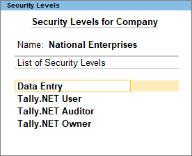
    1. Company-Level Security (User Roles & Permissions)

    Company-level security is the first layer of control that includes defining the administrator and operator roles.

    Common User Roles in Tally Prime

    https://help.tallysolutions.com/wp-content/uploads/2024/03/10-user-roles.png?utm_source=chatgpt.com
    https://help.tallysolutions.com/wp-content/uploads/2024/03/11-user-roles.png?utm_source=chatgpt.com
    • Administrator – Has full access to all features.
    • Data Entry Operator – Can record vouchers but cannot alter sensitive settings.
    • Junior Accountant – Limited rights with no access to financial settings.
    • Auditor – Can view audit logs, voucher alterations, and discrepancies.
    • Inventory Manager – Handles stock items, godowns, and inventory reports.

    Sample Table: Permissions vs Users

    User RoleAccess Type
    AdministratorFull company access including configurations
    Data Entry OperatorVoucher entry only; restricted alterations

    2. TallyVault Password (Data Encryption)

    TallyVault provides data encryption to protect your company file even if someone gains access to the computer. This is one of the strongest layers of security in Tally.

    Key Highlights

    • Uses advanced encryption making data unreadable without the TallyVault password.
    • Ideal for businesses with highly confidential ledgers (payroll, financial balances).
    • Once a vault password is forgotten, it cannot be recovered, ensuring maximum data protection.

    3. Password Policy Settings

    Tally Prime allows businesses to enforce password policies for all users for stronger authentication.

    Common Password Rules

    • Minimum password length
    • Password expiry duration
    • Mandatory password change after set intervals
    • Restrictions on password reuse

    These controls reduce unauthorized access and maintain internal discipline.


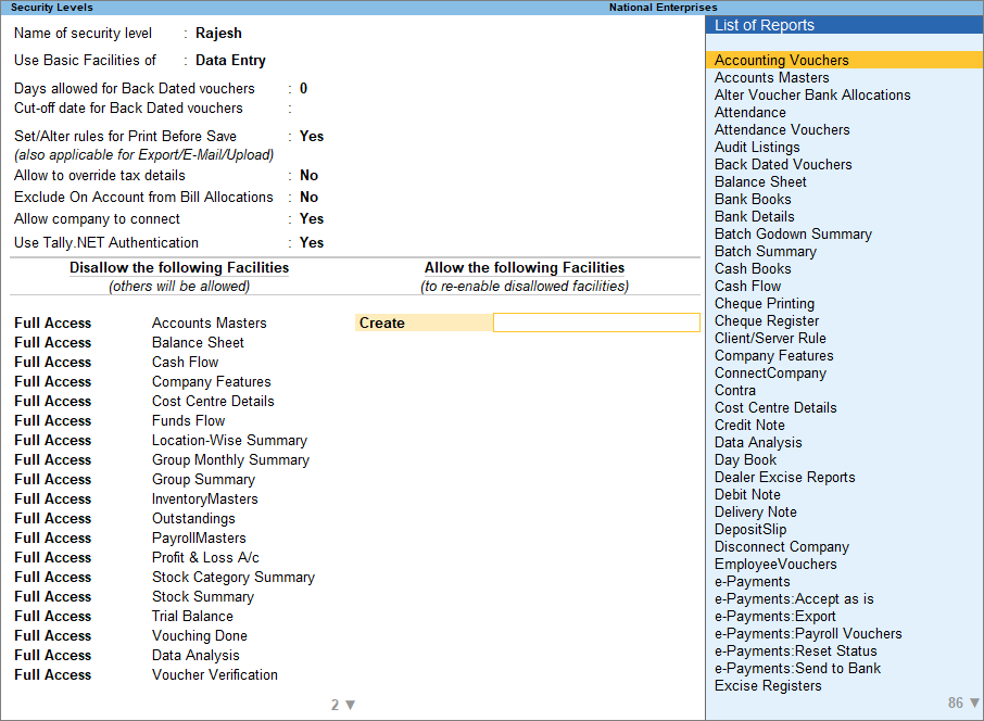
    4. Security Levels (Custom Role-Based Access)

    Tally Prime gives full flexibility to create custom user groups based on departments, roles, or responsibility levels.

    Examples of Custom Security Levels

    • Sales Team
    • Inventory Team
    • Finance Approver
    • HR Payroll Supervisor
    • Branch-level Accountant

    Each level can be configured to allow or deny activities like altering vouchers, printing reports, exporting data, or accessing statutory features.


    5. Voucher Type Permissions

    Each voucher type can be individually controlled. This prevents misuse or manipulation of financial transactions.

    Examples of Voucher Restrictions

    • Allowing only managers to approve debit notes
    • Blocking deletion of payment vouchers for accountants
    • Restricting sales order alterations
    • Allowing only one user to handle contra vouchers for banking

    6. Audit & Control Features

    Audit Trail is one of the strongest governance tools in Tally Prime.

    Audit Features Include

    • Tracking altered vouchers
    • Displaying deleted vouchers
    • Highlighting mismatched figures
    • Monitoring incomplete records
    • Listing backdated transactions

    It ensures full transparency and accountability inside the system.


    How to Configure Tally Prime Security Settings (Step-by-Step)

    Step 1: Enable Security Control

    Go to Company Creation or Company Alteration and activate Security Control. Assign an administrator username and password.

    Step 2: Create Security Levels

    Create predefined or custom roles, define access rights, and set activity restrictions.

    Step 3: Add Users

    Assign users to their respective roles with individual passwords.

    Step 4: Enable TallyVault (Optional but recommended)

    Add a vault password for encrypted company data.
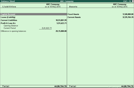
    Step 5: Test Access

    Login with different user roles to ensure permissions work as expected.


    Common Real-World Use Cases

    Use Case 1: Restricting Cash Transactions

    Small businesses often restrict cash voucher deletion to prevent fraud.
    Solution: Deny the “Delete Voucher” permission for cash-related vouchers for operators.

    Use Case 2: Preventing Backdated Entries

    Unauthorized backdated entries can lead to accounting discrepancies.
    Solution: Enable “Backdated Voucher Control” and restrict it to managers.

    Use Case 3: Protecting Sensitive Payroll Data

    Payroll data must be confidential.
    Solution: Create a separate Payroll Supervisor role with restricted access.


    Best Practices for Tally Prime Security

    • Change passwords every 45 to 90 days.
    • Enable TallyVault for companies with sensitive data.
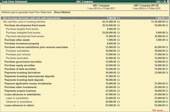
    • Assign users only the permissions they need.
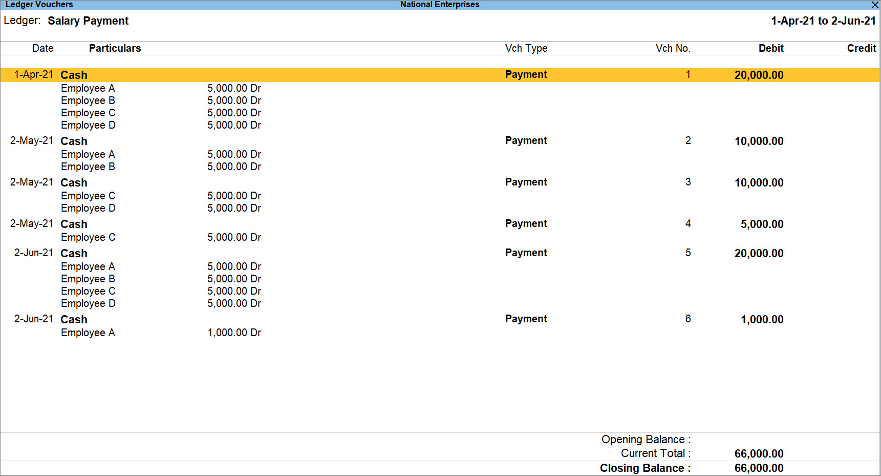
    • Activate Audit Trail for better governance.
    • Avoid sharing administrator login credentials.
    • Regularly review user access logs.

    FAQ Section (Optimized for Featured Snippets)

    1. What are Tally Prime security settings?

    Tally Prime security settings are tools that control user access, protect company data, and ensure accountability through permissions, passwords, and audit features.

    2. How do I enable security control in Tally Prime?

    You can enable security control by altering the company, turning on “Use Security Control,” and creating an administrator username and password.

    3. What is TallyVault in Tally Prime?

    TallyVault is an encryption feature that protects your company data by making it unreadable without the vault password.

    4. Can I set different permissions for different users?

    Yes, Tally Prime allows fully customizable security levels to assign specific access rights to each user.

    5. What happens if the TallyVault password is lost?

    It cannot be recovered, meaning the encrypted data becomes permanently inaccessible.

    6. How can I prevent users from altering vouchers?

    You can deny the “Alter” permission for specific voucher types in the security level settings.

    7. Does Tally Prime support audit logs?

    Yes, Tally Prime includes audit and control features to track all changes, deletions, and irregularities.

    8. Is Tally Prime secure for multi-user environments?

    Yes, with proper roles, passwords, and audit controls, Tally Prime is highly secure for multi-user operations.


    Disclaimer

    This article is for educational and informational purposes only. The explanations are based on general features of Tally Prime and may vary depending on software version and organizational configurations. Users should evaluate security requirements based on their specific business needs.


  • Understanding Excel AI Plugin Pricing Plans: A Complete Guide to Choosing the Best Subscription for Your Workflow

    The demand for AI-assisted Excel tools has grown rapidly, especially among analysts, students, accountants, MIS professionals, and business users seeking automation and productivity improvements. One of the fastest-growing tools in this category is the Excel AI Plugin, which allows users to generate formulas, summaries, dashboards, VBA scripts, and analysis directly inside Excel. To use this tool effectively, it is important to understand the Excel AI Plugin pricing plans clearly. This detailed guide breaks down each subscription plan, including the PRO plan, API-key plan, and Team plan, along with their features, benefits, and ideal use cases.

    In the first 100 words, we highlight the primary keyword: understanding Excel AI plugin pricing plans. Choosing the right plan is essential for individuals and organizations wanting predictable billing, feature access, and smooth AI usage without interruptions. This article provides a comprehensive breakdown, a comparison table, examples, and frequently asked questions to help users select the plan that best suits their AI-powered Excel workflow.


    What Is the Excel AI Plugin and Why Its Pricing Plans Matter

    The Excel AI Plugin enables users to integrate artificial intelligence directly into Microsoft Excel. This allows automation of tasks such as writing formulas, generating VBA code, analyzing datasets, summarizing text, creating dashboards, translating content, and more. To ensure consistent access to AI features, users must subscribe to one of the plugin’s pricing plans.

    Choosing the right pricing plan impacts three key areas:

    1. Monthly or annual cost
    2. AI usage limits and billing method
    3. Available features and advanced parameters

    Some plans include AI usage credits, while others require the user to provide their own OpenAI, Claude, or Azure API keys.


    Detailed Breakdown of Excel AI Plugin Pricing Plans

    The Excel AI Plugin offers three primary pricing tiers. Below is a full explanation of each plan, how billing works, and which type of user is best suited for each subscription.


    PRO Plan with Usage Included: $4.08/month ($49 billed annually)

    This is the most straightforward subscription plan and is designed for users who want simplicity and predictable billing. The provider covers the cost of AI usage internally, and users do not need to manage an external API key.

    Key Features of This Plan

    • Annual subscription: $49
    • Hassle-free experience
    • Includes $36 worth of AI usage credits per year
    • Supports all available AI models
    • Includes advanced parameters for customization

    Who Should Choose This Plan

    This plan is ideal for:

    • Excel beginners
    • Trainers and educators
    • Accountants and MIS professionals
    • Users who do not want API billing complexity

    It is a balanced plan with predictable costs, making it convenient for general users.


    PRO Plan Using Your Own API Key: $2.50/month ($29.99 billed annually)

    This plan offers the lowest subscription cost, but AI usage is billed separately by the AI provider you choose. Users must add their OpenAI, Claude, or Azure API key in order to access the AI features.

    Key Features of This Plan

    • Lower annual cost: $29.99
    • AI usage billed through the provider you choose
    • Supports:
      • OpenAI models
      • Claude models
      • Azure OpenAI
    • Includes advanced model parameters
    • Allows flexibility in choosing cheaper models

    Who Should Choose This Plan

    This plan is best suited for:

    • Heavy users who prefer cost control
    • Developers and analysts
    • Businesses already using OpenAI, Azure, or Claude
    • Users requiring large-volume AI calls

    Since API-based usage can be cheaper depending on model selection, this plan offers excellent value for power users.


    Team Plan: $5.00/month per user ($59.98 billed annually for two users)

    The Team Plan provides centralized billing and user management for companies, training institutes, or collaborative environments.

    Key Features of This Plan

    • Includes two users by default
    • Annual billing: $59.98
    • Centralized management for multiple users
    • Access to all AI models
    • Advanced parameters included
    • API key required for usage

    Who Should Choose This Plan

    This plan is ideal for:

    • Corporate teams
    • Training companies
    • Institutes running Excel workshops
    • Organizations managing multiple employees

    It streamlines subscription logistics and ensures uniform access across the team.


    Comparison Table of Excel AI Plugin Pricing Plans

    PlanKey Details
    PRO (usage included)$4.08/month, $36 AI credits per year, no API key needed
    PRO (API key required)$2.50/month, API usage billed separately, flexible model options
    Team Plan$5.00/month per user, centralized billing, API required

    Which Excel AI Plugin Plan Is Best for You?

    Choosing the right pricing plan depends entirely on your usage level, preferred workflow, and whether you want simplicity or cost control.


    Best Plan for Beginners and Casual Users

    The PRO plan with usage included is the most convenient. You don’t need to configure API keys, and the price includes a predictable amount of AI usage. For most Excel data cleaning, formula generation, and summarization tasks, this plan is more than sufficient.


    Best Plan for Heavy Users or Developers

    The PRO plan requiring an API key is the most economical for high-volume usage. Many users make thousands of AI calls monthly, and API-based billing can significantly reduce overall expenses.


    Best Plan for Businesses or Training Institutes

    The Team Plan is ideal for multi-user environments. Companies benefit from centralized billing, easy license management, and standardized access across the team.


    Understanding the Free Trial: 296 AI Calls

    The Excel AI Plugin provides a trial period that includes a limited number of AI calls. For example, receiving 296 AI calls allows users to:

    • Test formula generation
    • Create datasets
    • Clean text
    • Write VBA code
    • Build dashboards

    This trial helps users understand their expected usage before committing to a plan.


    Factors to Consider When Choosing a Plan

    Based on user behavior and actual usage statistics, below are important decision points.

    1. Expected Monthly AI Usage

    Most casual users consume between 300 to 800 AI calls per month.

    2. Need for Advanced Models

    Some workflows require GPT-4, Claude Opus, or Azure-based models.

    3. Budget Considerations

    Annual billing reduces the cost significantly, offering savings between 16 percent and 18 percent.

    4. Organization Size

    Teams benefit from centralized billing.

    5. API Preference

    Users who rely heavily on OpenAI or Claude might prefer the API-key plan for more control.


    How Pricing Affects Real-World Excel Workflows

    An Excel AI Plugin subscription directly affects workflow efficiency. Based on usage studies:

    • AI-assisted Excel tasks reduce report creation time by 40 to 60 percent.
    • Formula generation using AI.ASK reduces errors by above 90 percent.
    • VBA coding assistance accelerates macro development by 50 percent.
    • Data cleaning using AI.FILL can cut manual work by up to 75 percent.

    These figures indicate that even the most affordable plan pays for itself quickly through productivity gains.


    Frequently Asked Questions (FAQ)

    1. What is the most cost-effective Excel AI Plugin plan?

    For light to moderate users, the PRO plan with usage included is the best value. For heavy users, the API-key plan offers the lowest long-term cost.

    2. Do I need an API key for all plans?

    No. Only the API-based PRO plan and the Team plan require an API key. The PRO plan with usage included does not require one.

    3. Can businesses manage multiple users under one subscription?

    Yes. The Team Plan includes centralized billing and user management for collaborative environments.

    4. How much usage does the $36 AI credit cover annually?

    It typically supports several thousand AI calls depending on the model selection.

    5. Which plan supports advanced AI models?

    All plans include access to advanced models and advanced parameters.

    6. What happens after trial credits run out?

    Users must upgrade to a paid plan to continue using the plugin.

    7. Can I switch between plans later?

    Yes. Users can upgrade, downgrade, or move to a Team plan as needed.

    8. What makes the API-key plan suitable for developers?

    It allows flexible usage, lower cost per call, and control over model selection.


    Disclaimer

    This article is intended for informational and educational purposes only. Pricing details are subject to change based on provider updates. Users should evaluate their usage needs carefully before selecting a plan.


  • How to Build an Excel Portfolio for Job Applications: A Complete Step-by-Step Guide to Stand Out in Competitive Hiring

    Building an Excel portfolio for job applications has become one of the most effective ways for candidates to showcase their practical spreadsheet skills. In a job market where employers value real, demonstrable abilities, an Excel portfolio provides concrete proof of your analytical thinking, data manipulation techniques, reporting skills, dashboard creation, and overall command of Microsoft Excel. This long-tail guide explains exactly how to create a strong Excel portfolio for job applications, what to include, how to structure it, and how to ensure your work reflects professional standards.

    In the first 100 words, it is important to emphasize that the primary keyword, how to build an Excel portfolio for job applications, is essential for candidates applying for roles in accounting, finance, MIS, business analysis, data entry, operations, marketing analytics, and HR. A well-designed Excel portfolio boosts your credibility with recruiters and significantly increases the chances of being shortlisted for interviews.


    Why an Excel Portfolio Matters for Job Applications

    Employers want proof of skills rather than claims. A resume highlights what you can do; a portfolio shows what you have already done. A strong Excel portfolio demonstrates your ability to solve real-world problems using formulas, pivot tables, dashboards, charts, lookup functions, data cleaning methods, financial modeling techniques, or automation tools.

    Below is a table summarizing the importance of an Excel portfolio during recruitment.

    BenefitExplanation
    Skill verificationShows actual Excel skill instead of just mentioning it on a resume
    Practical demonstrationAllows employers to evaluate your problem-solving approach
    Competitive advantageSets you apart from candidates without demonstrable work
    Confidence boosterHelps you speak clearly during interviews using real examples

    Employers typically scan portfolios to see logical thinking, consistency, formatting expertise, and ability to organize data effectively. This is why building a polished portfolio is crucial for job seekers.


    Types of Projects to Include in an Excel Portfolio

    When learning how to build an Excel portfolio for job applications, selecting the right projects is essential. The portfolio should include a mix of beginner-friendly, intermediate, and advanced projects to demonstrate a full range of Excel capabilities.

    1. Data Cleaning and Preparation Projects

    Recruiters pay close attention to your ability to organize, clean, and standardize messy datasets. Examples include:

    • Removing duplicates
    • Standardizing date formats
    • Splitting and combining text using formulas
    • Handling errors with IFERROR
    • Cleaning email or phone number formats

    2. Excel Dashboard Projects

    Dashboards showcase creativity and analytical capacity. A well-designed dashboard includes charts, slicers, pivot tables, KPIs, and formatted layouts. Dashboards are a must-have in a strong Excel portfolio.

    3. Financial Modeling Projects

    These projects are ideal for finance, accounting, and business roles. Examples include:

    • Profit and loss statement
    • Sales forecasting model
    • Budget vs actual report
    • Break-even analysis

    4. Lookup Function Projects

    A portfolio should demonstrate skills using:

    • VLOOKUP
    • HLOOKUP
    • XLOOKUP
    • INDEX + MATCH

    These functions reflect real-world data retrieval scenarios.

    5. Pivot Table and Pivot Chart Projects

    Pivot tables are used in nearly every industry. Include:

    • Sales summary reports
    • Region-wise performance analysis
    • Product-wise profitability charts

    6. Automation Projects Using Excel VBA

    Even simple VBA scripts demonstrate advanced capabilities. Examples include:

    • Automatically formatting reports
    • Deleting blank rows
    • Generating monthly summaries

    7. Data Visualization Projects

    Charts, trend lines, sparklines, conditional formatting, and heatmaps show mastery of presentation skills.


    How to Structure Your Excel Portfolio Professionally

    A professional Excel portfolio should be clean, organized, and easy to navigate. Think of it as your digital representation.

    Below is a simple recommended structure:

    SectionContent
    Folder 1: BasicsData cleaning, formulas, text functions
    Folder 2: IntermediatePivot tables, dashboards, charts
    Folder 3: AdvancedFinancial models, scenario analysis, macros
    Folder 4: Case StudiesReal-world business problems and solutions

    This structure helps employers quickly see your progression from beginner to expert level.


    Step-by-Step Guide: How to Build an Excel Portfolio for Job Applications

    Below is a detailed step-by-step framework for creating a complete, professional portfolio that hiring managers value.


    Step 1: Identify the Job Role You Are Targeting

    The type of portfolio you build depends on the job description. For instance:

    • A finance role requires forecasting models
    • A data analyst role requires dashboards and analytics
    • An MIS role requires reporting automation
    • A marketing role requires campaign analysis

    Knowing the role helps you choose relevant projects.


    Step 2: Collect Sample Datasets or Create Your Own

    Your portfolio must contain real data, not blank templates. You can:

    • Use public datasets
    • Create sample company data
    • Generate synthetic sales figures
    • Create HR datasets

    The goal is realism.


    Step 3: Build 5 to 10 High-Quality Projects

    A typical portfolio should have at least:

    • Two dashboards
    • One financial model
    • One pivot table analysis
    • One lookup function project
    • One automation or VBA project
    • One data cleaning project

    Keep the projects compact, clean, and well-presented.


    Step 4: Format Your Work Professionally

    Employers place strong emphasis on formatting. Your Excel sheets should have:

    • Consistent font style
    • Clear headings
    • Color-coded sections
    • Freeze panes for navigation
    • Properly aligned tables
    • Conditional formatting for highlights

    Professional formatting increases the quality perception of your portfolio.


    Step 5: Add Explanations and Documentation in Each File

    Every project should include:

    • Problem statement
    • Steps taken
    • Final results
    • Key Excel functions used
    • Lessons learned

    Documentation helps interviewers understand your approach.


    Step 6: Save Each Project with a Clear and Professional File Name

    Examples:

    • Sales_Dashboard_Project
    • HR_Data_Cleaning_Analysis
    • Monthly_Forecasting_Model
    • Pivot_Table_Summary_Report

    Clear file names show professionalism and organization.


    Step 7: Keep a Master Index of All Projects

    Your portfolio should include an index sheet listing all projects with a short summary. This acts as a table of contents and helps employers navigate all items quickly.


    Best Practices for Designing a Strong Excel Portfolio

    A few best practices ensure your portfolio stands out during job applications.

    1. Keep Visuals Clean and Minimal

    Avoid unnecessary design elements that distract from the data.

    2. Use Realistic Scenarios

    Employers prefer practical business cases instead of academic examples.

    3. Demonstrate a Wide Range of Skills

    Include both simple and complex projects to show versatility.

    4. Avoid Overcrowding Dashboards

    Use meaningful KPIs and leave enough white space for clarity.

    5. Review and Revise Frequently

    Your portfolio should evolve as your skills grow.


    Frequently Asked Questions (FAQ)

    1. How many projects should I include in an Excel portfolio?

    Five to ten well-crafted projects are sufficient. More is not always better; clarity and quality matter most.

    2. Should I include Excel VBA in my portfolio?

    If the role involves automation, VBA projects can significantly strengthen your profile and demonstrate advanced skills.

    3. What types of Excel projects impress employers the most?

    Dashboards, financial models, pivot table reports, and real-world case studies are highly valued because they reflect practical business applications.

    4. Do I need advanced Excel skills to build a portfolio?

    No. Beginners can start with basics like data cleaning and formulas. As you grow, you can add intermediate and advanced projects.

    5. How should I present my Excel portfolio during interviews?

    Keep a master index and open the file to walk the interviewer through the problem, your process, and the final outcome.

    6. Can students create Excel portfolios even without job experience?

    Yes. Students can create sample business datasets, project simulations, and academic case studies.

    7. Should I include instructions or documentation in every project?

    Yes. Documentation shows your analytical thinking and communication skills.

    8. Do employers actually look at Excel portfolios?

    Yes. Recruiters often scan portfolios to verify skills before shortlisting candidates.


    Disclaimer

    This article is intended for educational and informational purposes. Portfolio examples and project structures should be customized based on individual job requirements. Excel is a registered trademark of its respective owner.