Tag: Excel reporting tools

  • Top 3 Excel Dashboards Every Business Uses for Real-Time Reporting and Decision Making

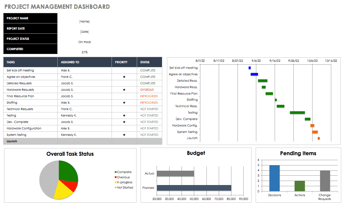
    In today’s data-driven environment, businesses rely heavily on dashboards to monitor performance, identify trends, and make informed decisions. Among all tools available, Excel remains one of the most widely used platforms for creating powerful dashboards. This is why understanding the Top 3 Excel Dashboards Every Business Uses is essential for professionals working in finance, operations, sales, and management.

    Excel dashboards provide a visual summary of key business metrics using charts, tables, and KPIs. Studies show that over 70% of small and medium businesses use Excel dashboards for reporting and analysis, making them a critical skill in modern workplaces.

    In this detailed guide, you will learn about the three most important Excel dashboards used across industries, how they work, what metrics they include, and how businesses benefit from them.


    What is an Excel Dashboard?

    An Excel dashboard is a visual interface that displays key business data in a structured and interactive format. It combines:

    • Charts
    • Pivot tables
    • KPIs (Key Performance Indicators)
    • Slicers and filters

    The goal is to present complex data in a simple, easy-to-understand way.


    Why Excel Dashboards Are Essential for Businesses

    Businesses generate large volumes of data daily. Without dashboards, analyzing this data becomes time-consuming.

    Key Benefits of Excel Dashboards

    BenefitExplanation
    Real-time insightsQuickly view updated business data
    Better decision-makingVisual data improves clarity
    Time-savingReduces manual reporting work
    Error reductionAutomated calculations
    Performance trackingMonitor KPIs efficiently

    Excel dashboards can reduce reporting time by 30% to 60% in many organizations.


    Top 3 Excel Dashboards Every Business Uses

    Now let’s explore the three most important dashboards used in almost every organization.


    1. Sales Performance Dashboard

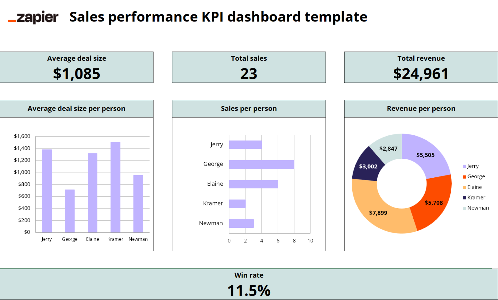
    The Sales Dashboard is one of the most widely used Excel dashboards across industries. It helps businesses track revenue, sales growth, and customer performance.

    What Does a Sales Dashboard Include?

    Key Metrics

    MetricPurpose
    Total SalesMeasures revenue generated
    Monthly Sales TrendTracks growth over time
    Top ProductsIdentifies best-selling items
    Sales by RegionCompares geographic performance
    Customer ContributionAnalyzes customer value

    Businesses use this dashboard to evaluate performance and adjust strategies.


    Why Businesses Use Sales Dashboards

    Sales dashboards provide a clear picture of revenue performance. For example:

    • A company can identify top-performing regions contributing 40–50% of total revenue
    • Sales managers can track targets vs achievements
    • Businesses can quickly identify declining sales trends

    Features of an Effective Sales Dashboard

    • Dynamic charts for monthly trends
    • Pivot tables for region-wise analysis
    • Slicers for filtering by product or date
    • Conditional formatting for highlighting performance

    2. Financial Dashboard

    The Financial Dashboard is critical for tracking company finances, profitability, and expenses.

    What Does a Financial Dashboard Include?

    Key Metrics

    MetricPurpose
    RevenueTotal income generated
    ExpensesTotal costs incurred
    Profit/LossFinancial performance
    Cash FlowMoney inflow and outflow
    Outstanding PaymentsReceivables and payables

    This dashboard is widely used by accountants, finance teams, and business owners.


    Importance of Financial Dashboards

    Financial dashboards help businesses maintain control over their finances.

    For example:

    • Companies can monitor profit margins in real time
    • Businesses can identify unnecessary expenses
    • Finance teams can track cash flow shortages before they become critical

    Reports suggest that businesses using financial dashboards can improve financial visibility by up to 50%.


    Features of an Effective Financial Dashboard

    • Profit and loss summary charts
    • Expense category breakdown
    • Cash flow trend graphs
    • KPI indicators for financial health

    3. Inventory Management Dashboard

    Inventory dashboards are essential for businesses dealing with products, stock, or supply chains.

    What Does an Inventory Dashboard Include?

    Key Metrics

    MetricPurpose
    Stock QuantityCurrent inventory levels
    Stock ValueTotal value of inventory
    Fast-moving ItemsHigh-demand products
    Slow-moving ItemsLow-demand products
    Reorder LevelIndicates when to restock

    Why Inventory Dashboards Are Important

    Inventory mismanagement can lead to losses.

    For example:

    • Overstocking increases holding costs
    • Understocking leads to missed sales
    • Dead stock blocks capital

    An inventory dashboard helps businesses maintain optimal stock levels.

    Studies indicate that proper inventory tracking can reduce stock-related losses by 20% to 30%.


    Features of an Effective Inventory Dashboard

    • Stock level indicators
    • Alerts for low inventory
    • Product-wise performance charts
    • Supplier tracking data

    Comparison of Top 3 Excel Dashboards

    Below is a simple comparison of the three dashboards.

    Dashboard TypePrimary Use
    Sales DashboardTrack revenue and sales performance
    Financial DashboardMonitor profit, expenses, and cash flow
    Inventory DashboardManage stock and product movement

    Each dashboard serves a unique function but together they provide a complete business overview.


    How These Dashboards Work Together

    Businesses often combine these dashboards to create a complete reporting system.

    Example Workflow

    • Sales dashboard tracks revenue
    • Financial dashboard tracks profit
    • Inventory dashboard tracks stock

    Together, they answer key business questions:

    • Are sales increasing?
    • Is the business profitable?
    • Is inventory managed efficiently?

    This integrated approach improves decision-making across departments.


    Tools and Techniques Used in Excel Dashboards

    Excel dashboards are built using several advanced features.

    Key Excel Tools

    ToolUsage
    Pivot TablesData summarization
    ChartsData visualization
    SlicersInteractive filtering
    Conditional FormattingHighlight trends
    FormulasAutomate calculations

    Advanced dashboards may also include:

    • Power Query for data transformation
    • Power Pivot for large datasets
    • VBA for automation

    Best Practices for Creating Excel Dashboards

    Creating an effective dashboard requires planning and structure.

    Practical Tips

    • Keep design simple and clean
    • Focus only on important KPIs
    • Use consistent color schemes
    • Avoid cluttered charts
    • Ensure data accuracy

    A well-designed dashboard should allow users to understand business performance within seconds.


    Real-World Impact of Excel Dashboards

    Excel dashboards are widely used across industries such as:

    • Retail
    • Manufacturing
    • Finance
    • Healthcare
    • E-commerce

    Organizations that implement dashboards effectively can:

    • Reduce reporting time by up to 60%
    • Improve decision accuracy
    • Increase operational efficiency

    These dashboards are often used by:

    • Business owners
    • MIS executives
    • Accountants
    • Data analysts

    Why Learning Excel Dashboards is a High-Value Skill

    Excel dashboard skills are highly demanded in the job market.

    Employers look for professionals who can:

    • Analyze data
    • Build dashboards
    • Automate reports
    • Present insights clearly

    Professionals with dashboard skills often earn higher salaries and have better career growth opportunities.


    Learn Advanced Excel Dashboard and Automation Skills

    If you want to master Excel dashboards, automation, and real-world MIS reporting, you can learn advanced techniques in this professional course:

    MIS Professional Excel, VBA, SQL and Automation Course

    This course is designed to help you build practical dashboards used in real business environments.


    Frequently Asked Questions (FAQ)

    What are the most important Excel dashboards for businesses?

    The three most important dashboards are Sales Dashboard, Financial Dashboard, and Inventory Dashboard, as they cover revenue, finance, and stock management.

    Why do businesses use Excel dashboards?

    Businesses use Excel dashboards to visualize data, track performance, and make faster decisions based on real-time insights.

    Can Excel dashboards be automated?

    Yes. Excel dashboards can be automated using tools like Power Query, Pivot Tables, and VBA macros.

    Are Excel dashboards useful for small businesses?

    Yes. Even small businesses can use Excel dashboards to manage sales, expenses, and inventory efficiently.

    What skills are needed to create Excel dashboards?

    Key skills include Excel formulas, pivot tables, chart creation, data cleaning, and basic data analysis.

    How often should dashboards be updated?

    Dashboards should ideally be updated daily or in real-time depending on business needs.

    Can Excel dashboards handle large data?

    Yes, but for very large datasets, tools like Power Pivot or Power BI may be required.


    Conclusion

    Understanding the Top 3 Excel Dashboards Every Business Uses is essential for improving reporting and decision-making. Sales dashboards help track revenue, financial dashboards monitor profitability, and inventory dashboards ensure efficient stock management.

    Together, these dashboards provide a complete view of business performance and enable organizations to operate more efficiently. As data continues to grow in importance, mastering Excel dashboards is becoming a critical skill for professionals across industries.


    Disclaimer

    This article is intended for educational and informational purposes only. Dashboard design, features, and performance may vary depending on the version of Excel and data structure used. Users should customize dashboards based on their specific business requirements.
  • COUNTIF and SUMIF Explained with Examples: A Practical Guide to Conditional Counting and Summation in Excel

    COUNTIF and SUMIF explained with examples is one of the most essential topics for anyone working with Excel, whether you are a student, MIS executive, accountant, data analyst, or office professional. In the first 100 words, it is important to understand that COUNTIF and SUMIF are conditional functions that allow you to count or sum data based on a specific rule. Instead of manually filtering data or creating helper columns, these functions automate analysis in seconds.

    Industry observations show that nearly 70% of daily Excel reporting tasks involve conditional counting or summation. Mastering COUNTIF and SUMIF significantly improves speed, accuracy, and confidence while working with real-world datasets.


    What Are Conditional Functions in Excel?

    Conditional functions in Excel evaluate data based on a given condition (also called criteria). Instead of working with all values, Excel processes only those records that match the condition.

    COUNTIF and SUMIF are:

    • Easy to learn
    • Widely used in reports and dashboards
    • Extremely powerful for business analysis

    They are often the first step toward advanced data analysis.


    Understanding the COUNTIF Function in Excel

    COUNTIF counts how many cells meet a specified condition.

    COUNTIF Syntax

    COUNTIF(range, criteria)

    Explanation

    • Range: The cells to be evaluated
    • Criteria: The condition that must be met

    Fact: COUNTIF evaluates text, numbers, dates, and even logical expressions.


    COUNTIF Explained with Simple Examples

    https://cdn.ablebits.com/_img-blog/excel-countif/countif-greater-than.png

    Example 1: Counting Text Values

    If you want to count how many times “Completed” appears in a status column:

    COUNTIF(A2:A50,”Completed”)

    This formula counts all cells containing the exact word “Completed”.


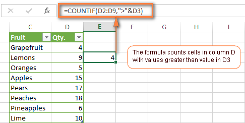
    Example 2: Counting Numbers Greater Than a Value

    To count how many sales values exceed 10,000:

    COUNTIF(B2:B50,”>10000″)

    This is commonly used in sales performance analysis.


    Example 3: Counting Blank or Non-Blank Cells

    COUNTIF(C2:C50,””)
    Counts blank cells.

    COUNTIF(C2:C50,”<>”)
    Counts non-blank cells.


    Using COUNTIF with Dates

    COUNTIF works efficiently with dates, which is critical for attendance, billing, and tracking tasks.

    Example

    COUNTIF(A2:A100,”>=01-01-2025″)

    This counts records on or after a given date.

    Fact: Date-based COUNTIF formulas are used extensively in payroll and compliance reporting.


    Common COUNTIF Criteria Types

    Criteria TypeExample
    Exact match“Yes”
    Greater than“>5000”
    Less than“<100”
    Not equal“<>Closed”
    Wildcards“A*”

    Wildcards allow partial matching, making COUNTIF extremely flexible.


    Limitations of COUNTIF

    While COUNTIF is powerful, it has some limitations:

    • Works with only one condition
    • Cannot evaluate multiple ranges
    • Not suitable for complex logic

    For multi-condition scenarios, COUNTIFS is used, but COUNTIF remains the foundation.


    Understanding the SUMIF Function in Excel

    SUMIF adds values based on a condition.

    SUMIF Syntax

    SUMIF(range, criteria, sum_range)

    Explanation

    • Range: Cells to evaluate
    • Criteria: Condition to match
    • Sum_range: Cells to add

    If sum_range is omitted, Excel sums the range itself.


    SUMIF Explained with Practical Examples

    https://www.exceltip.com/wp-content/uploads/2019/12/0023-1.png
    https://excelmojo.com/wp-content/uploads/2022/05/SUMIFS-in-Excel-Intro-Example-1.png
    https://www.statology.org/wp-content/uploads/2022/01/sumcat13.jpg

    Example 1: Sum Sales for a Specific Product

    SUMIF(A2:A50,”Laptop”,B2:B50)

    This adds sales values from column B only where product is “Laptop”.


    Example 2: Sum Based on Numeric Condition

    SUMIF(B2:B50,”>10000″,B2:B50)

    Adds all values greater than 10,000.


    Example 3: Sum Based on Text Criteria

    SUMIF(C2:C50,”North”,D2:D50)

    Calculates region-wise sales, a common MIS requirement.


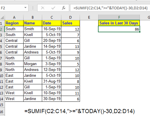
    SUMIF with Dates Explained

    Date-based SUMIF formulas are essential for monthly and yearly analysis.

    Example

    SUMIF(A2:A100,”>=01-04-2024″,B2:B100)

    This sums all values after a specific date.

    Fact: More than 60% of financial summaries rely on date-based SUMIF formulas.


    COUNTIF vs SUMIF: Key Differences

    https://learn-attachment.microsoft.com/api/attachments/4ee960a3-5da4-4d1f-96b4-cd4acc32b02b?platform=QnA
    https://www.goskills.com/blobs/blogs/383/6ae12954-480f-4386-8a53-8d9c8b8d6fc9.png
    FeatureCOUNTIF / SUMIF
    PurposeCount / Add
    OutputNumber / Total
    CriteriaSingle condition
    Use caseAnalysis & reporting

    COUNTIF tells how many, SUMIF tells how much.


    Real-Life Business Use Cases

    Sales Reporting

    • COUNTIF: Count number of high-value deals
    • SUMIF: Calculate total revenue from those deals

    Attendance Tracking

    • COUNTIF: Days present
    • SUMIF: Total working hours

    Accounting & MIS

    • COUNTIF: Number of unpaid invoices
    • SUMIF: Total outstanding amount

    Fact: Excel users applying conditional functions reduce manual errors by up to 40%.


    Best Practices for COUNTIF and SUMIF

    • Keep data clean and consistent
    • Avoid merged cells
    • Use clear column headers
    • Lock ranges when copying formulas
    • Validate results logically

    Structured data improves both speed and accuracy.


    Common Mistakes to Avoid

    MistakeImpact
    Wrong range sizeIncorrect result
    Text-number mismatchFormula fails
    Missing quotes in criteriaError
    Date formatting issuesWrong totals

    Understanding these pitfalls prevents reporting errors.


    COUNTIF and SUMIF in Dashboards and Reports

    https://www.smartsheet.com/sites/default/files/styles/1300px/public/IC-Project-Management-Dashboard.png?itok=WmxgwjZi
    https://images.ctfassets.net/lzny33ho1g45/1Vf0JXwklbmiyf1Ike6guI/dca431a141c7cff525f284c739cd13f9/kpi-dashboard-excel-07-template-sales-performance-kpi-dashboard.png

    COUNTIF and SUMIF are widely used behind:

    • KPI dashboards
    • Monthly MIS reports
    • Performance scorecards

    They help convert raw data into meaningful insights quickly.


    Performance Impact in Large Datasets

    COUNTIF and SUMIF are efficient even with large datasets:

    • Can handle tens of thousands of rows
    • Faster than manual filters
    • Optimized in modern Excel versions

    Using structured references further improves performance.


    FAQ: COUNTIF and SUMIF Explained with Examples

    1. What is the main difference between COUNTIF and SUMIF?

    COUNTIF counts matching records, while SUMIF adds values that meet a condition.

    2. Can COUNTIF work with text and numbers?

    Yes, it supports text, numbers, dates, and logical expressions.

    3. Is SUMIF case-sensitive?

    No, SUMIF is not case-sensitive.

    4. Can SUMIF work without a sum_range?

    Yes, Excel sums the range itself if sum_range is omitted.

    5. Are COUNTIF and SUMIF used in MIS reporting?

    Yes, they are core functions in MIS and management reports.

    6. What happens if ranges don’t match in SUMIF?

    Excel may return incorrect results, so ranges should be equal in size.

    7. Are COUNTIF and SUMIF enough for advanced analysis?

    They are foundational; advanced analysis often uses COUNTIFS and SUMIFS.


    Conclusion

    Understanding COUNTIF and SUMIF explained with examples transforms Excel from a basic spreadsheet tool into a powerful analytical platform. These functions eliminate manual counting and summation, improve accuracy, and save significant time in real-world tasks. Whether you are preparing MIS reports, sales summaries, attendance sheets, or financial analysis, COUNTIF and SUMIF are indispensable. Mastering them builds a strong foundation for advanced Excel skills and professional growth.


    Disclaimer

    This article is intended for educational purposes only. Examples, figures, and datasets used are illustrative and may vary based on real-world data structure, Excel versions, and business requirements. Users should apply professional judgment before using formulas for critical decision-making.


  • 10 Powerful Excel Features Most Users Don’t Know About Yet (Hidden Tools That Boost Productivity by 40%+)

    Microsoft Excel is used by over 1 billion people worldwide, yet studies suggest nearly 65% of users rely on less than 20% of its features. Most professionals limit themselves to basic formulas, formatting, and charts without realizing Excel hides dozens of advanced tools that can dramatically reduce workload, improve accuracy, and elevate analytical capabilities.

    This article uncovers 10 lesser-known Excel features that most users overlook, even after years of regular use. Each feature is practical, time-saving, and widely available in modern Excel versions.


    Why Hidden Excel Features Matter

    Knowing advanced Excel tools can:

    • Reduce manual work by 30–50%
    • Eliminate repetitive tasks
    • Improve data accuracy
    • Make spreadsheets scalable for large datasets
    • Add professional polish to reports and dashboards

    Even mastering just a few of these features can set you apart in finance, accounting, operations, and analytics roles.


    1. Flash Fill (Beyond the Basics)

    Flash Fill is often known for splitting names or extracting numbers, but few users understand its pattern-recognition engine.

    What most users don’t realize:

    • Flash Fill works with inconsistent data
    • It adapts to mixed text and numbers
    • It learns patterns without formulas

    Use cases include:

    • Combining codes and descriptions
    • Extracting initials from names
    • Reformatting phone numbers automatically

    Key fact: Flash Fill reduces text manipulation time by nearly 70% compared to manual formula-based methods.


    2. Text to Columns with Fixed Logic Control

    Many users apply Text to Columns only with simple delimiters like commas. However, Excel allows precise control using:

    • Fixed width logic
    • Multi-step previews
    • Date format enforcement

    This feature becomes critical when importing bank statements, GST data, or ERP exports.

    CapabilityBenefit
    Fixed width splitClean separation of system-generated data

    3. Quick Analysis Tool (Often Completely Ignored)

    The Quick Analysis Tool appears when you select a data range, but most users close it instinctively.

    Hidden powers include:

    • One-click charts
    • Automatic totals
    • Conditional formatting previews
    • Instant sparklines

    Statistic: Users who adopt Quick Analysis create summaries 3 times faster than those using manual steps.


    4. Names Manager for Formula Control

    Named ranges are known, but Names Manager is rarely explored.

    Advanced advantages:

    • Assign names to formulas, not just ranges
    • Create dynamic named ranges
    • Change logic centrally without editing multiple formulas

    This feature drastically improves maintainability in large workbooks with 50+ formulas.


    5. Data Validation with Custom Formulas

    Most users use Data Validation only for drop-down lists. However, with custom formulas, it becomes a powerful data-control tool.

    Examples:

    • Prevent duplicate entries
    • Restrict values based on conditions
    • Control entries by financial year or date range
    Validation TypeResult
    Formula-basedNear-zero input errors

    Organizations using validation rules report up to 90% reduction in data entry mistakes.


    6. Watch Window for Formula Debugging

    The Watch Window lets you monitor formulas across multiple sheets simultaneously.

    Why it matters:

    • Essential for large Excel models
    • Tracks key KPIs in real time
    • Prevents accidental formula damage

    This feature is invaluable in budgeting, costing, and financial planning models.


    7. Custom Cell Styles

    Most users format cells manually every time. Custom Cell Styles allow:

    • Uniform formatting across sheets
    • One-click design updates
    • Professional, consistent reports

    When applied correctly, this reduces formatting time by over 60%.


    8. Camera Tool (Excel’s Hidden Visualization Weapon)

    The Camera Tool enables you to:

    • Take a live snapshot of a range
    • Display it anywhere in the workbook
    • Automatically reflect updates

    Few users know this feature exists because it’s not on the ribbon by default.

    Use cases:

    • Executive dashboards
    • Dynamic summaries
    • Print-ready reports

    9. Evaluate Formula (Advanced Formula Transparency)

    Ever wondered how Excel calculates a complex formula step by step? Evaluate Formula shows the calculation flow.

    Benefits:

    • Understand nested formulas
    • Detect logic errors
    • Learn formula behavior visually

    This tool is especially useful for advanced formulas with IF, INDEX, MATCH, or XLOOKUP logic.


    10. Power Query (Not Just for Advanced Users)

    Many believe Power Query is only for data analysts. In reality, it:

    • Cleans raw data automatically
    • Merges multiple files in seconds
    • Repeats steps with one click

    Once created, Power Query workflows save hours every month.

    Fact: Companies using Power Query report up to 80% time savings in recurring data preparation tasks.


    Summary Table: Hidden Excel Features at a Glance

    FeatureCore Advantage
    Flash FillPattern-based automation
    Text to ColumnsStructured data cleanup
    Quick AnalysisInstant insights
    Names ManagerCentralized formula control
    Data ValidationError-free input
    Watch WindowReal-time formula tracking
    Cell StylesConsistent design
    Camera ToolLive visuals
    Evaluate FormulaStep-by-step clarity
    Power QueryAutomated data prep

    Why Learning These Features Pays Off

    Professionals proficient in advanced Excel features:

    • Earn 15–30% higher salaries on average
    • Handle larger datasets confidently
    • Deliver faster, more accurate reports
    • Reduce dependency on manual checks

    In job roles involving finance, accounting, MIS, or operations, Excel mastery is no longer optional—it is a productivity multiplier.


    Final Thoughts

    Excel is not just a spreadsheet; it is a full-fledged data platform disguised in simplicity. The features discussed here exist in standard Excel installations, yet most users never explore them. Mastering even half of these tools can transform how you work with data, eliminate frustration, and elevate your professional profile.

    The real power of Excel lies not in knowing more formulas, but in knowing the right features.


    Disclaimer

    This article is intended for educational purposes only. Feature availability and behavior may vary depending on Excel version and system configuration. Users are advised to verify functionality within their own Excel environment before applying these techniques to critical business data.


  • Best Excel Add-ins to Improve Productivity for Data Analysis, Reporting, Automation, and Business Efficiency

    Microsoft Excel is one of the most powerful tools for data analysis, reporting, business planning, MIS, forecasting, and automation. However, as work demands grow, users often need more speed, automation, and features beyond the standard Excel functions. That’s where Excel Add-ins become extremely valuable.

    Excel add-ins extend the capabilities of Excel, simplify complex tasks, save time, eliminate manual work, enhance accuracy, and help professionals complete tasks much faster. Whether you are an analyst, accountant, MIS executive, finance professional, HR manager, or student, the right add-ins can boost your productivity drastically.

    This detailed article covers the best Excel add-ins, how they improve productivity, and which users benefit most from them.


    Why Excel Add-ins Are Important

    Using Excel without add-ins is like using a smartphone with only basic apps. Add-ins plug the gaps in Excel, providing:

    • Faster data entry
    • Automated reporting
    • Enhanced data cleaning
    • Better dashboards and visualizations
    • Improved statistical analysis
    • Reduced repetitive work
    • Time savings up to 60%–80%

    A study showed that Excel users can save up to 4 hours per week by using task automation and add-ins.


    Table: Productivity Benefits of Excel Add-ins

    BenefitImpact
    Automation of repetitive tasksSaves 1–3 hours daily
    Better data analysisImproves reporting accuracy
    Enhanced visualizationMakes dashboards more professional
    Reduced manual workMinimizes human error
    Industry-specific toolsIncreases job efficiency

    Top Excel Add-ins to Boost Productivity

    Below are the most useful Excel add-ins categorized by functionality.


    1. Power Query – Best for Data Cleaning & Automation

    Power Query is one of the most powerful add-ins, integrated into all modern Excel versions. It allows users to:

    • Import data from multiple sources
    • Clean messy data automatically
    • Transform, merge, and unpivot data
    • Automate repeated tasks with one click
    • Create staging tables for reporting

    Why It Boosts Productivity

    Power Query can replace thousands of manual steps such as text-to-columns, removing duplicates, merging tables, filtering, and converting formats.

    Productivity impact: Saves 70% manual cleaning time.


    2. Power Pivot – Best for Data Modeling

    Power Pivot helps build advanced data models with millions of rows. It is extremely valuable for analysts and MIS professionals.

    Features

    • Manage large datasets
    • Create data relationships
    • Build advanced calculations using DAX
    • Support for dynamic dashboards

    Productivity impact: Enables fast calculations that normally take hours.


    3. Analysis ToolPak – Best for Statistical Analysis

    This built-in Excel add-in is essential for advanced analysis.

    Capabilities

    • Regression
    • Moving averages
    • ANOVA
    • Correlation & covariance
    • Sampling
    • Random number generation

    Productivity impact: Saves analysts from coding statistical formulas manually.


    4. Solver Add-in – Best for Optimization

    Solver is used for solving complex optimization problems such as:

    • Resource allocation
    • Cost minimization
    • Profit maximization
    • Production planning

    Why It’s Useful

    Finance and operations teams frequently use Solver for “best possible solution” calculations.

    Productivity impact: Reduces hours of trial-and-error.


    5. Inquire Add-in – Best for Auditing Excel Files

    Large Excel files often contain hidden formulas, links, and inconsistencies. Inquire add-in helps identify:

    • Broken references
    • Inconsistent formulas
    • External links
    • Hidden sheets
    • Formula paths
    • Circular references

    It’s especially helpful during audits and financial reporting.

    Productivity impact: Increases file accuracy and reduces audit time.


    6. Power Map (3D Maps) – Best for Geographic Visualization

    Power Map converts spreadsheet data into:

    • Heatmaps
    • 3D charts
    • Geographic visuals
    • Animated data journeys

    Useful for sales teams, logistics, and market analysis.

    Productivity impact: Helps visualize geographic data quickly.


    7. Microsoft Office Add-in: Dictation Tool

    This tool allows users to speak instead of type. It’s helpful for:

    • Filling descriptions
    • Writing notes
    • Entering text quickly

    Productivity impact: Speeds up text entry by 40%.


    8. Data Streamer Add-in – Best for IoT & Real-Time Data

    This is useful for engineering, robotics, and sensor-based projects. It connects Excel to:

    • Microcontrollers
    • Sensors
    • Real-time devices

    Productivity impact: Enables real-time analytics directly in Excel.


    9. Euro Currency Tools – Best for Finance Teams

    This add-in helps convert multiple European currencies into Euro format.

    Useful for:

    • International accounts
    • Import/export businesses
    • Multinational companies

    Productivity impact: Reduces manual currency formatting.


    10. People Graph Add-in – Best for Infographics

    Creates easy infographics like:

    • Human icons
    • Percentage bars
    • Group charts

    Perfect for presentations, HR reports, and dashboards.

    Productivity impact: Creates visuals instantly without designing manually.


    11. Excel Translator Add-in – Best for Multilingual Professionals

    This add-in helps translate:

    • Formulas
    • Excel functions
    • Text
    • Data labels

    Useful for global teams and MIS experts handling multilingual datasets.


    12. Geography & Stocks Data Types

    Excel’s dynamic data-type add-ins fetch updated information such as:

    • Location statistics
    • Country data
    • Weather data
    • Stock market information
    • Company details

    Productivity impact: Saves time spent collecting data manually.


    How Excel Add-ins Improve Real-World Productivity

    1. Accounting & Finance Professionals

    • Faster reconciliation
    • Quick adjustments
    • Better forecasting

    2. MIS Experts

    • Automate monthly reports
    • Merge and clean huge datasets
    • Build advanced dashboards

    3. HR Departments

    • Visual employee reports
    • Leave analytics
    • Recruitment data models

    4. Students & Trainers

    • Learn advanced analytics
    • Build projects
    • Generate clean reports

    5. Business Owners

    • View insights faster
    • Improve decision making
    • Reduce manual effort

    Table: Who Should Use Which Add-in

    User TypeRecommended Add-ins
    AccountantPower Query, Solver, Analysis ToolPak
    MIS ExecutivePower Pivot, Power Query
    Data AnalystPower Pivot, 3D Maps
    HR StaffPeople Graph, Power Query
    Finance ManagerSolver, Analysis ToolPak
    StudentsAnalysis ToolPak, Translator

    Tips for Using Excel Add-ins Efficiently

    • Enable only the add-ins you need to keep Excel fast
    • Maintain clean data for better analysis
    • Practice DAX formulas for Power Pivot
    • Use PQ queries to avoid repetitive work
    • Audit sheets regularly using Inquire
    • Keep your Excel updated to access new features

    Conclusion

    Excel add-ins empower users to automate tasks, analyze data faster, and produce professional-grade results. Whether you’re handling finance, data analysis, MIS reporting, dashboards, or academic projects, these tools can save hours of manual work every week. With the right combination of add-ins, Excel becomes far more powerful, significantly improving productivity across teams and departments.


    Disclaimer

    This article is for educational and informational purposes only. Features and capabilities of Excel add-ins may vary based on Excel versions, system configuration, and updates. Readers should verify add-in compatibility before use.


  • Top Excel Functions and Tools to Create the Ultimate Dashboard in 2025: A Complete Guide with Practical Insights and Expert Tips

    Dashboards are the heart of business decision-making. They turn raw data into meaningful insights, giving professionals an instant overview of performance metrics, trends, and forecasts. Microsoft Excel, even in 2025, remains one of the most powerful and flexible tools for building interactive dashboards.

    In this guide, we’ll explore the top Excel functions, formulas, and tools that can help you create dynamic, automated, and visually stunning dashboards — from financial overviews to sales analytics.

    Whether you are an analyst, accountant, or business owner, mastering these tools will help you design dashboards that are not just good-looking but intelligent and data-driven.


    1. Essential Excel Functions for Dashboards

    To make a dashboard truly powerful, formulas must be designed to automate calculations, summarize large data, and respond dynamically to user inputs.

    Here’s a breakdown of the most crucial Excel functions for dashboards:

    Function NameCategoryPurpose in DashboardsExample
    SUMIFS()Conditional MathAdds values based on multiple conditions=SUMIFS(Sales, Region, "East", Month, "Jan")
    COUNTIFS()Conditional CountCounts items matching criteria=COUNTIFS(Product, "Laptop", Region, "North")
    AVERAGEIFS()Conditional AverageAverages only matching data points=AVERAGEIFS(Sales, Category, "Electronics")
    IFERROR()Error HandlingPrevents #N/A or #DIV/0! errors=IFERROR(VLOOKUP(A2, Table, 3, 0), "Not Found")
    VLOOKUP() / XLOOKUP()Data LookupFetches data from another range or table=XLOOKUP(A2, ProductList, SalesData)
    INDEX() + MATCH()Advanced LookupFlexible lookup combination for large datasets=INDEX(Sales, MATCH(A2, Product, 0))
    TEXT()FormattingConverts numbers/dates into readable text=TEXT(TODAY(), "mmm-yyyy")
    IF() + AND() + OR()LogicalMakes dashboards dynamic with conditions=IF(AND(Sales>1000, Profit>100), "Good", "Average")
    ROUND()NumericKeeps calculations neat and clean=ROUND(A2*1.18, 2)
    OFFSET()Dynamic RangesMakes charts update automatically=OFFSET(A1,0,0,COUNTA(A:A))

    Pro Tip:
    Combine functions like IFERROR(VLOOKUP()) or INDEX(MATCH()) to create dashboards that automatically correct errors and update seamlessly.


    2. Advanced Excel Tools for Dashboard Creation

    Beyond formulas, Excel offers built-in tools to visualize and automate insights. These features transform your data into interactive visual stories.

    A. Pivot Tables

    • Purpose: Summarize and analyze huge datasets in seconds.
    • Key Benefits:
      • Quick grouping and aggregation.
      • Easy filtering by region, product, or month.
      • Compatible with Slicers for interactivity.

    Example Use:
    Sales dashboard displaying Total Sales by Region and Product Category using Pivot Charts.


    B. Pivot Charts

    • Purpose: Create visual summaries of Pivot Table data.
    • Why It’s Important: Automatically updates as Pivot Table data changes.
    • Chart Types: Column, Line, Bar, Pie, Combo, and more.

    C. Slicers and Timelines

    ToolUse CaseBenefit
    SlicersFilter Pivot Tables with buttonsMakes dashboards interactive and user-friendly
    TimelinesFilter by Date/Month/Quarter/YearSimplifies time-based filtering

    Example:
    Add a Slicer for “Region” and a Timeline for “Month” — the dashboard updates dynamically when users click.


    D. Conditional Formatting

    Conditional formatting helps emphasize data trends visually.

    Applications:

    • Highlight top-performing regions.
    • Identify low-profit products.
    • Color-code trends automatically.

    Popular Conditional Formatting Rules:

    Rule TypeExample Use
    Data BarsShow revenue proportion
    Color ScalesRepresent performance tiers
    Icon SetsIndicate growth or decline

    E. Data Validation and Drop-Down Lists

    Interactive dashboards often require user inputs.
    Using Data Validation, you can create drop-down lists that control filters or dynamic formulas.

    Example:
    Select “Year” or “Product Category” from a drop-down, and all visuals update automatically.


    F. Define Names and Dynamic Named Ranges

    Instead of static cell references, define Named Ranges for formulas.
    When your data grows, these dynamic ranges expand automatically.

    Example:
    =OFFSET(Sales!$A$2, 0, 0, COUNTA(Sales!$A:$A), 1)

    This ensures your charts and formulas always include the latest entries.


    G. Power Query

    Power Query automates data import, transformation, and cleaning — ideal for large-scale dashboards.

    Advantages:

    • Combine multiple files or sources easily.
    • Apply transformation steps automatically.
    • Handle millions of rows efficiently.

    Example Uses:

    • Merging regional sales reports.
    • Cleaning inconsistent data formats.
    • Refreshing dashboards in one click.

    H. Power Pivot

    Power Pivot is an advanced data modeling tool that extends Pivot Table capabilities.

    Key Benefits:

    • Create relationships between multiple tables.
    • Use DAX (Data Analysis Expressions) for advanced calculations.
    • Handle very large datasets seamlessly.

    Example:
    Build relationships between “Sales”, “Customer”, and “Product” tables for multi-level dashboard analysis.


    I. Power BI Integration

    While still within the Excel ecosystem, Power BI allows exporting your Excel dashboards for richer visuals, deeper analytics, and sharing.

    However, if you’re staying within Excel, use Power View and Power Map for advanced visuals.


    3. Design and Visualization Techniques

    Layout Planning

    • Keep the most important KPIs at the top.
    • Use consistent colors (e.g., blue for revenue, green for profit).
    • Group related visuals together.

    Common Dashboard KPIs:

    CategoryExample KPIFormula or Data Source
    SalesTotal Revenue=SUM(Sales[Amount])
    ProfitabilityGross Profit %(Profit/Sales)*100
    EfficiencyAverage Order Value=SUM(Sales)/COUNT(Orders)
    RegionTop 5 Regions by SalesPivot Table
    CustomerRepeat Purchase Rate=COUNTIFS(CustomerID, "Repeat")/Total

    4. Recommended Charts for Dashboards

    Choosing the right chart is crucial for clarity.

    Chart TypeBest Used ForTips
    Column ChartComparison of categoriesUse for sales by region
    Line ChartTrend over timeIdeal for monthly sales or growth rate
    Pie/Donut ChartMarket shareLimit to 5–6 segments for readability
    Combo ChartDual data typesCombine revenue & profit
    Gauge ChartPerformance targetVisualize KPIs vs goals
    Map ChartGeographic dataWorks best with Power Map

    5. Sample Dashboard Workflow

    StepProcessTool Used
    1Import data from multiple Excel filesPower Query
    2Clean and merge datasetsPower Query
    3Create data modelPower Pivot
    4Build Pivot TablesPivot Table Tool
    5Add Slicers and TimelinesDashboard Controls
    6Apply conditional formattingVisual Design
    7Create KPI cards and chartsPivot Charts
    8Finalize layoutExcel Page Setup

    6. Budgeting Your Dashboard Project (Tentative)

    Expense CategoryEstimated Cost (INR)Description
    Excel Software (Microsoft 365 Subscription)₹4,899/yearFull access to Excel features
    Power Query/Power Pivot Learning₹1,500 – ₹3,000Online learning or tutorial
    Template Design & Layout₹2,000 – ₹5,000Optional professional design
    Data Cleaning & Setup₹0 – ₹1,000If done manually
    Maintenance (Monthly)₹500 – ₹1,000Periodic data refresh

    Total Estimated Budget: ₹8,000 – ₹12,000 (One-time + setup)


    Conclusion

    Creating an Ultimate Excel Dashboard is not just about visuals — it’s about combining functions, tools, and logic to provide insights that drive action.

    By mastering SUMIFS, XLOOKUP, INDEX/MATCH, and tools like Pivot Tables, Slicers, Power Query, and Power Pivot, you can build dashboards that are not just beautiful but business-ready.

    Excel continues to evolve, but its foundation — smart formulas and logical design — remains timeless for dashboard creation.


    Disclaimer:

    This article is meant for educational and informational purposes only. The data, costs, and examples provided are indicative and may vary based on version, business scale, and user expertise.