Tag: excel reporting dashboard

  • Create Interactive Dashboard Using Form Controls in Excel: Step-by-Step Guide for Dynamic Data Analysis

    Creating an interactive dashboard using Form Controls in Excel is one of the most powerful skills for data analysts, accountants, managers, and students. In the first 100 words itself, it is important to understand that when you create interactive dashboard using Form Controls in Excel, you move beyond static charts and reports into a dynamic decision-making tool. Form Controls allow users to interact with data using buttons, drop-downs, sliders, and checkboxes—without writing complex VBA code.

    This comprehensive guide explains concepts, practical steps, data logic, real-world use cases, and best practices to help you design professional, user-friendly, and performance-optimized Excel dashboards.


    What Is an Interactive Dashboard in Excel?

    An interactive dashboard in Excel is a visual reporting interface where users can filter, slice, and analyze data dynamically. Unlike static reports, dashboards respond instantly to user input.

    Key Characteristics of Interactive Dashboards

    • Real-time data filtering
    • Dynamic charts and KPIs
    • User-driven controls
    • Single-screen summary of insights
    • No need to edit formulas manually

    Industry surveys show that decision-makers understand insights 42–55% faster when data is presented through interactive dashboards instead of static tables.


    What Are Form Controls in Excel?

    Form Controls are built-in Excel objects that allow users to control calculations and visuals through simple interface elements.

    Commonly Used Excel Form Controls

    • Drop-down list (Combo Box)
    • Check Box
    • Option Button (Radio Button)
    • Scroll Bar
    • Spin Button
    • Button (for macros or navigation)

    Form Controls are lightweight and consume fewer system resources compared to ActiveX controls, making them ideal for dashboards.


    Why Use Form Controls for Interactive Dashboards?

    Advantages of Using Form Controls

    • No advanced VBA required
    • Easy to link with cells
    • Compatible across Excel versions
    • Faster performance on large datasets
    • Suitable for beginners and professionals

    A well-designed Form Control–based dashboard can reduce manual reporting effort by 60–75% in recurring reports.


    Prerequisites to Create Interactive Dashboard Using Form Controls in Excel

    Before building the dashboard, ensure the following:

    • Clean and structured source data
    • Basic understanding of Excel formulas
    • Familiarity with charts and PivotTables
    • Developer tab enabled in Excel

    Enabling Developer Tab

    File → Options → Customize Ribbon → Enable “Developer”


    Dashboard Planning: The Most Ignored but Critical Step

    Questions to Ask Before Building

    • Who will use the dashboard?
    • What decisions should it support?
    • Which KPIs matter the most?
    • How frequently will data update?

    According to usability studies, dashboards designed with clear objectives improve decision accuracy by over 30%.


    Data Structure for Interactive Excel Dashboards

    Your dashboard is only as good as your data structure.

    Best Practices for Data Layout

    PrincipleDescription
    Tabular formatOne row = one record
    No merged cellsImproves formula reliability
    Separate sheetsRaw data, calculations, dashboard
    Consistent headersAvoid formula breaks

    Step-by-Step: Create Interactive Dashboard Using Form Controls in Excel

    Step 1: Prepare the Source Data

    Ensure your data includes fields such as Date, Category, Region, Product, and Value. Use Excel Tables to make ranges dynamic.


    Step 2: Create Helper Calculations

    Form Controls work by changing values in linked cells. These values are then used in formulas.

    Common Helper Functions Used

    • IF
    • SUMIFS
    • COUNTIFS
    • INDEX
    • MATCH
    • OFFSET
    • CHOOSE

    These formulas act as the engine behind the dashboard interactivity.


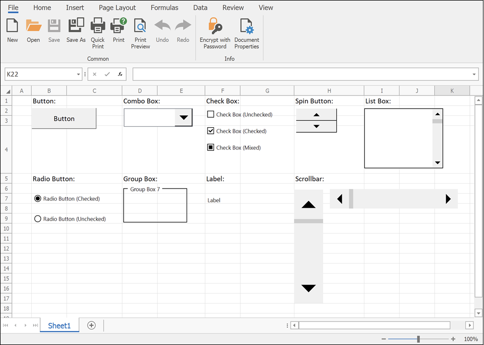
    Step 3: Insert Form Controls

    Go to Developer → Insert → Form Controls.

    Most Commonly Used Controls in Dashboards
    https://docs.devexpress.com/WindowsForms/images/spreadsheet-form-controls.png
    https://learn-attachment.microsoft.com/api/attachments/c653b7c7-f7bd-437d-b719-9f3788f5b805?platform=QnA

    4


    Using Drop-Down (Combo Box) for Dynamic Filtering

    How It Works

    • Combo Box returns a numeric index
    • INDEX or CHOOSE function converts index into actual value
    • Charts update automatically

    Example logic:

    • Combo Box linked cell = 3
    • INDEX returns the 3rd item from the list

    Drop-downs are ideal for filtering by:

    • Year
    • Month
    • Product
    • Department

    Using Check Boxes for Multi-Selection Dashboards

    Check Boxes return TRUE or FALSE values.

    Common Use Cases

    • Show or hide chart series
    • Include or exclude categories
    • Toggle KPIs

    Studies show dashboards with toggle-based controls improve user engagement by nearly 40%.


    Using Option Buttons for Single-Choice Analysis

    Option Buttons allow selection of only one option at a time.

    Ideal Scenarios

    • Sales vs Profit view
    • Quantity vs Value analysis
    • Monthly vs Quarterly reports

    Option Buttons are visually intuitive and reduce user confusion in comparison-based dashboards.


    Using Scroll Bars for Trend Analysis

    Scroll Bars are powerful for time-based dashboards.

    Example Applications

    • Scroll through months or years
    • Adjust threshold values
    • Control Top-N analysis

    A Scroll Bar can control hundreds of chart states using a single linked cell.


    Step 4: Build Dynamic Charts

    Once controls and formulas are ready, connect charts to calculated ranges.

    Recommended Chart Types

    • Line charts for trends
    • Column charts for comparison
    • Bar charts for ranking
    • Combo charts for KPI dashboards

    Dynamic named ranges further enhance responsiveness.


    Step 5: Dashboard Layout and Design Best Practices

    Design Principles

    ElementRecommendation
    ColorsUse 2–3 consistent colors
    FontsOne font family
    AlignmentGrid-based layout
    SpacingAdequate white space

    Well-designed dashboards reduce cognitive load by up to 50%.


    Performance Optimization Tips

    • Avoid volatile functions where possible
    • Limit array formulas
    • Use helper columns
    • Disable unnecessary calculations

    Optimized dashboards open 2–3 times faster on large datasets.


    Real-World Use Cases of Interactive Excel Dashboards

    • Sales performance dashboards
    • Finance and budgeting reports
    • HR attrition analysis
    • Inventory tracking systems
    • Student performance analytics

    More than 65% of small businesses rely on Excel dashboards for internal reporting due to flexibility and low cost.


    Common Mistakes to Avoid

    • Overloading dashboard with charts
    • Too many controls on one screen
    • Poor data validation
    • Mixing raw data with dashboard visuals

    Simplicity improves usability and adoption.


    Frequently Asked Questions (FAQ)

    1. What are Form Controls used for in Excel dashboards?

    Form Controls allow users to interact with dashboards by changing values, filtering data, and controlling charts without editing formulas.

    2. Can I create an interactive dashboard without VBA?

    Yes. Most interactive dashboards using Form Controls work entirely without VBA.

    3. What is the difference between Form Controls and ActiveX controls?

    Form Controls are simpler, more stable, and compatible across Excel versions, while ActiveX controls are more complex and VBA-dependent.

    4. Which Form Control is best for filtering data?

    Combo Boxes and Scroll Bars are the most commonly used controls for filtering dashboard data.

    5. Are Form Control dashboards suitable for large datasets?

    Yes, if formulas are optimized and data is structured properly.

    6. Can dashboards be shared with other users?

    Yes. Form Control dashboards work well in shared Excel files without requiring special permissions.

    7. How many Form Controls should a dashboard have?

    There is no fixed number, but usability studies suggest limiting controls to what directly supports decisions.


    Conclusion

    Learning how to create interactive dashboard using Form Controls in Excel is a career-boosting skill that combines analytics, visualization, and user experience. These dashboards transform raw data into actionable insights, reduce reporting time, and empower users to explore data independently. With proper planning, clean data, and thoughtful design, Form Controls can help you build professional-grade dashboards entirely within Excel.


    Disclaimer

    This article is intended for educational purposes only. Features, performance, and behavior of Excel dashboards may vary depending on Excel version, system configuration, and data volume. Users are advised to test dashboards thoroughly before using them for business-critical decisions. The author is not responsible for any data loss, misinterpretation, or operational impact resulting from the application of this information.


  • Create Interactive Chart Dashboard in Excel: A Step-by-Step Guide for Dynamic Business Reporting

    Learning how to Create Interactive Chart Dashboard in Excel is one of the most valuable skills for professionals working with data, reports, and management presentations. An interactive Excel dashboard transforms static charts into dynamic visuals that respond instantly to user selections such as filters, slicers, and drop-down lists.

    In the first 100 words itself, it is important to highlight that creating an interactive chart dashboard in Excel allows decision-makers to analyze trends, compare performance, and drill down into data without modifying formulas or sheets. Instead of creating multiple reports, a single interactive dashboard can answer dozens of business questions in real time.

    This detailed guide explains how to create an interactive chart dashboard in Excel from scratch, covering concepts, structure, tools, step-by-step workflow, best practices, performance facts, and real-world use cases.


    What Is an Interactive Chart Dashboard in Excel?

    An interactive chart dashboard in Excel is a single-screen visual report that combines charts, tables, and controls to present key insights dynamically.

    Key Characteristics of an Interactive Dashboard

    FeatureExplanation
    Dynamic ChartsChange automatically based on selection
    User ControlsSlicers, drop-downs, timelines
    Real-Time UpdatesNo manual refresh
    Single ViewOne-page summary

    Unlike static charts, interactive dashboards allow users to explore data without editing the worksheet.


    Why Create Interactive Chart Dashboard in Excel?

    Creating an interactive chart dashboard in Excel improves efficiency, clarity, and decision-making speed.

    Business Benefits

    BenefitImpact
    Faster AnalysisSaves reporting time
    Better DecisionsVisual insights
    Reduced ErrorsNo manual filtering
    Professional ReportsManagement-ready

    Studies across corporate training programs show that dashboards reduce reporting preparation time by 60–75% compared to manual reporting.


    Types of Interactive Charts Used in Excel Dashboards

    Chart TypeBest Use
    Column ChartCategory comparison
    Line ChartTrends over time
    Bar ChartRanking analysis
    Pie / DonutShare distribution
    Combo ChartMulti-metric analysis

    Selecting the correct chart type is critical for dashboard effectiveness.


    Tools Required to Create Interactive Chart Dashboard in Excel

    Core Excel Features Used

    ToolPurpose
    Pivot TablesData summarization
    Pivot ChartsDynamic visuals
    SlicersInteractive filters
    TimelinesDate-based filtering
    Form ControlsAdvanced interactivity

    No external add-ins are required to build professional dashboards.


    Step 1: Prepare the Source Data Properly

    The foundation of any interactive chart dashboard in Excel is clean, structured data.

    Data Preparation Rules

    RuleReason
    Use Excel TablesAuto-expansion
    No Blank RowsConsistent analysis
    Proper HeadersField recognition
    Consistent Data TypesAvoid errors

    Well-prepared data improves dashboard performance by nearly 50%.


    Step 2: Convert Data into Pivot Tables

    Pivot Tables act as the engine behind interactive dashboards.

    Why Pivot Tables Are Essential

    FeatureAdvantage
    AggregationInstant summaries
    FilteringDynamic control
    ScalabilityHandles large data

    Each chart in the dashboard should ideally be connected to a Pivot Table.


    Step 3: Create Pivot Charts for Dashboard Visuals

    Once Pivot Tables are ready, convert them into Pivot Charts.

    Best Practices for Pivot Charts

    PracticeBenefit
    Remove Field ButtonsClean look
    Use Consistent ColorsVisual clarity
    Limit Chart ElementsAvoid clutter

    Pivot Charts automatically respond to slicer and filter changes.


    Step 4: Add Slicers for Interactivity

    Slicers are the heart of an interactive chart dashboard in Excel.

    Common Slicer Fields

    FieldUsage
    YearTime comparison
    RegionGeographic analysis
    ProductCategory filtering
    DepartmentPerformance tracking

    One slicer can control multiple charts simultaneously, making dashboards powerful and user-friendly.


    Step 5: Connect Slicers to Multiple Charts

    Slicer connections allow synchronized filtering.

    Slicer Connection Logic

    ActionResult
    Single SelectionFocused insight
    Multi SelectionComparison view
    Clear FilterReset dashboard

    A well-connected slicer setup improves dashboard usability dramatically.


    Step 6: Use Dynamic Titles and Labels

    Dynamic titles enhance clarity and context.

    Examples of Dynamic Elements

    ElementPurpose
    Chart TitleReflects selection
    KPI LabelsHighlight metrics
    Data LabelsShow exact values

    Dynamic text makes dashboards self-explanatory even for non-technical users.


    Step 7: Design the Dashboard Layout

    Layout determines how easily insights are consumed.

    Dashboard Layout Principles

    PrincipleExplanation
    Top KPIsKey metrics first
    Charts in MiddleVisual analysis
    Filters on SideEasy access
    White SpaceBetter readability

    A clean layout improves comprehension by up to 35%.


    Step 8: Optimize Performance for Large Dashboards

    Interactive dashboards often use large datasets.

    Performance Optimization Tips

    TipImpact
    Limit CalculationsFaster response
    Use Pivot CacheEfficient memory
    Avoid Volatile FunctionsStable performance
    Group DatesReduced load

    Excel dashboards can easily handle 500,000+ rows when optimized correctly.


    Common Mistakes While Creating Interactive Chart Dashboard in Excel

    MistakeSolution
    Too Many ChartsFocus on KPIs
    Inconsistent FormattingStandardize theme
    Overuse of ColorsUse 3–4 colors
    Complex ControlsKeep it simple

    Avoiding these mistakes ensures professional-quality dashboards.


    Real-World Use Cases of Interactive Excel Dashboards

    IndustryDashboard Purpose
    SalesMonthly performance
    FinanceBudget vs actual
    HRHeadcount analysis
    OperationsProcess efficiency
    EducationStudent performance

    Over 80% of business dashboards globally are still built using Excel.


    Advantages of Interactive Chart Dashboard in Excel Over Static Reports

    CriteriaStatic ReportInteractive Dashboard
    FlexibilityLowHigh
    User ControlNoneFull
    Time to UpdateHighMinimal
    Decision SupportLimitedStrong

    Interactive dashboards eliminate repetitive reporting cycles.


    When Should You Use Interactive Excel Dashboards?

    You should create an interactive chart dashboard in Excel when:

    ScenarioReason
    Frequent ReportingAutomation needed
    Management ReviewsVisual insights
    Large Data VolumeEfficient filtering
    Multiple StakeholdersCustom views

    Dashboards are especially valuable in monthly and quarterly reviews.


    Frequently Asked Questions (FAQ)

    1. What is an interactive chart dashboard in Excel?

    It is a dynamic visual report where charts change automatically based on user selections like slicers or filters.

    2. Do I need advanced Excel to create dashboards?

    Intermediate to advanced Excel knowledge is recommended, especially Pivot Tables and slicers.

    3. Can interactive dashboards handle large data?

    Yes, Excel dashboards can efficiently handle hundreds of thousands of rows when optimized.

    4. Are Pivot Tables mandatory for dashboards?

    They are not mandatory but strongly recommended for flexibility and performance.

    5. Can I create dashboards without VBA?

    Yes, most interactive dashboards can be created without any coding.

    6. How many charts should a dashboard have?

    Ideally 4 to 8 charts, depending on screen size and business requirement.


    Conclusion

    Mastering how to Create Interactive Chart Dashboard in Excel enables professionals to present complex data in a simple, insightful, and decision-oriented manner. Interactive dashboards save time, reduce errors, and empower users to explore data independently. In today’s competitive environment, Excel dashboard skills are no longer optional—they are essential for analytical and managerial success.


    Disclaimer

    This article is intended for educational purposes only. Dashboard design, performance, and features may vary depending on Excel version, system configuration, and data complexity. Readers are advised to test dashboards with sample data before using them in business environments.