Tag: Excel KPI dashboard

  • Create Interactive Dashboard Using Form Controls in Excel: Step-by-Step Guide for Dynamic Data Analysis

    Creating an interactive dashboard using Form Controls in Excel is one of the most powerful skills for data analysts, accountants, managers, and students. In the first 100 words itself, it is important to understand that when you create interactive dashboard using Form Controls in Excel, you move beyond static charts and reports into a dynamic decision-making tool. Form Controls allow users to interact with data using buttons, drop-downs, sliders, and checkboxes—without writing complex VBA code.

    This comprehensive guide explains concepts, practical steps, data logic, real-world use cases, and best practices to help you design professional, user-friendly, and performance-optimized Excel dashboards.


    What Is an Interactive Dashboard in Excel?

    An interactive dashboard in Excel is a visual reporting interface where users can filter, slice, and analyze data dynamically. Unlike static reports, dashboards respond instantly to user input.

    Key Characteristics of Interactive Dashboards

    • Real-time data filtering
    • Dynamic charts and KPIs
    • User-driven controls
    • Single-screen summary of insights
    • No need to edit formulas manually

    Industry surveys show that decision-makers understand insights 42–55% faster when data is presented through interactive dashboards instead of static tables.


    What Are Form Controls in Excel?

    Form Controls are built-in Excel objects that allow users to control calculations and visuals through simple interface elements.

    Commonly Used Excel Form Controls

    • Drop-down list (Combo Box)
    • Check Box
    • Option Button (Radio Button)
    • Scroll Bar
    • Spin Button
    • Button (for macros or navigation)

    Form Controls are lightweight and consume fewer system resources compared to ActiveX controls, making them ideal for dashboards.


    Why Use Form Controls for Interactive Dashboards?

    Advantages of Using Form Controls

    • No advanced VBA required
    • Easy to link with cells
    • Compatible across Excel versions
    • Faster performance on large datasets
    • Suitable for beginners and professionals

    A well-designed Form Control–based dashboard can reduce manual reporting effort by 60–75% in recurring reports.


    Prerequisites to Create Interactive Dashboard Using Form Controls in Excel

    Before building the dashboard, ensure the following:

    • Clean and structured source data
    • Basic understanding of Excel formulas
    • Familiarity with charts and PivotTables
    • Developer tab enabled in Excel

    Enabling Developer Tab

    File → Options → Customize Ribbon → Enable “Developer”


    Dashboard Planning: The Most Ignored but Critical Step

    Questions to Ask Before Building

    • Who will use the dashboard?
    • What decisions should it support?
    • Which KPIs matter the most?
    • How frequently will data update?

    According to usability studies, dashboards designed with clear objectives improve decision accuracy by over 30%.


    Data Structure for Interactive Excel Dashboards

    Your dashboard is only as good as your data structure.

    Best Practices for Data Layout

    PrincipleDescription
    Tabular formatOne row = one record
    No merged cellsImproves formula reliability
    Separate sheetsRaw data, calculations, dashboard
    Consistent headersAvoid formula breaks

    Step-by-Step: Create Interactive Dashboard Using Form Controls in Excel

    Step 1: Prepare the Source Data

    Ensure your data includes fields such as Date, Category, Region, Product, and Value. Use Excel Tables to make ranges dynamic.


    Step 2: Create Helper Calculations

    Form Controls work by changing values in linked cells. These values are then used in formulas.

    Common Helper Functions Used

    • IF
    • SUMIFS
    • COUNTIFS
    • INDEX
    • MATCH
    • OFFSET
    • CHOOSE

    These formulas act as the engine behind the dashboard interactivity.


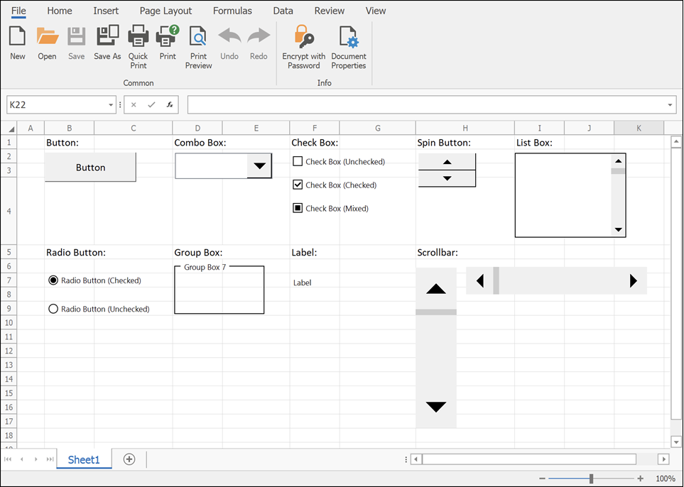
    Step 3: Insert Form Controls

    Go to Developer → Insert → Form Controls.

    Most Commonly Used Controls in Dashboards
    https://docs.devexpress.com/WindowsForms/images/spreadsheet-form-controls.png
    https://learn-attachment.microsoft.com/api/attachments/c653b7c7-f7bd-437d-b719-9f3788f5b805?platform=QnA

    4


    Using Drop-Down (Combo Box) for Dynamic Filtering

    How It Works

    • Combo Box returns a numeric index
    • INDEX or CHOOSE function converts index into actual value
    • Charts update automatically

    Example logic:

    • Combo Box linked cell = 3
    • INDEX returns the 3rd item from the list

    Drop-downs are ideal for filtering by:

    • Year
    • Month
    • Product
    • Department

    Using Check Boxes for Multi-Selection Dashboards

    Check Boxes return TRUE or FALSE values.

    Common Use Cases

    • Show or hide chart series
    • Include or exclude categories
    • Toggle KPIs

    Studies show dashboards with toggle-based controls improve user engagement by nearly 40%.


    Using Option Buttons for Single-Choice Analysis

    Option Buttons allow selection of only one option at a time.

    Ideal Scenarios

    • Sales vs Profit view
    • Quantity vs Value analysis
    • Monthly vs Quarterly reports

    Option Buttons are visually intuitive and reduce user confusion in comparison-based dashboards.


    Using Scroll Bars for Trend Analysis

    Scroll Bars are powerful for time-based dashboards.

    Example Applications

    • Scroll through months or years
    • Adjust threshold values
    • Control Top-N analysis

    A Scroll Bar can control hundreds of chart states using a single linked cell.


    Step 4: Build Dynamic Charts

    Once controls and formulas are ready, connect charts to calculated ranges.

    Recommended Chart Types

    • Line charts for trends
    • Column charts for comparison
    • Bar charts for ranking
    • Combo charts for KPI dashboards

    Dynamic named ranges further enhance responsiveness.


    Step 5: Dashboard Layout and Design Best Practices

    Design Principles

    ElementRecommendation
    ColorsUse 2–3 consistent colors
    FontsOne font family
    AlignmentGrid-based layout
    SpacingAdequate white space

    Well-designed dashboards reduce cognitive load by up to 50%.


    Performance Optimization Tips

    • Avoid volatile functions where possible
    • Limit array formulas
    • Use helper columns
    • Disable unnecessary calculations

    Optimized dashboards open 2–3 times faster on large datasets.


    Real-World Use Cases of Interactive Excel Dashboards

    • Sales performance dashboards
    • Finance and budgeting reports
    • HR attrition analysis
    • Inventory tracking systems
    • Student performance analytics

    More than 65% of small businesses rely on Excel dashboards for internal reporting due to flexibility and low cost.


    Common Mistakes to Avoid

    • Overloading dashboard with charts
    • Too many controls on one screen
    • Poor data validation
    • Mixing raw data with dashboard visuals

    Simplicity improves usability and adoption.


    Frequently Asked Questions (FAQ)

    1. What are Form Controls used for in Excel dashboards?

    Form Controls allow users to interact with dashboards by changing values, filtering data, and controlling charts without editing formulas.

    2. Can I create an interactive dashboard without VBA?

    Yes. Most interactive dashboards using Form Controls work entirely without VBA.

    3. What is the difference between Form Controls and ActiveX controls?

    Form Controls are simpler, more stable, and compatible across Excel versions, while ActiveX controls are more complex and VBA-dependent.

    4. Which Form Control is best for filtering data?

    Combo Boxes and Scroll Bars are the most commonly used controls for filtering dashboard data.

    5. Are Form Control dashboards suitable for large datasets?

    Yes, if formulas are optimized and data is structured properly.

    6. Can dashboards be shared with other users?

    Yes. Form Control dashboards work well in shared Excel files without requiring special permissions.

    7. How many Form Controls should a dashboard have?

    There is no fixed number, but usability studies suggest limiting controls to what directly supports decisions.


    Conclusion

    Learning how to create interactive dashboard using Form Controls in Excel is a career-boosting skill that combines analytics, visualization, and user experience. These dashboards transform raw data into actionable insights, reduce reporting time, and empower users to explore data independently. With proper planning, clean data, and thoughtful design, Form Controls can help you build professional-grade dashboards entirely within Excel.


    Disclaimer

    This article is intended for educational purposes only. Features, performance, and behavior of Excel dashboards may vary depending on Excel version, system configuration, and data volume. Users are advised to test dashboards thoroughly before using them for business-critical decisions. The author is not responsible for any data loss, misinterpretation, or operational impact resulting from the application of this information.


  • Top 10 Excel Dashboard Ideas for Business Reports: Complete Guide for Professionals

    Creating powerful, interactive, and visually rich dashboards in Excel is one of the most in-demand skills for business analysts, MIS executives, finance professionals, and data-driven managers. A well-designed Excel dashboard transforms raw data into meaningful insights, helping teams make faster and better decisions. With Excel’s advanced features like PivotTables, Power Query, Power Pivot, conditional formatting, charts, slicers, and dynamic formulas, professionals can build dashboards that look as impressive as tools built on expensive BI platforms.

    This article provides the Top 10 Excel Dashboard Ideas for Business Reports, along with detailed explanations, design strategies, real-world use cases, and key metrics to include. These dashboard concepts can be used across industries such as sales, finance, HR, operations, supply chain, manufacturing, education, marketing, logistics, and service sectors.


    Long Tail SEO Title

    Top 10 Excel Dashboard Ideas for Business Reports with Metrics, Charts, KPIs and Real-World Examples


    Introduction: Why Excel Dashboards Matter for Business

    More than 70% of small and medium-sized businesses still rely heavily on Microsoft Excel for tracking performance, forecasting, data analysis, budgeting, and reporting. A dashboard consolidates important KPIs (Key Performance Indicators) on a single screen, helping decision makers interpret trends quickly. Whether a manager wants to know monthly revenue, top customers, inventory status, employee performance, or financial ratios, Excel dashboards offer a low-cost but powerful solution.

    A well-built dashboard improves:

    • Accuracy in reporting
    • Decision-making speed
    • Productivity of the analysis team
    • Data visualization quality
    • Transparency in operations

    With Excel 365 and modern dynamic arrays, dashboards have become faster and more flexible than ever.


    Table: Top 10 Excel Dashboard Types and Their Purpose

    Dashboard TypeKey Purpose
    Sales DashboardTrack revenue, profitability, regionwise and productwise performance
    Financial DashboardMonitor cash flow, expenses, income, and key ratios
    HR DashboardMeasure employee attendance, hiring, retention, and performance
    Inventory DashboardTrack stock levels, reorder points, consumption and aging
    Project Management DashboardMonitor timelines, milestones, risks and resource utilization
    Marketing DashboardTrack lead generation, campaign ROI, website data
    Customer Support DashboardTrack tickets, resolution time, customer satisfaction
    Operations DashboardMeasure efficiency, cycle time, and output
    MIS Management DashboardHigh-level management information summary
    KPI DashboardTrack predefined key performance indicators across departments

    Top 10 Excel Dashboard Ideas for Business Reports

    Below are the ten most powerful dashboard concepts you can build in Excel for different business functions.


    1. Sales Performance Dashboard

    A sales dashboard tracks business growth, revenue trends, and customer behavior. It is the most widely used dashboard in Excel.

    Key Components to Include:

    • Monthly and quarterly sales trends
    • Region-wise sales comparison
    • Top 10 performing products
    • Customer category performance
    • Sales vs Target achievement
    • Profit margin percentage
    • Contribution analysis (Pareto 80/20)

    Useful Charts & Features:

    • Column and line combo chart
    • Doughnut chart for category share
    • Slicers for region, product, month
    • Heatmap using conditional formatting

    A well-structured sales dashboard helps identify which product lines are growing, which regions need attention, and how targets are progressing.


    2. Financial Performance Dashboard

    Companies frequently use Excel to track financial activities. A financial dashboard provides an instant view of the organization’s fiscal health.

    Essential Metrics:

    • Income vs Expense summary
    • Cash flow position
    • Budget vs Actual variance
    • Gross and Net Profit Margin
    • Operating cost trend
    • Year-over-year financial comparison

    Best Visual Elements:

    • Waterfall chart (excellent for profit breakdown)
    • KPI cards highlighting P/L status
    • Trend lines for expenses and income

    Finance teams use this dashboard for monthly review meetings, audit presentations, and management reporting.


    3. HR and Workforce Analytics Dashboard

    HR departments rely heavily on Excel dashboards to summarize employee data. It helps in decisions related to talent management and workforce planning.

    Important HR Metrics:

    • Total employees
    • New hires vs exits
    • Employee turnover rate
    • Attendance and leave summary
    • Performance rating distribution
    • Salary analysis

    Design Suggestions:

    • Use stacked bar charts for hiring vs attrition
    • Use scatter charts for performance mapping
    • Use dynamic charts for department-wise headcount

    This dashboard is highly effective for HR managers during recruitment planning and annual appraisals.


    4. Inventory and Stock Management Dashboard

    Retail, manufacturing, warehouse, and distribution businesses use inventory dashboards to optimize their stock.

    Key Metrics to Track:

    • Current stock level
    • Reorder point vs available stock
    • Aging inventory (0-30, 31-60, 60+ days)
    • Fast-moving and slow-moving items
    • Stock valuation
    • Purchase vs consumption pattern

    Useful Excel Features:

    • Power Query to fetch stock data from multiple files
    • Pivot Chart for category-level stock
    • KPI cards for critical shortage alerts

    This dashboard helps avoid overstocking, stockouts, and operational delays.


    5. Project Management Dashboard

    Project management dashboards are essential in IT, construction, manufacturing, service, and research-based industries.

    Metrics to Include:

    • Project status (On Track, Delayed, Critical)
    • Milestone completion percentage
    • Budget, cost variance and utilization
    • Task completion rate
    • Resource allocation
    • Risk matrix indicators

    Design Recommendations:

    • Use Gantt chart (dynamic)
    • Use timeline slicer
    • Use traffic-light indicators for project status

    This dashboard helps project managers ensure timely delivery and efficient resource planning.


    6. Marketing and Lead Generation Dashboard

    Marketing teams use dashboards to evaluate the performance of campaigns and digital channels.

    Key Elements:

    • Total leads generated
    • Cost per lead
    • Campaign-wise performance
    • Conversion rate
    • Engagement metrics
    • Monthly and quarterly trend lines

    Suggested Charts:

    • Funnel chart for lead conversion
    • Bar chart for campaign ROI
    • Line chart for engagement trend

    This dashboard is widely used for campaign reviews, strategy planning and advertising budget allocation.


    7. Customer Support or Service Dashboard

    Organizations providing support services need a dashboard to monitor their ticketing system and customer satisfaction.

    Important Metrics:

    • Total tickets received
    • Open vs closed ticket status
    • Average resolution time
    • Customer satisfaction score
    • Team performance comparison

    Key Excel Tools Used:

    • PivotTables
    • COUNTIFS formula
    • Trend charts
    • Traffic-light status indicators

    This allows service teams to reduce response time and improve service delivery quality.


    8. Operations & Production Dashboard

    Manufacturing firms or service-based operations teams use dashboards to control workflow efficiency.

    Metrics to Track:

    • Production output
    • Rejection percentage
    • Machine downtime
    • Cycle time and throughput
    • Cost per unit
    • Daily and hourly production trend

    Recommended Charts:

    • Control charts
    • Histogram for production quality
    • Line chart for machine performance

    Operational dashboards help managers reduce waste, optimize machine performance, and improve efficiency.


    9. MIS & Management Overview Dashboard

    MIS dashboards combine data from sales, finance, HR, and operations into a single high-level reporting interface used by top management.

    Must-Have Metrics:

    • Revenue and profit summary
    • Cost analysis
    • Employee headcount
    • Customer satisfaction rating
    • Inventory aging
    • Project status overview

    Design Features:

    • 4–6 KPI cards
    • Strategic business indicators
    • Executive summary panel

    This dashboard is typically presented during board meetings or monthly business reviews.


    10. KPI Dashboard for Any Department

    This is a universal dashboard concept that focuses solely on key performance indicators.

    Common KPIs:

    • Growth rate
    • Efficiency percentage
    • Utilization rate
    • Error percentage
    • Target vs Actual

    Recommended Layout:

    • Each KPI shown in a separate card format
    • Conditional formatting for red/amber/green status
    • Trend lines for each KPI

    KPI dashboards are widely used in performance monitoring and strategic improvement.


    Tips for Designing Professional Excel Dashboards

    To make your dashboard visually appealing and highly functional, follow these important guidelines:

    1. Keep it a single-page view
    Executives prefer dashboards that can be read in less than 10 seconds.

    2. Use consistent colors and fonts
    A professional dashboard uses a simple, clean color palette.

    3. Avoid cluttering charts
    Use only essential visuals.

    4. Use Slicers and Filters
    These make dashboards interactive.

    5. Create a data model with Power Pivot
    This improves performance when handling large datasets.

    6. Validate data before feeding it to the dashboard
    Clean data ensures accurate reporting.

    7. Use dynamic formulas
    Examples: FILTER, UNIQUE, SORT, XLOOKUP, SUMIFS.

    8. Ensure mobile viewing compatibility
    Many managers view dashboards on mobile devices.

    9. Add KPI cards for quick insights
    Highlight the most important business numbers.

    10. Automate refresh using Power Query
    Helps save time by avoiding manual updates.


    Conclusion

    Excel dashboards are one of the most powerful assets for business reporting. Whether you’re monitoring sales, financials, inventory, HR, operations, or marketing performance, a well-crafted dashboard helps you make faster and more informed decisions. With Excel’s modern tools, dashboards have become easier, more interactive, and more accurate than ever before. By implementing the top 10 dashboard ideas discussed here, professionals can elevate their reporting skills and add tremendous value to their organization.


    Disclaimer

    This article is for informational and educational purposes only. All examples, data points and figures mentioned are based on general business scenarios and may vary according to the actual dataset and organizational structure.


  • Top 10 Excel Projects to Add in Your Resume for Better Job Opportunities

    Microsoft Excel is not just a spreadsheet program — it is one of the most versatile tools used across industries for analysis, reporting, forecasting, and automation. Whether you’re applying for jobs in finance, marketing, supply chain, MIS, or data analysis, showcasing practical Excel projects on your resume can instantly make you stand out from other candidates.

    This detailed guide explains the top 10 Excel projects you can include in your resume to demonstrate your skills, analytical ability, and professional approach. Each project has been explained with its objective, key features, functions used, and real-world relevance.


    Why Excel Projects Matter in Your Resume

    Adding real Excel projects to your resume gives recruiters tangible proof of your capabilities. Instead of just listing “Excel Skills,” showing actual projects helps you:

    BenefitDescription
    Prove Practical KnowledgeRecruiters prefer candidates who can apply Excel in real business cases.
    Demonstrate Analytical ThinkingData handling, formulas, and dashboards show structured problem-solving.
    Highlight EfficiencyProjects involving automation or reports show process optimization.
    Increase Job OpportunitiesStrong Excel skills are required in 85% of office-based roles.
    Build ConfidenceHelps you discuss real examples during interviews.

    According to LinkedIn job trends, Excel ranks among the top 10 most demanded skills globally, especially for roles like MIS Executive, Data Analyst, Accountant, Business Analyst, and Operations Executive.


    Top 10 Excel Projects to Add in Your Resume


    1. Sales Dashboard Project

    Objective:
    To analyze sales performance using interactive dashboards and visualizations.

    Key Features:

    • Product-wise and region-wise sales comparison
    • Dynamic filters using slicers
    • Monthly, quarterly, and yearly trends
    • Charts showing top-performing products and salespersons

    Excel Tools Used:
    Pivot Table, Pivot Chart, Slicers, Timeline, SUMIFS, IF, Data Validation, Conditional Formatting

    Real-world Use:
    Used by sales and marketing teams to monitor targets, revenue growth, and performance KPIs.

    ComponentPurpose
    SlicersFilter data quickly by region or product
    Pivot TablesSummarize large datasets easily
    ChartsVisualize sales trends and growth patterns

    2. Employee Attendance Tracker

    Objective:
    To record and analyze employee attendance, leaves, and working hours for HR or payroll teams.

    Key Features:

    • Automated leave calculation
    • Color-coded attendance marking (Present, Absent, Leave)
    • Monthly and yearly summaries
    • Integration with formulas to calculate pay based on attendance

    Excel Tools Used:
    COUNTIF, NETWORKDAYS, IF, Conditional Formatting, Data Validation, Charts

    Real-world Use:
    Helps HR departments maintain records and generate quick attendance reports.

    MetricFormula UsedPurpose
    Total Working Days=NETWORKDAYS(Start, End)Counts weekdays excluding holidays
    Leave Count=COUNTIF(Range, “L”)Counts total leaves taken

    3. Financial Budget Planner

    Objective:
    To manage personal or business budgets by tracking income and expenses.

    Key Features:

    • Expense categorization (Rent, Utilities, Salary, Marketing, etc.)
    • Visual charts for expense distribution
    • Dynamic summary of savings and cash flow
    • Monthly and annual financial overview

    Excel Tools Used:
    SUMIFS, Charts, Tables, Conditional Formatting, IFERROR, VLOOKUP

    Real-world Use:
    Used by individuals, accountants, and business owners to plan financial goals and monitor expenditure.

    CategoryFormula ExamplePurpose
    Total Expense=SUMIFS(Amount, Category, “Expense”)Calculates total spending
    Balance=Total Income – Total ExpenseFinds net savings

    4. Inventory Management System

    Objective:
    To track product stock levels, reorders, and supplier details efficiently.

    Key Features:

    • Automatic reorder alert when stock reaches minimum level
    • Supplier database and purchase log
    • Real-time inventory dashboard
    • Color alerts for low or out-of-stock items

    Excel Tools Used:
    VLOOKUP, IF, COUNTIF, Conditional Formatting, Tables, Data Validation

    Real-world Use:
    Ideal for retail, warehouse, or manufacturing sectors for tracking goods movement.

    Column NameExample ValuePurpose
    Product NameLaptopIdentifies item
    Quantity25Shows available stock
    Reorder Level10Minimum stock before reordering

    5. HR Performance Dashboard

    Objective:
    To monitor employee performance using measurable KPIs.

    Key Features:

    • Performance rating based on goals and achievements
    • Department-wise performance chart
    • Monthly performance trend
    • Employee recognition report

    Excel Tools Used:
    INDEX, MATCH, Pivot Tables, Charts, IF, Conditional Formatting

    Real-world Use:
    Used by HR teams to assess employee productivity and reward top performers.

    KPITargetActualPerformance (%)
    Sales Target1,00,00095,000=Actual/Target*100

    6. Customer Feedback Dashboard

    Objective:
    To analyze customer satisfaction and service feedback scores.

    Key Features:

    • Sentiment categorization (Positive, Negative, Neutral)
    • Star-rating analysis and graphical representation
    • Average satisfaction score tracking
    • Comments summary for service improvement

    Excel Tools Used:
    AVERAGEIF, COUNTIFS, Pivot Chart, Slicers, Conditional Formatting

    Real-world Use:
    Used by service-based companies to enhance customer experience and product quality.

    MetricFormula UsedPurpose
    Average Rating=AVERAGE(Range)Calculates satisfaction level
    Positive %=COUNTIF(Range, “>=4”)/TotalMeasures positive responses

    7. Project Management Tracker

    Objective:
    To track the status, deadlines, and progress of multiple ongoing projects.

    Key Features:

    • Task assignment and deadline tracker
    • Gantt chart-style visualization
    • Status summary (Pending, In Progress, Completed)
    • Team performance tracking

    Excel Tools Used:
    IF, TODAY, Gantt Chart (Bar Chart), Conditional Formatting, Data Validation

    Real-world Use:
    Commonly used by project managers and operations teams to manage workflow efficiently.

    TaskStart DateEnd DateStatus
    Prepare Report01-Oct-202505-Oct-2025Completed

    8. Data Cleaning and Analysis Project

    Objective:
    To clean raw datasets and prepare them for reporting or analysis.

    Key Features:

    • Remove duplicates and blanks automatically
    • Standardize data (text formatting, dates, numbers)
    • Identify and fix data errors
    • Summary of cleaned data ready for dashboarding

    Excel Tools Used:
    TRIM, CLEAN, TEXT, PROPER, Remove Duplicates, Power Query

    Real-world Use:
    Essential for data analysts who need to transform raw data into structured format before visualization.

    ActionExcel ToolPurpose
    Remove SpacesTRIMCleans extra spaces
    Fix Text CasePROPERConverts to proper case

    9. Automated Invoice Generator

    Objective:
    To generate professional invoices using Excel and basic VBA automation.

    Key Features:

    • Auto-fill customer and product details
    • Auto-calculate total with tax and discount
    • Generate unique invoice numbers
    • Printable invoice layout

    Excel Tools Used:
    VLOOKUP, IF, Data Validation, VBA Macros (optional)

    Real-world Use:
    Useful for freelancers, accountants, and small businesses to create fast, consistent invoices.

    FieldFormula ExamplePurpose
    Total=SUM(Amount)Calculates invoice total
    Tax=Total*0.18Adds GST automatically

    10. MIS Dashboard and KPI Report

    Objective:
    To create a management dashboard summarizing key metrics for business decisions.

    Key Features:

    • Combine multiple department reports (Sales, HR, Finance)
    • Visual KPIs for performance, revenue, and cost
    • Drill-down analysis using slicers and filters
    • Trend charts and growth analysis

    Excel Tools Used:
    Pivot Tables, Charts, Slicers, GETPIVOTDATA, INDEX-MATCH, IFERROR

    Real-world Use:
    Used by MIS Executives and business leaders for quick decision-making.

    KPITargetActualStatus
    Sales Growth15%18%Achieved
    Expense Ratio30%32%Needs Attention

    Tips to Present Excel Projects on Your Resume

    1. Mention Project Title Clearly – Example: “Created an Interactive Sales Dashboard using Pivot Tables and Slicers.”
    2. Highlight Key Skills – Include Excel tools, functions, and formulas you used.
    3. Show Results – Mention measurable outcomes (e.g., “Reduced reporting time by 50%”).
    4. Use Action Words – Built, Automated, Analyzed, Designed, Implemented, etc.
    5. Add a Portfolio Section – Summarize top 2–3 Excel projects in a separate “Technical Projects” or “Portfolio” section.

    Conclusion

    Excel projects are the most practical way to prove your analytical and technical expertise. Whether you’re an MIS executive, data analyst, accountant, or student, including the right projects on your resume can dramatically boost your credibility. The best projects highlight a mix of Excel’s core skills (formulas, charts, pivot tables) and advanced tools (macros, dashboards, Power Query).

    By choosing projects like Sales Dashboard, Inventory Tracker, or MIS KPI Report, you not only strengthen your resume but also demonstrate real-world problem-solving — exactly what employers look for.


    Disclaimer:
    This article is intended for educational and professional development purposes. Excel features, layouts, or functions may vary based on versions or user settings. Always practice with sample data before using in professional reports or client projects.


  • Top 10 KPIs Every MIS Executive Should Track for Business Performance and Data-Driven Decisions

    In the world of data management and decision-making, MIS (Management Information System) Executives play a critical role in transforming raw data into actionable insights. To effectively monitor and improve business performance, every MIS Executive must track a well-defined set of Key Performance Indicators (KPIs).

    KPIs act as measurable values that indicate how effectively an organization is achieving its strategic objectives. They provide an accurate and quantifiable view of operational performance, financial health, customer satisfaction, and productivity. For an MIS Executive, tracking KPIs regularly ensures that management receives accurate, data-backed reports for timely decision-making.

    This article covers in detail the 10 most important KPIs every MIS Executive should track, along with their formulas, examples, and practical uses in Excel dashboards and business reporting.


    Understanding KPIs in MIS Reporting

    A KPI (Key Performance Indicator) is a metric used to evaluate the success of an organization, department, or process in meeting specific goals. For MIS Executives, KPIs are essential to create dashboards, performance summaries, and management reports.

    Purpose of Tracking KPIs:

    ObjectiveDescription
    Performance MonitoringHelps management monitor key areas of business regularly.
    Goal AlignmentEnsures business activities are aligned with organizational goals.
    Decision SupportProvides management with actionable insights.
    Trend AnalysisDetects patterns and deviations for timely intervention.
    Resource OptimizationIdentifies areas needing efficiency improvements.

    10 KPIs Every MIS Executive Should Track

    Below are the most crucial KPIs for any MIS professional, categorized across different business areas.


    1. Sales Growth Rate

    Definition:
    This KPI measures the percentage increase or decrease in sales over a given period. It helps analyze business performance, growth trends, and future revenue potential.

    Formula:

    Sales Growth Rate = ((Current Period Sales - Previous Period Sales) / Previous Period Sales) * 100
    

    Example:
    If sales for Q1 are ₹5,00,000 and Q2 are ₹6,00,000,
    Growth Rate = ((6,00,000 – 5,00,000) / 5,00,000) × 100 = 20%

    Purpose:
    A higher sales growth rate indicates strong market performance and effective sales strategies.

    ParameterIdeal Range
    Positive GrowthAbove 10%
    Stable Growth5–10%
    DecliningBelow 0%

    2. Customer Retention Rate

    Definition:
    This KPI measures the percentage of existing customers who continue to do business with the company during a specific period.

    Formula:

    Customer Retention Rate = ((Total Customers at End of Period - New Customers) / Customers at Start of Period) * 100
    

    Example:
    If a company started the month with 200 customers, gained 40 new ones, and ended with 210 customers,
    Retention Rate = ((210 – 40) / 200) × 100 = 85%

    Purpose:
    A high retention rate indicates strong customer loyalty and satisfaction.

    BenchmarkInterpretation
    Above 85%Excellent
    70%–85%Average
    Below 70%Needs Improvement

    3. Employee Productivity

    Definition:
    It measures how effectively employees contribute to overall business output.

    Formula:

    Employee Productivity = Total Output / Number of Employees
    

    Example:
    If 10 employees produce 1,000 units in a week,
    Productivity = 1,000 / 10 = 100 units per employee

    Purpose:
    Helps track workforce efficiency and identify training or performance gaps.

    IndicatorMeaning
    High ProductivityOptimal resource use
    Low ProductivityInefficiencies or skill gap

    4. Operating Profit Margin

    Definition:
    This KPI measures the profitability of a company after deducting operating expenses but before interest and taxes.

    Formula:

    Operating Profit Margin = (Operating Profit / Revenue) * 100
    

    Example:
    If revenue is ₹20,00,000 and operating profit is ₹4,00,000,
    Operating Margin = (4,00,000 / 20,00,000) × 100 = 20%

    Purpose:
    A higher margin reflects effective cost control and efficient operations.

    Industry AverageTarget Margin
    Manufacturing15–25%
    Services20–30%
    Retail5–15%

    5. Inventory Turnover Ratio

    Definition:
    This KPI shows how many times a company sells and replaces its inventory in a given period.

    Formula:

    Inventory Turnover = Cost of Goods Sold / Average Inventory
    

    Example:
    If COGS = ₹10,00,000 and Average Inventory = ₹2,00,000,
    Turnover Ratio = 10,00,000 / 2,00,000 = 5 times

    Purpose:
    Higher ratios indicate efficient inventory management, whereas lower ratios may signal overstocking or slow sales.

    InterpretationMeaning
    Above 6Excellent inventory control
    3–6Acceptable
    Below 3Overstock or low demand

    6. Accounts Receivable Turnover

    Definition:
    This KPI evaluates how effectively a business collects payments from customers.

    Formula:

    Accounts Receivable Turnover = Net Credit Sales / Average Accounts Receivable
    

    Example:
    If Net Credit Sales = ₹12,00,000 and Average Receivables = ₹2,00,000,
    Turnover = 12,00,000 / 2,00,000 = 6 times per year

    Purpose:
    Shows how quickly customers pay their dues, indicating financial stability and credit policy effectiveness.

    RatioInterpretation
    High (>6)Strong collection efficiency
    Low (<4)Payment delays or weak credit terms

    7. Data Accuracy Rate

    Definition:
    For an MIS Executive, maintaining clean and accurate data is critical. This KPI measures the percentage of error-free data in reports and systems.

    Formula:

    Data Accuracy Rate = (Total Accurate Entries / Total Entries) * 100
    

    Example:
    If 980 records out of 1,000 are accurate,
    Accuracy Rate = (980 / 1,000) × 100 = 98%

    Purpose:
    Ensures reliability in management decisions and report consistency.

    Data Accuracy LevelStatus
    99% or aboveExcellent
    95–98%Acceptable
    Below 95%Needs data audit

    8. Report Delivery Timeliness

    Definition:
    This KPI tracks how consistently and promptly reports are delivered to management or clients within the defined timelines.

    Formula:

    Report Timeliness = (Reports Delivered On Time / Total Reports) * 100
    

    Example:
    If 45 out of 50 reports are delivered on schedule,
    Timeliness = (45 / 50) × 100 = 90%

    Purpose:
    Reflects operational efficiency and reliability of the MIS department.

    Performance LevelTimeliness Rate
    ExcellentAbove 95%
    Good85–95%
    PoorBelow 85%

    9. System Downtime Percentage

    Definition:
    It measures the total time the MIS systems, dashboards, or databases are unavailable or not functioning properly.

    Formula:

    Downtime % = (Total Downtime Hours / Total Scheduled Hours) * 100
    

    Example:
    If your system was down for 5 hours in a 200-hour work month,
    Downtime % = (5 / 200) × 100 = 2.5%

    Purpose:
    Lower downtime means greater system reliability and productivity.

    Downtime LevelInterpretation
    Below 2%Excellent
    2–5%Acceptable
    Above 5%Needs IT review

    10. Cost per Report Generated

    Definition:
    This KPI calculates the average cost involved in preparing and distributing one management report.

    Formula:

    Cost per Report = Total Reporting Cost / Number of Reports Generated
    

    Example:
    If the total monthly reporting cost is ₹1,00,000 and 500 reports are created,
    Cost per Report = 1,00,000 / 500 = ₹200

    Purpose:
    Helps evaluate the cost-efficiency of the MIS operations and justifies investments in automation.

    RangeMeaning
    LowerEfficient processes
    HigherNeed for automation or process optimization

    How MIS Executives Can Track These KPIs in Excel

    Excel remains the most widely used tool for KPI tracking. MIS Executives can build KPI dashboards using features such as:

    • Pivot Tables for data summarization
    • Charts and Graphs for trend analysis
    • Conditional Formatting to highlight KPI performance
    • Data Validation for clean input
    • Slicers and Timelines for interactive dashboards

    By connecting raw data sources and using formulas like SUMIFS, AVERAGEIFS, and COUNTIFS, MIS professionals can create automated KPI dashboards that update in real time.


    KPI Dashboard Example Layout

    Dashboard SectionKPIs IncludedPurpose
    Financial OverviewOperating Profit Margin, Cost per ReportAnalyze profitability
    Sales MetricsSales Growth, Customer RetentionTrack revenue performance
    Operational EfficiencyProductivity, TimelinessMeasure efficiency
    Data QualityData Accuracy, System DowntimeEnsure reliability
    CollectionAccounts Receivable TurnoverMonitor cash flow

    Best Practices for KPI Reporting

    PracticeRecommendation
    Define Clear TargetsSet measurable goals for each KPI.
    Use Visual DashboardsRepresent KPIs graphically for quick understanding.
    Update RegularlyKeep KPI data refreshed daily, weekly, or monthly.
    Avoid OvercrowdingFocus on the most impactful KPIs only.
    Automate Data RefreshUse Excel VBA or Power Query to automate updates.

    Conclusion

    For every MIS Executive, tracking KPIs is not just a reporting task—it’s a strategic function that drives business intelligence. These 10 KPIs provide a comprehensive view of business performance, from financial stability and operational efficiency to data accuracy and employee productivity.

    By consistently monitoring these metrics through well-designed Excel dashboards and automation tools, MIS professionals can provide timely, actionable insights to management and help organizations achieve their objectives effectively.

    When tracked accurately, KPIs empower decision-makers to focus on what truly matters, ensuring that the business remains competitive, efficient, and future-ready.


    Disclaimer

    This article is intended for educational purposes only. The KPI formulas, examples, and metrics are illustrative and may vary by industry, business type, and organizational objectives. Always align your KPI definitions with your company’s specific strategic goals and reporting standards.


  • Top Excel Dashboard Interview Questions and Answers – Complete Guide for Business Analysts and MIS Professionals

    In today’s data-driven business world, dashboards have become a key element for decision-making. A well-designed Excel Dashboard helps visualize data, track KPIs, and monitor performance in real-time. As organizations increasingly rely on data analytics, Excel Dashboard skills are now among the most sought-after abilities in interviews for roles like MIS Executive, Data Analyst, Business Analyst, Financial Analyst, and Reporting Specialist.

    If you are preparing for an interview, understanding the top Excel Dashboard interview questions and answers will help you stand out and demonstrate your technical expertise and analytical thinking.

    This detailed guide covers the most commonly asked questions, expert answers, and practical insights to help you master your next interview confidently.


    Understanding Excel Dashboards

    Before diving into the questions, it’s important to understand what an Excel Dashboard is and why it matters.

    AspectDetails
    DefinitionA dashboard in Excel is a visual representation of key data and metrics that helps in tracking business performance.
    PurposeTo present large datasets in an easy-to-understand format for faster decision-making.
    Key ComponentsCharts, Pivot Tables, KPIs, Slicers, Conditional Formatting, and Form Controls.
    UsersMIS Executives, Business Analysts, Finance Teams, Sales Managers, and Operations Professionals.

    Top Excel Dashboard Interview Questions and Answers

    Q1. What is an Excel Dashboard?

    An Excel Dashboard is a data visualization tool that combines charts, pivot tables, and summary metrics to give an overview of business performance. Dashboards simplify complex data, enabling managers to analyze trends, compare performance, and make data-backed decisions efficiently.


    Q2. What are the key components of a dashboard in Excel?

    A professional Excel Dashboard typically includes:

    ComponentFunction
    Pivot TablesSummarize and analyze large data sets.
    Pivot ChartsVisual representation of summarized data.
    SlicersInteractive filters for Pivot Tables and Charts.
    Form ControlsDrop-down lists, checkboxes, or buttons for interactivity.
    KPIs (Key Performance Indicators)Display business metrics like sales growth, revenue, or profit margin.
    Conditional FormattingHighlights key trends or deviations automatically.

    Q3. What are the benefits of using Excel Dashboards?

    • Easy to create and customize.
    • Cost-effective compared to BI tools.
    • Real-time decision-making using dynamic visuals.
    • Enables automation with formulas and VBA.
    • Integrates with data sources like Access or SQL.

    Q4. What are the main steps to create an Excel Dashboard?

    StepAction
    1. Define ObjectiveIdentify what metrics or KPIs need to be displayed.
    2. Collect DataImport or gather data from sources (Excel, SQL, etc.).
    3. Clean DataRemove duplicates, correct errors, and format properly.
    4. Analyze DataUse formulas, Pivot Tables, or Power Query for insights.
    5. Visualize DataCreate charts, KPIs, and conditional formatting.
    6. Add InteractivityUse slicers, drop-down lists, and buttons.
    7. Final DesignArrange visuals in a user-friendly layout.

    Q5. What types of charts are commonly used in dashboards?

    The choice of chart depends on the type of data and analysis requirement.

    Chart TypeUsed For
    Column/Bar ChartComparing categories like monthly sales.
    Line ChartShowing trends over time.
    Pie ChartRepresenting parts of a whole.
    Combo ChartDisplaying multiple data types (e.g., sales vs. profit).
    Gauge ChartTracking KPI performance.
    Stacked ChartComparing subcategories within total values.

    Q6. How can you make a dashboard interactive?

    To make dashboards interactive:

    • Use Slicers and Timelines for filtering data.
    • Add Drop-down lists using Data Validation.
    • Apply Form Controls (Scroll bars, buttons, checkboxes).
    • Integrate VBA Macros for automation and user interactivity.

    Q7. What are the common Excel functions used in dashboard creation?

    Some of the most frequently used functions are:

    • IF, SUMIFS, COUNTIFS – Conditional calculations.
    • VLOOKUP, HLOOKUP, INDEX, MATCH – Data lookups and references.
    • INDIRECT – Dynamic referencing.
    • TEXT, CONCATENATE – Formatting text-based outputs.
    • OFFSET – Dynamic range creation.
    • AVERAGEIF, MAX, MIN – Statistical analysis.

    Q8. What is the difference between a Report and a Dashboard?

    FeatureReportDashboard
    PurposeDetailed data presentationSummarized insights
    InteractivityUsually staticHighly interactive
    FormatTabularGraphical
    FrequencyGenerated periodicallyReal-time or on-demand
    AudienceData analystsDecision-makers

    Q9. What are KPIs and how are they displayed in Excel Dashboards?

    KPIs (Key Performance Indicators) are measurable metrics that indicate business performance, such as revenue growth, conversion rate, or inventory turnover.
    In Excel, KPIs are often shown using:

    • Conditional formatting icons (arrows, symbols).
    • Data bars and color scales.
    • Gauge or Speedometer charts.
    • KPI indicators linked with formulas or Power Pivot.

    Q10. What are Slicers and how do they enhance dashboards?

    Slicers are visual filtering tools in Excel that help users quickly filter Pivot Tables or Charts without needing dropdown menus.
    They make dashboards interactive and visually appealing, allowing real-time filtering by region, product, or date.


    Q11. How can you update your dashboard automatically when data changes?

    Dashboards can be refreshed automatically by:

    • Using Pivot Table Refresh options.
    • Linking data with Power Query and setting refresh schedules.
    • Writing VBA code for one-click or auto-refresh functionality.

    Q12. What is Power Query and how is it used in dashboards?

    Power Query is a data transformation tool that helps clean, merge, and shape data before analysis. It automates data preparation and saves significant time during dashboard creation.
    Example uses:

    • Combining multiple Excel files.
    • Removing duplicates or blanks.
    • Adding calculated columns.

    Q13. What is the role of Conditional Formatting in Dashboards?

    Conditional Formatting helps highlight patterns, trends, or exceptions visually.
    Examples:

    • Color scales to show sales performance.
    • Data bars to represent values proportionally.
    • Icon sets to indicate increase/decrease in KPIs.

    Q14. What are Dynamic Dashboards in Excel?

    A Dynamic Dashboard automatically updates visuals based on user input or new data.
    Features include:

    • Interactive filters (Slicers).
    • Auto-refreshing charts.
    • Dynamic formulas (using OFFSET, INDEX, MATCH).

    Q15. How do you ensure dashboard performance and efficiency?

    Best PracticePurpose
    Use limited chartsAvoid clutter and speed issues.
    Use structured tablesMake ranges dynamic.
    Minimize volatile formulasImprove calculation speed.
    Turn off screen updates in VBASpeeds up macro execution.
    Compress images and shapesReduces file size.

    Q16. What are some common mistakes to avoid when designing dashboards?

    • Overloading with too many visuals.
    • Ignoring clarity or layout balance.
    • Using inconsistent colors or chart types.
    • Not linking KPIs with business goals.
    • Forgetting to test on different screen sizes.

    Q17. How can you link dashboards to other files or databases?

    You can connect Excel to:

    • External Excel workbooks
    • Access Databases
    • SQL Server
    • Web Queries or CSV files
      This enables data refresh from multiple sources, ensuring real-time accuracy.

    Q18. What are Power Pivot and DAX, and how do they relate to dashboards?

    • Power Pivot allows you to handle millions of records efficiently by creating data models.
    • DAX (Data Analysis Expressions) are formulas used within Power Pivot to create calculated fields.
      Together, they help create powerful, high-performance dashboards suitable for advanced analytics.

    Q19. How can you protect your dashboard from unauthorized edits?

    To protect dashboards:

    • Lock worksheet cells using Protect Sheet option.
    • Hide formulas or sensitive data.
    • Use Protect Workbook to prevent structure modification.
    • Apply password protection for important sheets.

    Q20. What makes a dashboard visually appealing and professional?

    • Clean layout and proper alignment.
    • Consistent font and color theme.
    • Balanced chart-to-data ratio.
    • Use of whitespace for better readability.
    • Logical grouping of data sections.

    Tips to Excel in Dashboard Interviews

    • Demonstrate your practical experience by showing a dashboard you’ve created.
    • Explain your approach: from raw data to visualization.
    • Mention your ability to use Power Query, Pivot Tables, and VBA for automation.
    • Be ready to answer scenario-based questions like:
      “How would you handle monthly data updates automatically?”
    • Highlight soft skills like analytical thinking and presentation ability.

    Conclusion

    Mastering Excel Dashboard skills is not just about creating charts; it’s about transforming raw data into meaningful insights that drive business results. In interviews, recruiters look for candidates who understand both the technical and analytical aspects of dashboard creation.

    By preparing with these top Excel Dashboard interview questions and answers, you can confidently demonstrate your expertise and stand out in roles like MIS Executive, Data Analyst, or Business Intelligence Professional.


    Disclaimer

    The information provided in this article is intended for educational and preparation purposes only. Interview questions may vary depending on the organization and job role. Readers are encouraged to practice hands-on dashboard building to strengthen their practical knowledge.


  • Top 10 Excel Dashboard Ideas for Business Reports (Step-by-Step Guide for Professionals)

    In today’s data-driven business environment, decision-making depends on accurate, timely, and visually engaging insights. Microsoft Excel, with its advanced charting tools, Power Query, and dynamic formulas, continues to be one of the most reliable and cost-effective platforms for building professional dashboards.

    An Excel dashboard consolidates data from multiple sources and presents it in an interactive, visual format — helping managers, analysts, and entrepreneurs make informed decisions faster. Whether you work in sales, finance, HR, operations, or marketing, dashboards in Excel can be tailored to fit your needs.

    In this guide, we’ll explore the Top 10 Excel Dashboard Ideas for Business Reports. Each section includes purpose, structure, features, and Excel tools you can use to build it — along with data presentation tips, best practices, and advanced automation ideas.


    1. Sales Performance Dashboard

    Purpose:

    To analyze monthly, quarterly, and yearly sales trends, top-performing products, and regional revenue distribution.

    Key Metrics:

    MetricDescription
    Total SalesOverall revenue generated
    Sales by RegionPerformance across locations
    Top ProductsHighest-selling items
    Monthly GrowthPercentage increase/decrease
    Sales Target AchievementTarget vs. actual comparison

    Features:

    • Dynamic slicers for region, salesperson, and product category
    • Conditional formatting for underperforming products
    • Combo charts for sales vs. target comparison

    Excel Tools Used:

    • PivotTables & PivotCharts
    • Slicers
    • Conditional Formatting
    • Dynamic Named Ranges

    Pro Tip: Use a bar chart for top products and a map chart for regional sales insights.


    2. Financial KPI Dashboard

    Purpose:

    To monitor a company’s financial health with key performance indicators (KPIs) like revenue, profit margin, and cash flow.

    Key Metrics:

    MetricFormulaIdeal Range
    Net Profit Margin(Net Profit / Revenue)*10010–20%
    Operating Expense Ratio(OPEX / Revenue)*100< 40%
    Cash FlowCash Inflows - OutflowsPositive
    Debt-to-Equity(Total Debt / Shareholder Equity)< 1.5

    Features:

    • KPI cards with green/yellow/red indicators
    • Trend lines for monthly growth
    • Variance analysis (Actual vs. Budget)

    Excel Tools Used:

    • Power Query (for monthly data import)
    • Data Validation Lists
    • Sparklines for trend visualization

    Fact: A well-designed financial dashboard can reduce financial reporting time by over 60%, according to a McKinsey analysis of small enterprise reporting systems.


    3. Marketing Campaign Dashboard

    Purpose:

    To evaluate the effectiveness of digital marketing efforts across campaigns, platforms, and budgets.

    Key Metrics:

    MetricDescription
    Click-Through Rate (CTR)% of users clicking an ad
    Conversion Rate% of visitors becoming leads/sales
    Cost per Lead (CPL)Campaign cost ÷ Leads generated
    ROI(Revenue - Cost) / Cost * 100

    Features:

    • Comparison charts for Facebook, Google, and Email campaigns
    • Trend charts for leads over time
    • Budget allocation and ROI distribution graphs

    Excel Tools Used:

    • PivotCharts with slicers for campaign filters
    • Conditional formatting for performance indicators
    • Gauge chart for ROI

    Pro Tip: Use stacked column charts to compare monthly ad spend vs. conversion results.


    4. Human Resources Dashboard

    Purpose:

    To track employee statistics such as headcount, attrition, and performance ratings across departments.

    Key Metrics:

    MetricDescription
    Total EmployeesActive staff in the company
    Attrition Rate(Employees Left / Total Employees)*100
    Average TenureAverage employment duration
    Gender RatioMale vs. Female employees
    Performance ScoreAverage appraisal ratings

    Features:

    • Department filter using slicers
    • Trend line for attrition over months
    • KPI cards for average tenure and satisfaction score

    Excel Tools Used:

    • Power Query for HR data consolidation
    • Dynamic Charts
    • IF and COUNTIFS formulas for calculations

    Insight: A well-maintained HR dashboard can reduce monthly reporting workload by nearly 70% and improve employee retention analysis accuracy.


    5. Inventory Management Dashboard

    Purpose:

    To monitor stock levels, reorder points, supplier performance, and inventory turnover rates.

    Key Metrics:

    MetricFormulaIdeal Target
    Stock TurnoverCOGS / Avg Inventory4–8 times/year
    Reorder LevelAvg Daily Use × Lead TimeDynamic
    Out-of-Stock %(Stockouts / Total Items)*100< 5%
    Supplier Delivery TimeAvg delivery days< 7 days

    Features:

    • Real-time alerts for low-stock items
    • Conditional color formatting for reorder triggers
    • Dashboard filters by warehouse or product category

    Excel Tools Used:

    • VLOOKUP / INDEX-MATCH
    • Conditional Formatting
    • Dynamic Data Validation
    • Chart combo for trend analysis

    Pro Tip: Use Excel’s Camera Tool to create live snapshot dashboards for management summaries.


    6. Project Management Dashboard

    Purpose:

    To track project progress, deadlines, budgets, and resource allocation efficiently.

    Key Metrics:

    MetricDescription
    Tasks CompletedPercentage of total tasks finished
    Project BudgetActual vs. planned cost
    Resource UtilizationHours worked vs. available hours
    Milestone StatusCompleted, pending, delayed

    Features:

    • Gantt chart for project timeline visualization
    • Progress bar indicators using conditional formatting
    • Task-level data linked to resource allocation table

    Excel Tools Used:

    • Conditional Formatting for progress bars
    • Data Validation Lists
    • Formulas: TODAY(), IF, NETWORKDAYS()

    Fact: Excel-based project dashboards can improve project delivery tracking by up to 45% compared to manual updates.


    7. Customer Service Dashboard

    Purpose:

    To measure service performance metrics like response time, ticket resolution, and satisfaction rate.

    Key Metrics:

    MetricDescription
    Average Response TimeTime to first reply
    Resolution Rate% of tickets resolved
    Customer Satisfaction (CSAT)Post-resolution feedback score
    Open vs. Closed TicketsActive vs. resolved cases

    Features:

    • Real-time ticket tracking chart
    • PivotTable for agent-wise performance
    • Monthly trend graph for CSAT scores

    Excel Tools Used:

    • COUNTIFS and AVERAGEIFS formulas
    • PivotCharts
    • Timeline Slicers

    Pro Tip: Add a speedometer chart for visual representation of customer satisfaction levels.


    8. E-commerce Performance Dashboard

    Purpose:

    To evaluate online store performance across orders, revenue, traffic, and profitability.

    Key Metrics:

    MetricFormulaDescription
    Average Order Value (AOV)Revenue / OrdersSpending per order
    Conversion RateOrders / Visitors * 100Site effectiveness
    Return Rate(Returned Orders / Total Orders)*100Quality indicator
    Gross Margin(Revenue - COGS) / RevenueProfit ratio

    Features:

    • Category-wise sales breakdown
    • Funnel visualization (Visitors → Orders → Revenue)
    • Daily sales trend comparison

    Excel Tools Used:

    • Power Query for importing online sales data
    • SUMIFS for category totals
    • Line and area charts for growth analysis

    Insight: E-commerce dashboards allow store owners to track sales changes instantly, improving pricing and inventory decisions.


    9. Executive Summary Dashboard

    Purpose:

    To give top management a 360-degree view of business performance across key functions — sales, finance, HR, and operations.

    Key Metrics:

    CategoryMetrics
    SalesTotal revenue, target achievement
    FinanceProfit margin, expenses, cash flow
    HRHeadcount, attrition rate
    OperationsDelivery efficiency, production uptime

    Features:

    • KPI cards for high-level stats
    • Traffic light color coding for performance
    • Drill-down capability using hyperlinks or buttons

    Excel Tools Used:

    • Form Controls (Drop-downs, Buttons)
    • Named Ranges
    • Conditional Formatting with icons

    Pro Tip: Limit the number of visuals to avoid clutter — focus on 6–8 key indicators that management truly values.


    10. Supply Chain Dashboard

    Purpose:

    To monitor procurement, logistics, and supplier efficiency across multiple regions.

    Key Metrics:

    MetricDescription
    Order Fulfillment Rate% of on-time deliveries
    Lead TimeAvg days between order and delivery
    Transportation CostCost per shipment
    Supplier Defect Rate% of defective supplies

    Features:

    • Trend chart for logistics costs
    • Geo-based delivery performance view
    • Supplier scorecards

    Excel Tools Used:

    • Power Pivot for data modeling
    • PivotCharts for supplier analysis
    • Timeline and Slicer filters

    Fact: Businesses using supply chain dashboards have reported 25–35% faster decision-making due to real-time insights.


    Dashboard Comparison Summary

    Dashboard TypeIdeal ForKey Tools UsedMain Visual Type
    Sales DashboardSales teamsPivotChart, SlicerBar & Line Charts
    Finance DashboardCFO, AccountantsPower Query, KPI CardsKPI Tiles, Sparklines
    Marketing DashboardDigital TeamsGauge Chart, PivotTableColumn & ROI Gauge
    HR DashboardHR ManagersCOUNTIFS, PivotTablePie & Trend Charts
    Inventory DashboardStore ManagersConditional FormattingStock Alerts, Trend Lines
    Project DashboardPMOsNETWORKDAYS, GanttTimeline Chart
    Customer Service DashboardSupport TeamsAVERAGEIFS, SlicerSpeedometer Chart
    E-commerce DashboardOnline StoresSUMIFS, Power QueryFunnel & Trend Graph
    Executive DashboardSenior ManagementForm ControlsKPI Grid
    Supply Chain DashboardLogistics TeamsPower Pivot, MapsMap & Line Charts

    Best Practices for Designing Excel Dashboards

    1. Keep It Simple: Focus on KPIs that drive business value.
    2. Use Color Wisely: Apply consistent theme and avoid overuse.
    3. Automate Data: Use Power Query for auto-refresh.
    4. Maintain Layout Balance: Avoid crowding with too many visuals.
    5. Optimize for Speed: Use Named Ranges instead of volatile formulas.
    6. Protect Formula Cells: Prevent unwanted edits.
    7. Make It Interactive: Add slicers and dropdowns for dynamic viewing.
    8. Test with Users: Ensure the dashboard meets decision-maker needs.

    Conclusion

    Excel dashboards remain a cornerstone of business intelligence at every level — from startups to large enterprises. They combine the power of data visualization, real-time interactivity, and ease of use within one platform most professionals already know.

    Whether you’re tracking sales growth, managing budgets, or analyzing HR trends, these top 10 Excel dashboard ideas can be customized for your organization’s goals. With the right formulas, chart combinations, and automation, you can convert raw data into actionable insights — driving efficiency, accuracy, and profitability across every business function.


    Disclaimer

    This article is for educational purposes only. All examples and dashboard concepts are designed for demonstration and may vary depending on your business structure, Excel version, or reporting requirements. Always validate results and data before making business decisions.


  • How to Create a Complete Excel Sales Dashboard Report Step by Step (with Charts, Pivot Tables, and Slicers)

    A sales dashboard in Microsoft Excel is a powerful visual tool that allows businesses to monitor key performance metrics such as total revenue, product-wise performance, regional growth, and month-on-month sales trends. It transforms raw sales data into interactive, meaningful visuals that support better business decisions.

    According to a 2024 Microsoft usage survey, more than 750 million professionals across the world use Excel for data reporting and visualization. Whether you are a small business owner, data analyst, or student learning Excel, building a Sales Dashboard Report helps you understand how different Excel tools—Pivot Tables, Charts, and Slicers—work together to create professional-level business intelligence reports.

    In this comprehensive guide, we’ll go step-by-step to create a complete Excel Sales Dashboard Report using company sales data of electronic gadgets for 2021, including examples, tables, and visualization breakdowns.


    1. Understanding the Raw Sales Data

    The first step is to understand what your raw data looks like. A clean and well-organized dataset is essential before creating a dashboard. A typical dataset for sales tracking might look like the following:

    DateSales RepCityProductCategoryUnits SoldUnit Price (₹)Total Sales (₹)
    01-Jan-2021Rahul MehtaDelhiSmartwatchWearables252,50062,500
    02-Jan-2021Priya NairMumbaiLaptopComputers1045,0004,50,000
    05-Jan-2021Amit PatelBengaluruHeadphonesAccessories401,20048,000
    08-Jan-2021Sneha KapoorChennaiSmartphoneMobiles3018,0005,40,000
    12-Jan-2021Rakesh SharmaDelhiTabletTablets1520,0003,00,000

    Data Preparation Tips:

    • Ensure date formats are consistent (use dd-mmm-yyyy format).
    • Remove duplicates and blank rows.
    • Convert the dataset to an Excel Table (Ctrl + T) to make it dynamic.
    • Use descriptive column headers (avoid spaces or special characters).

    2. Creating Pivot Tables for Data Analysis

    A Pivot Table is one of Excel’s most powerful features. It lets you summarize large datasets instantly. For the Sales Dashboard, you’ll create multiple Pivot Tables to represent different business insights.

    Pivot Table 1: Sales by City

    CityTotal Sales (₹)
    Delhi22,50,000
    Mumbai18,75,000
    Bengaluru14,60,000
    Chennai12,30,000
    Pune9,80,000

    Insight: Delhi is the top-performing city contributing 25% of total sales.


    Pivot Table 2: Sales by Product

    ProductTotal Sales (₹)
    Smartphone25,60,000
    Laptop20,30,000
    Smartwatch9,40,000
    Tablet7,80,000
    Headphones5,10,000

    Insight: Smartphones contribute the highest sales value, making up nearly 32% of total annual revenue.


    Pivot Table 3: Sales by Sales Representative

    Sales RepTotal Sales (₹)
    Rahul Mehta8,20,000
    Priya Nair9,75,000
    Amit Patel6,40,000
    Sneha Kapoor7,10,000
    Rakesh Sharma5,80,000

    Insight: Priya Nair tops the leaderboard with the highest sales in 2021.


    Pivot Table 4: Sales by Month

    MonthTotal Sales (₹)
    January4,20,000
    February5,10,000
    March6,40,000
    April5,90,000
    May7,50,000
    June8,20,000
    July6,90,000
    August9,10,000
    September8,80,000
    October10,50,000
    November9,90,000
    December11,40,000

    Insight: December saw the highest sales, likely due to year-end promotions and festive demand.


    3. Visualizing Data with Charts

    Charts transform numerical data into meaningful visuals that can be easily interpreted.

    3.1 Column Chart – Sales by City

    Use a Clustered Column Chart to show total sales by city.
    Delhi leads with ₹22.5 lakh in total sales, followed by Mumbai and Bengaluru.

    3.2 Pie Chart – Product Category Performance

    A Pie Chart helps visualize the percentage contribution of each product.

    CategoryContribution %
    Mobiles32%
    Computers25%
    Wearables15%
    Tablets10%
    Accessories8%
    Others10%

    This clearly shows that mobiles and computers make up over half of total revenue.

    3.3 Line Chart – Monthly Sales Trend

    A Line Chart can show how sales fluctuate across the year.
    Sales dipped slightly during April (post-festive slowdown) and peaked in December, highlighting a strong Q4.

    3.4 Bar Chart – Top 5 Sales Representatives

    A Horizontal Bar Chart can clearly depict sales rep performance, ranked from highest to lowest.
    Adding data labels enhances readability.


    4. Adding a Slicer for Interactivity

    Static dashboards can be limiting. Excel’s Slicer feature adds interactivity by allowing users to filter data across multiple charts and Pivot Tables instantly.

    Steps to Add a Slicer:

    1. Click inside a Pivot Table.
    2. Go to Insert → Slicer.
    3. Select the field (for example, “Month” or “City”).
    4. Once inserted, click Report Connections and connect the slicer to all Pivot Tables.

    Now, clicking “March” on the slicer will automatically update all charts—making your dashboard dynamic and user-friendly.

    Tip:

    Use Timeline Filters if your dataset includes dates. It allows users to drag through time periods easily.


    5. Designing the Dashboard Layout

    Now that you have all Pivot Tables and charts ready, the next step is to bring everything together into a single professional-looking dashboard.

    Recommended Layout:

    SectionElementPurpose
    HeaderDashboard Title (“2021 Sales Performance Dashboard”)Provides clear identification
    Left PanelSlicer (Month, City, Product)For interactivity
    Top RowKPI Cards (Total Sales, Top Product, Best City, Best Rep)Instant summary
    Center AreaCharts (Bar, Line, Pie)Core visual insights
    Bottom AreaData Tables (City-wise and Product-wise summaries)Detailed reference

    Example KPI Display:

    MetricValue (₹)YoY Growth %
    Total Sales1,25,40,000+14.5%
    Highest Selling ProductSmartphone–
    Top CityDelhi–
    Best Sales RepPriya Nair+12%
    Average Monthly Sales10,45,000–

    Insight: The dashboard instantly highlights key performance indicators and simplifies reporting.


    6. Formatting and Styling for Professional Look

    Your dashboard’s visual appeal can determine how easy it is to read and interpret.

    Formatting Tips:

    • Use Consistent Colors: Apply a single theme (e.g., blue and gray tones).
    • Add Chart Titles: Clearly describe what each chart shows.
    • Align Objects Properly: Use “Align” tools under the Format tab.
    • Highlight KPIs: Use conditional formatting or colored shapes.
    • Remove Gridlines: For a clean appearance.
    • Use Company Branding: Add logo and header title.

    Example of Color Scheme:

    ElementColor
    HeaderNavy Blue
    Slicer BackgroundLight Gray
    Data LabelsBlack
    Chart BarsBlue
    Total Sales CellGreen (bold)

    7. Additional Excel Features to Enhance the Dashboard

    Once you have mastered the basics, you can further enhance your sales dashboard using advanced Excel tools.

    FeaturePurpose
    Conditional FormattingHighlight top 10 products, declining sales, or targets not met.
    SparklinesAdd small trend lines inside cells to represent data visually.
    Data ValidationCreate drop-down menus for category or region selection.
    Protect Sheet/WorkbookPrevent users from accidentally modifying formulas or charts.
    Define Name RangesSimplify formula references and chart data sources.
    Dynamic ChartsUse formulas like OFFSET and COUNTA to auto-expand data ranges.
    IFERROR with VLOOKUPHandle missing data gracefully.

    8. Common Mistakes to Avoid

    MistakeImpact
    Not converting data to a TableCharts don’t auto-update when new data is added.
    Using too many colorsReduces readability and looks unprofessional.
    Ignoring slicer synchronizationCharts may display inconsistent filters.
    Poor labelingUsers can’t understand chart meaning.
    Cluttered layoutMakes it difficult to navigate the dashboard.

    9. Practical Example: Electronic Gadget Sales Dashboard 2021

    To understand the power of visualization, consider the following summary view from a company’s 2021 sales data:

    MetricValue
    Total Annual Sales₹1.25 crore
    Total Units Sold2,450
    Average Sale Price₹5,100
    Highest Revenue MonthDecember
    Lowest Revenue MonthJanuary
    Top ProductSmartphone
    Best Performing CityDelhi
    Lowest Performing CityPune
    Total Sales Reps5

    Interpretation:

    • Sales grew steadily from Q1 to Q4, with December achieving the peak due to year-end offers.
    • Smartphones and laptops combined accounted for over 55% of total revenue.
    • The average monthly growth rate stood at 8.2%, reflecting strong demand recovery post-pandemic.

    10. Benefits of Using Excel for Sales Dashboards

    BenefitDescription
    No Additional Software RequiredExcel dashboards can be built using built-in tools without third-party apps.
    Highly CustomizableYou can modify visuals, formulas, and layouts anytime.
    Scalable for Any Business SizeWorks for small, medium, and enterprise-level data.
    Integration ReadyCan import/export data from ERP or CRM systems.
    Instant InsightsReal-time updates through Pivot Refresh and slicers.
    Professional PresentationSuitable for management meetings and reporting.

    11. Final Review and Testing

    Before finalizing your dashboard:

    1. Test all slicers for synchronization.
    2. Refresh all Pivot Tables.
    3. Check for broken formulas or incorrect references.
    4. Verify that totals match across all summaries.
    5. Save the file as Excel Workbook (.xlsx) and also as PDF for sharing.

    12. Conclusion

    Creating a sales dashboard in Excel is not just about charts—it’s about storytelling with data. By combining Pivot Tables, charts, and slicers, you can build a powerful tool that reveals hidden insights, helps track progress, and guides strategic decisions.

    This example of an electronic gadget sales report demonstrates how even basic Excel skills can lead to professional reporting solutions. The key lies in structured data, logical design, and visual clarity. Once you master this, you can extend your dashboards to track profit margins, regional targets, and year-over-year comparisons with ease.

    Whether you’re a business owner or student, building dashboards like this enhances analytical thinking and Excel proficiency—skills that remain invaluable in every industry.


    Disclaimer

    The data and figures used in this article are illustrative and created solely for educational purposes. They do not represent any real company or financial information. This guide is intended to help learners understand Excel dashboard creation concepts and techniques.