📊 What is a Dashboard in Excel?
An Excel Dashboard is a visual and interactive summary of key data used to monitor performance, track KPIs, and make informed decisions. It combines charts, tables, metrics, and slicers on a single screen to present complex data in a clear and actionable format.
Think of it as the control panel of your data – where decision-makers can quickly get answers without digging into raw spreadsheets.
✅ Key Elements of a Good Excel Dashboard:
- Clean and well-prepared data sources
- Use of PivotTables and formulas (SUMIFS, INDEX-MATCH, etc.)
- Interactive elements like Slicers, Drop-downs, and Form Controls
- Charts (Bar, Line, Combo, etc.) for visual storytelling
- Focused on key metrics (KPI-focused)
💡 Why Excel Dashboards Are Important
- Fast Decision-Making: Present trends and insights in seconds
- Time-Saving: Automates reports that would take hours to compile
- Customizable & Interactive: Tailored to specific teams—sales, HR, finance, etc.
- Widely Used Tool: Excel is available in almost every organization worldwide
- No Need for Expensive Tools: Dashboards in Excel offer business intelligence without needing Power BI or Tableau (for small to medium needs)
👩💼 Career Impact of Mastering Excel Dashboards
📈 Huge Demand Across Industries:
Excel dashboards are used in marketing, sales, finance, HR, operations, and more.
💼 Boost Your Resume & Job Role:
Proficiency in dashboards is a top skill recruiters look for in analysts, managers, and administrators.
💵 Higher Earning Potential:
Professionals with Excel dashboard and data analysis skills command higher salaries and are often first in line for promotions.
🌐 Freelancing & Consulting Opportunities:
Many small businesses need dashboard creators but can’t afford BI tools. Your skill can become a paid gig or side hustle.
✅ Excel Dashboard Mastery: 25-Day Learning Plan
📅 WEEK 1: Excel Foundations & Data Basics
Goal: Strengthen core Excel skills and data understanding
| Day | Topic |
|---|---|
| Day 1 | ✅ Introduction to Dashboards 📌 What makes a good dashboard, types (KPI, analytical, strategic) |
| Day 2 | ✅ Excel Interface & Shortcuts 📌 Ribbons, ranges, tables, navigation |
| Day 3 | ✅ Data Cleaning Basics 📌 Remove blanks, duplicates, trim, text-to-columns |
| Day 4 | ✅ Data Types & Formatting 📌 Numbers, dates, text formatting, custom formats |
| Day 5 | ✅ Excel Tables & Structured References 📌 Convert data into tables, advantages |
| Day 6 | ✅ Named Ranges & Cell Referencing 📌 Absolute vs relative references |
| Day 7 | 🔁 Practice Day 📌 Data cleanup & prep challenges |
📅 WEEK 2: Data Analysis & Functions
Goal: Master formulas essential for dashboards
| Day | Topic |
|---|---|
| Day 8 | ✅ Lookup Functions 📌 VLOOKUP, HLOOKUP, INDEX-MATCH |
| Day 9 | ✅ Logical Functions 📌 IF, IFS, AND, OR |
| Day 10 | ✅ Text Functions 📌 LEFT, RIGHT, MID, TEXTJOIN, TEXT |
| Day 11 | ✅ Date & Time Functions 📌 TODAY, MONTH, NETWORKDAYS |
| Day 12 | ✅ COUNTIFS, SUMIFS, AVERAGEIFS 📌 Conditional calculations |
| Day 13 | ✅ Sorting, Filtering & Advanced Filters |
| Day 14 | 🔁 Practice Day 📌 Create a mini report using all formulas learned |
📅 WEEK 3: Pivot Tables, Charts & Data Modeling
Goal: Learn core visual & analysis tools
| Day | Topic |
|---|---|
| Day 15 | ✅ Pivot Tables Basics 📌 Summarize & group data |
| Day 16 | ✅ Pivot Charts & Slicers 📌 Visual summary + interactivity |
| Day 17 | ✅ Chart Types in Excel 📌 Column, Line, Bar, Pie, Combo |
| Day 18 | ✅ Advanced Charts 📌 Gauge, Bullet, Thermometer, Gantt |
| Day 19 | ✅ Data Model & Power Pivot (Basics) |
| Day 20 | 🔁 Chart Building Practice Day 📌 Build 5 different charts |
📅 WEEK 4: Interactivity, Design & Final Dashboards
Goal: Learn how to create complete, professional dashboards
| Day | Topic |
|---|---|
| Day 21 | ✅ Data Validation & Drop-downs |
| Day 22 | ✅ Form Controls (Sliders, Checkboxes) & Conditional Formatting |
| Day 23 | ✅ Dashboard Design Principles 📌 Layout, color, user experience |
| Day 24 | ✅ Create a Full Interactive Dashboard 📌 With slicers, charts, KPIs |
| Day 25 | ✅ Capstone Project + Review 📌 Create your own business dashboard from scratch |
🔧 Tools & Skills You’ll Use:
- Excel Tables & PivotTables
- Dynamic Named Ranges
- Formulas: IF, VLOOKUP, INDEX/MATCH, SUMIFS
- Charts: Column, Line, Combo, Gauge
- Form Controls: Buttons, Sliders
- Conditional Formatting
- Slicers, Timelines
- Power Query (basic if time permits)
📘 Suggested Practice Projects:
- ✅ Sales Dashboard (weekly trends, region-wise sales)
- ✅ HR Dashboard (employee attrition, hiring, headcount)
- ✅ Financial Dashboard (profit/loss, KPIs, forecasts)
- ✅ Inventory Dashboard (stock, reorder levels, category-wise)
✅ Tips to Stay on Track:
- Practice daily, not just watching videos
- Use real or sample business datasets
- Keep dashboards simple, functional, and visually clean
- Review your own dashboards critically (What’s missing? Is it user-friendly?)
🎓 Want to Learn Faster and Smarter?
If you’re serious about mastering Excel—not just for dashboards, but from the ground up—you’ll love this course:
🚀 Microsoft Excel 365 – From Beginner to Advanced | Unleash Your Excel Potential
✅ Master Excel 365 – From Novice to Pro
📚 11.5 hours of real-world training, hands-on walkthroughs, downloadable files, and lifetime access
Whether you’re brushing up your skills or starting from scratch, this course will guide you through data entry to automation—helping you become job-ready, data-savvy, and confident in Excel.
Featured products
-

Best Ergonomic Gaming & Computer Chair
-
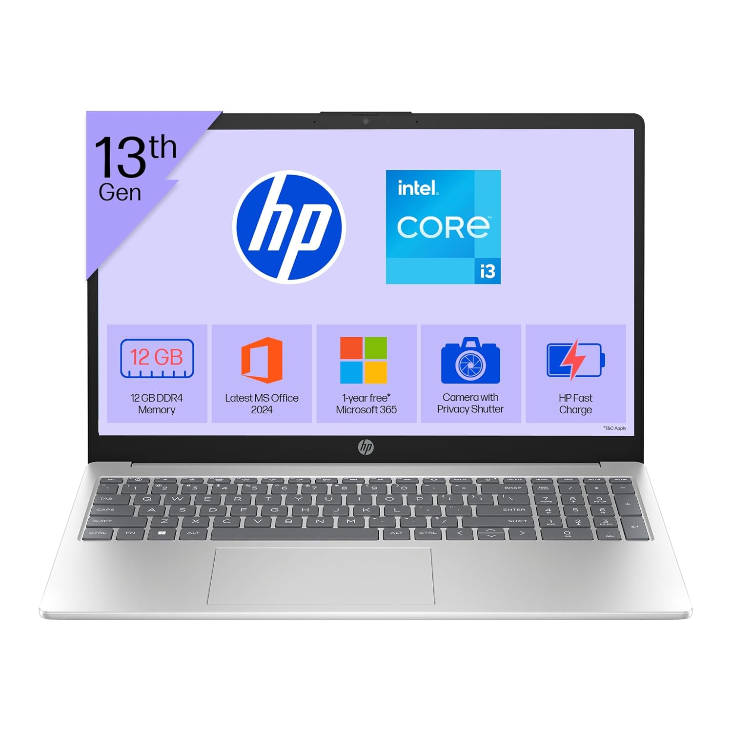
HP 15 Laptop – 13th Gen Intel Core i3 (12GB RAM, 512GB SSD)
Original price was: ₹52,721.00.₹33,990.00Current price is: ₹33,990.00. -
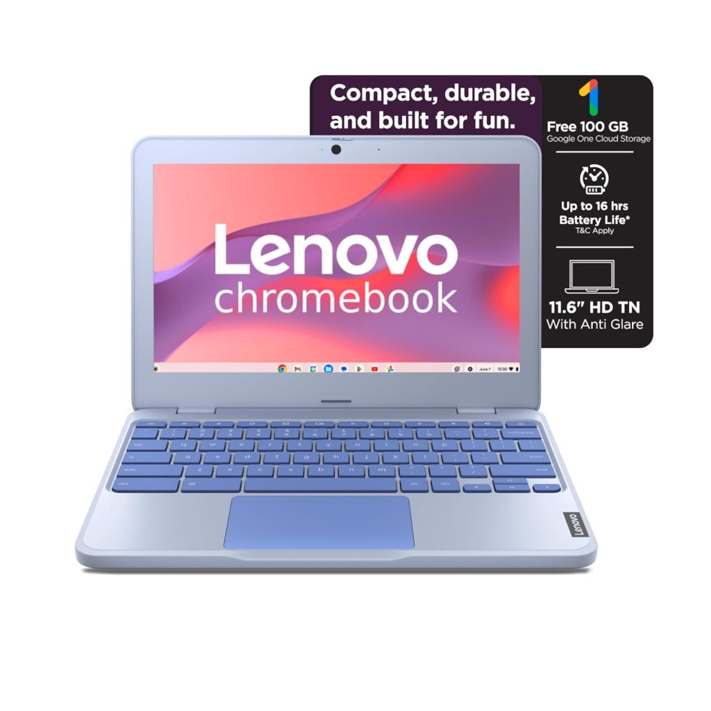
Lenovo SmartChoice Chromebook (82UY0014HA) – Compact & Affordable Everyday Laptop
-

Master Excel, Access, Macros & SQL – All in One Course
-
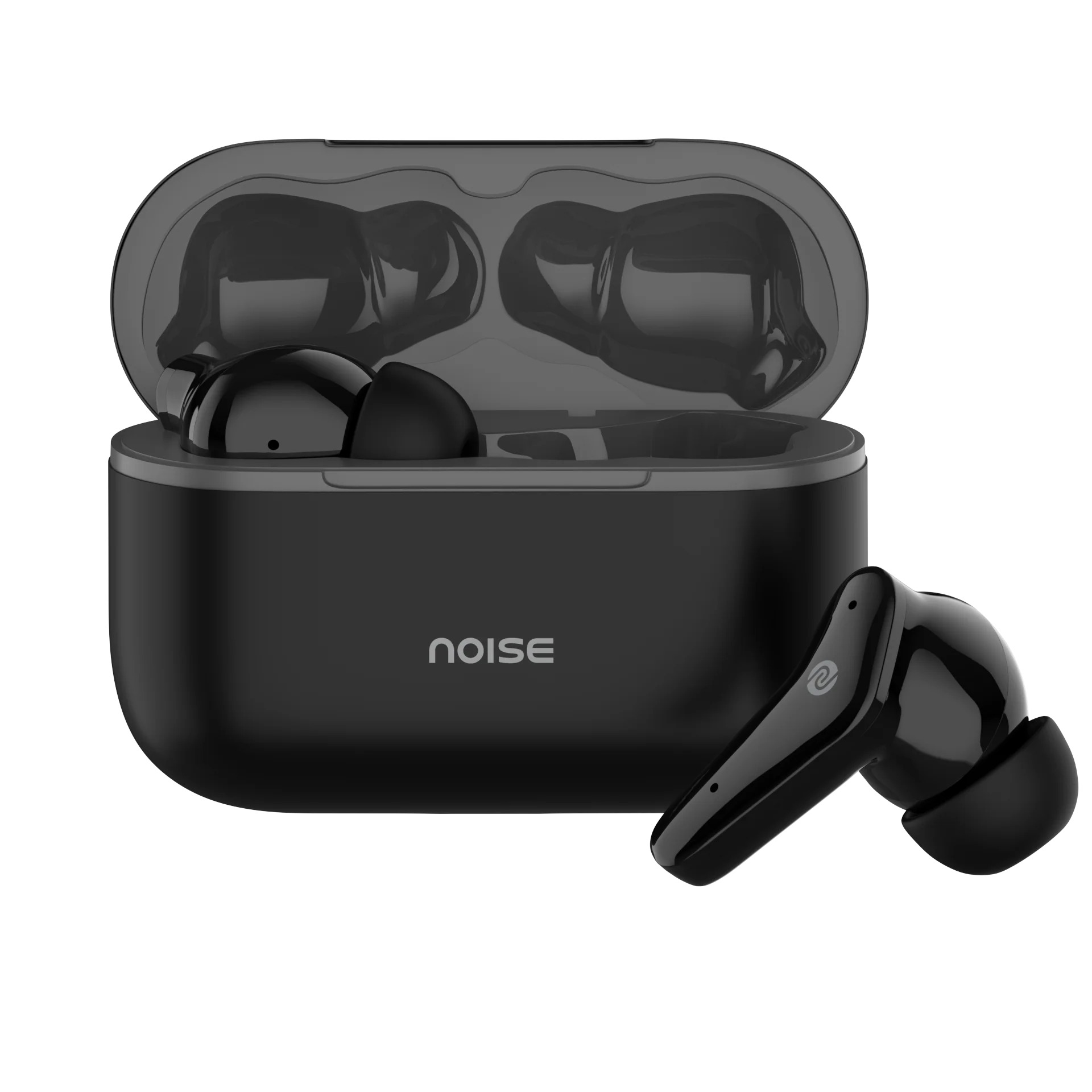
Noise Buds VS102
Original price was: ₹2,999.00.₹799.00Current price is: ₹799.00.