Tag: dynamic Excel dashboard

  • Create Interactive Dashboard Using Form Controls in Excel: Step-by-Step Guide for Dynamic Data Analysis

    Creating an interactive dashboard using Form Controls in Excel is one of the most powerful skills for data analysts, accountants, managers, and students. In the first 100 words itself, it is important to understand that when you create interactive dashboard using Form Controls in Excel, you move beyond static charts and reports into a dynamic decision-making tool. Form Controls allow users to interact with data using buttons, drop-downs, sliders, and checkboxes—without writing complex VBA code.

    This comprehensive guide explains concepts, practical steps, data logic, real-world use cases, and best practices to help you design professional, user-friendly, and performance-optimized Excel dashboards.


    What Is an Interactive Dashboard in Excel?

    An interactive dashboard in Excel is a visual reporting interface where users can filter, slice, and analyze data dynamically. Unlike static reports, dashboards respond instantly to user input.

    Key Characteristics of Interactive Dashboards

    • Real-time data filtering
    • Dynamic charts and KPIs
    • User-driven controls
    • Single-screen summary of insights
    • No need to edit formulas manually

    Industry surveys show that decision-makers understand insights 42–55% faster when data is presented through interactive dashboards instead of static tables.


    What Are Form Controls in Excel?

    Form Controls are built-in Excel objects that allow users to control calculations and visuals through simple interface elements.

    Commonly Used Excel Form Controls

    • Drop-down list (Combo Box)
    • Check Box
    • Option Button (Radio Button)
    • Scroll Bar
    • Spin Button
    • Button (for macros or navigation)

    Form Controls are lightweight and consume fewer system resources compared to ActiveX controls, making them ideal for dashboards.


    Why Use Form Controls for Interactive Dashboards?

    Advantages of Using Form Controls

    • No advanced VBA required
    • Easy to link with cells
    • Compatible across Excel versions
    • Faster performance on large datasets
    • Suitable for beginners and professionals

    A well-designed Form Control–based dashboard can reduce manual reporting effort by 60–75% in recurring reports.


    Prerequisites to Create Interactive Dashboard Using Form Controls in Excel

    Before building the dashboard, ensure the following:

    • Clean and structured source data
    • Basic understanding of Excel formulas
    • Familiarity with charts and PivotTables
    • Developer tab enabled in Excel

    Enabling Developer Tab

    File → Options → Customize Ribbon → Enable “Developer”


    Dashboard Planning: The Most Ignored but Critical Step

    Questions to Ask Before Building

    • Who will use the dashboard?
    • What decisions should it support?
    • Which KPIs matter the most?
    • How frequently will data update?

    According to usability studies, dashboards designed with clear objectives improve decision accuracy by over 30%.


    Data Structure for Interactive Excel Dashboards

    Your dashboard is only as good as your data structure.

    Best Practices for Data Layout

    PrincipleDescription
    Tabular formatOne row = one record
    No merged cellsImproves formula reliability
    Separate sheetsRaw data, calculations, dashboard
    Consistent headersAvoid formula breaks

    Step-by-Step: Create Interactive Dashboard Using Form Controls in Excel

    Step 1: Prepare the Source Data

    Ensure your data includes fields such as Date, Category, Region, Product, and Value. Use Excel Tables to make ranges dynamic.


    Step 2: Create Helper Calculations

    Form Controls work by changing values in linked cells. These values are then used in formulas.

    Common Helper Functions Used

    • IF
    • SUMIFS
    • COUNTIFS
    • INDEX
    • MATCH
    • OFFSET
    • CHOOSE

    These formulas act as the engine behind the dashboard interactivity.


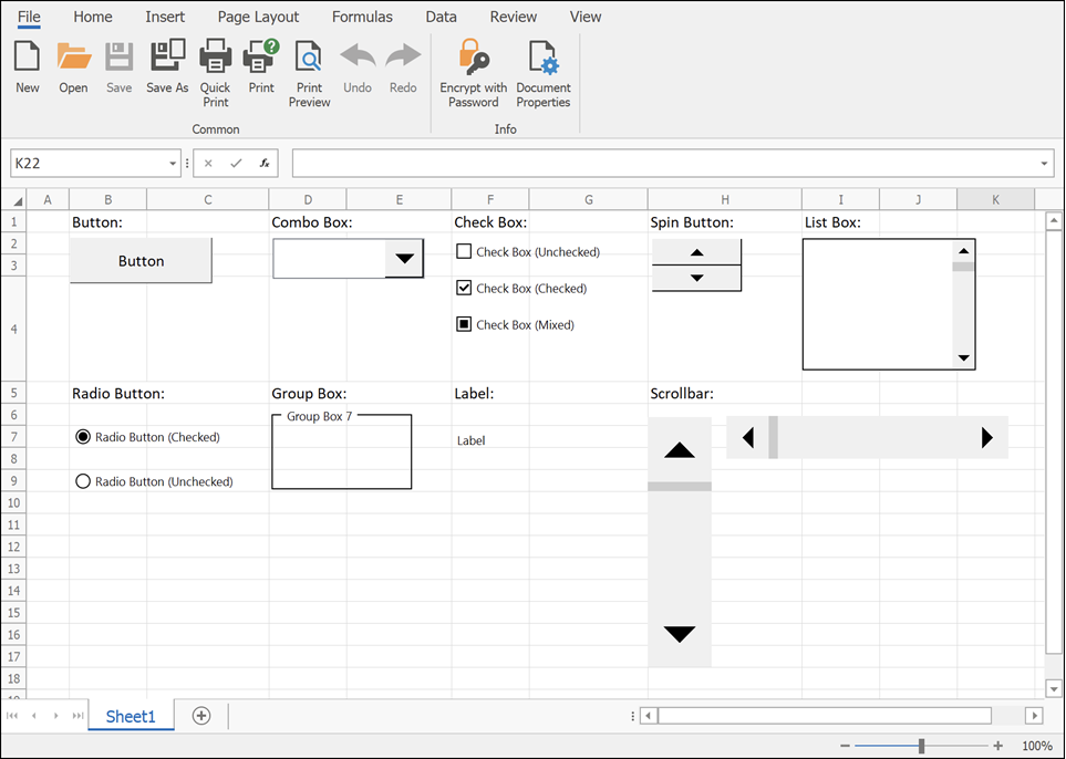
    Step 3: Insert Form Controls

    Go to Developer → Insert → Form Controls.

    Most Commonly Used Controls in Dashboards
    https://docs.devexpress.com/WindowsForms/images/spreadsheet-form-controls.png
    https://learn-attachment.microsoft.com/api/attachments/c653b7c7-f7bd-437d-b719-9f3788f5b805?platform=QnA

    4


    Using Drop-Down (Combo Box) for Dynamic Filtering

    How It Works

    • Combo Box returns a numeric index
    • INDEX or CHOOSE function converts index into actual value
    • Charts update automatically

    Example logic:

    • Combo Box linked cell = 3
    • INDEX returns the 3rd item from the list

    Drop-downs are ideal for filtering by:

    • Year
    • Month
    • Product
    • Department

    Using Check Boxes for Multi-Selection Dashboards

    Check Boxes return TRUE or FALSE values.

    Common Use Cases

    • Show or hide chart series
    • Include or exclude categories
    • Toggle KPIs

    Studies show dashboards with toggle-based controls improve user engagement by nearly 40%.


    Using Option Buttons for Single-Choice Analysis

    Option Buttons allow selection of only one option at a time.

    Ideal Scenarios

    • Sales vs Profit view
    • Quantity vs Value analysis
    • Monthly vs Quarterly reports

    Option Buttons are visually intuitive and reduce user confusion in comparison-based dashboards.


    Using Scroll Bars for Trend Analysis

    Scroll Bars are powerful for time-based dashboards.

    Example Applications

    • Scroll through months or years
    • Adjust threshold values
    • Control Top-N analysis

    A Scroll Bar can control hundreds of chart states using a single linked cell.


    Step 4: Build Dynamic Charts

    Once controls and formulas are ready, connect charts to calculated ranges.

    Recommended Chart Types

    • Line charts for trends
    • Column charts for comparison
    • Bar charts for ranking
    • Combo charts for KPI dashboards

    Dynamic named ranges further enhance responsiveness.


    Step 5: Dashboard Layout and Design Best Practices

    Design Principles

    ElementRecommendation
    ColorsUse 2–3 consistent colors
    FontsOne font family
    AlignmentGrid-based layout
    SpacingAdequate white space

    Well-designed dashboards reduce cognitive load by up to 50%.


    Performance Optimization Tips

    • Avoid volatile functions where possible
    • Limit array formulas
    • Use helper columns
    • Disable unnecessary calculations

    Optimized dashboards open 2–3 times faster on large datasets.


    Real-World Use Cases of Interactive Excel Dashboards

    • Sales performance dashboards
    • Finance and budgeting reports
    • HR attrition analysis
    • Inventory tracking systems
    • Student performance analytics

    More than 65% of small businesses rely on Excel dashboards for internal reporting due to flexibility and low cost.


    Common Mistakes to Avoid

    • Overloading dashboard with charts
    • Too many controls on one screen
    • Poor data validation
    • Mixing raw data with dashboard visuals

    Simplicity improves usability and adoption.


    Frequently Asked Questions (FAQ)

    1. What are Form Controls used for in Excel dashboards?

    Form Controls allow users to interact with dashboards by changing values, filtering data, and controlling charts without editing formulas.

    2. Can I create an interactive dashboard without VBA?

    Yes. Most interactive dashboards using Form Controls work entirely without VBA.

    3. What is the difference between Form Controls and ActiveX controls?

    Form Controls are simpler, more stable, and compatible across Excel versions, while ActiveX controls are more complex and VBA-dependent.

    4. Which Form Control is best for filtering data?

    Combo Boxes and Scroll Bars are the most commonly used controls for filtering dashboard data.

    5. Are Form Control dashboards suitable for large datasets?

    Yes, if formulas are optimized and data is structured properly.

    6. Can dashboards be shared with other users?

    Yes. Form Control dashboards work well in shared Excel files without requiring special permissions.

    7. How many Form Controls should a dashboard have?

    There is no fixed number, but usability studies suggest limiting controls to what directly supports decisions.


    Conclusion

    Learning how to create interactive dashboard using Form Controls in Excel is a career-boosting skill that combines analytics, visualization, and user experience. These dashboards transform raw data into actionable insights, reduce reporting time, and empower users to explore data independently. With proper planning, clean data, and thoughtful design, Form Controls can help you build professional-grade dashboards entirely within Excel.


    Disclaimer

    This article is intended for educational purposes only. Features, performance, and behavior of Excel dashboards may vary depending on Excel version, system configuration, and data volume. Users are advised to test dashboards thoroughly before using them for business-critical decisions. The author is not responsible for any data loss, misinterpretation, or operational impact resulting from the application of this information.


  • Top Excel Functions and Tools to Create the Ultimate Dashboard in 2025: A Complete Guide with Practical Insights and Expert Tips

    Dashboards are the heart of business decision-making. They turn raw data into meaningful insights, giving professionals an instant overview of performance metrics, trends, and forecasts. Microsoft Excel, even in 2025, remains one of the most powerful and flexible tools for building interactive dashboards.

    In this guide, we’ll explore the top Excel functions, formulas, and tools that can help you create dynamic, automated, and visually stunning dashboards — from financial overviews to sales analytics.

    Whether you are an analyst, accountant, or business owner, mastering these tools will help you design dashboards that are not just good-looking but intelligent and data-driven.


    1. Essential Excel Functions for Dashboards

    To make a dashboard truly powerful, formulas must be designed to automate calculations, summarize large data, and respond dynamically to user inputs.

    Here’s a breakdown of the most crucial Excel functions for dashboards:

    Function NameCategoryPurpose in DashboardsExample
    SUMIFS()Conditional MathAdds values based on multiple conditions=SUMIFS(Sales, Region, "East", Month, "Jan")
    COUNTIFS()Conditional CountCounts items matching criteria=COUNTIFS(Product, "Laptop", Region, "North")
    AVERAGEIFS()Conditional AverageAverages only matching data points=AVERAGEIFS(Sales, Category, "Electronics")
    IFERROR()Error HandlingPrevents #N/A or #DIV/0! errors=IFERROR(VLOOKUP(A2, Table, 3, 0), "Not Found")
    VLOOKUP() / XLOOKUP()Data LookupFetches data from another range or table=XLOOKUP(A2, ProductList, SalesData)
    INDEX() + MATCH()Advanced LookupFlexible lookup combination for large datasets=INDEX(Sales, MATCH(A2, Product, 0))
    TEXT()FormattingConverts numbers/dates into readable text=TEXT(TODAY(), "mmm-yyyy")
    IF() + AND() + OR()LogicalMakes dashboards dynamic with conditions=IF(AND(Sales>1000, Profit>100), "Good", "Average")
    ROUND()NumericKeeps calculations neat and clean=ROUND(A2*1.18, 2)
    OFFSET()Dynamic RangesMakes charts update automatically=OFFSET(A1,0,0,COUNTA(A:A))

    Pro Tip:
    Combine functions like IFERROR(VLOOKUP()) or INDEX(MATCH()) to create dashboards that automatically correct errors and update seamlessly.


    2. Advanced Excel Tools for Dashboard Creation

    Beyond formulas, Excel offers built-in tools to visualize and automate insights. These features transform your data into interactive visual stories.

    A. Pivot Tables

    • Purpose: Summarize and analyze huge datasets in seconds.
    • Key Benefits:
      • Quick grouping and aggregation.
      • Easy filtering by region, product, or month.
      • Compatible with Slicers for interactivity.

    Example Use:
    Sales dashboard displaying Total Sales by Region and Product Category using Pivot Charts.


    B. Pivot Charts

    • Purpose: Create visual summaries of Pivot Table data.
    • Why It’s Important: Automatically updates as Pivot Table data changes.
    • Chart Types: Column, Line, Bar, Pie, Combo, and more.

    C. Slicers and Timelines

    ToolUse CaseBenefit
    SlicersFilter Pivot Tables with buttonsMakes dashboards interactive and user-friendly
    TimelinesFilter by Date/Month/Quarter/YearSimplifies time-based filtering

    Example:
    Add a Slicer for “Region” and a Timeline for “Month” — the dashboard updates dynamically when users click.


    D. Conditional Formatting

    Conditional formatting helps emphasize data trends visually.

    Applications:

    • Highlight top-performing regions.
    • Identify low-profit products.
    • Color-code trends automatically.

    Popular Conditional Formatting Rules:

    Rule TypeExample Use
    Data BarsShow revenue proportion
    Color ScalesRepresent performance tiers
    Icon SetsIndicate growth or decline

    E. Data Validation and Drop-Down Lists

    Interactive dashboards often require user inputs.
    Using Data Validation, you can create drop-down lists that control filters or dynamic formulas.

    Example:
    Select “Year” or “Product Category” from a drop-down, and all visuals update automatically.


    F. Define Names and Dynamic Named Ranges

    Instead of static cell references, define Named Ranges for formulas.
    When your data grows, these dynamic ranges expand automatically.

    Example:
    =OFFSET(Sales!$A$2, 0, 0, COUNTA(Sales!$A:$A), 1)

    This ensures your charts and formulas always include the latest entries.


    G. Power Query

    Power Query automates data import, transformation, and cleaning — ideal for large-scale dashboards.

    Advantages:

    • Combine multiple files or sources easily.
    • Apply transformation steps automatically.
    • Handle millions of rows efficiently.

    Example Uses:

    • Merging regional sales reports.
    • Cleaning inconsistent data formats.
    • Refreshing dashboards in one click.

    H. Power Pivot

    Power Pivot is an advanced data modeling tool that extends Pivot Table capabilities.

    Key Benefits:

    • Create relationships between multiple tables.
    • Use DAX (Data Analysis Expressions) for advanced calculations.
    • Handle very large datasets seamlessly.

    Example:
    Build relationships between “Sales”, “Customer”, and “Product” tables for multi-level dashboard analysis.


    I. Power BI Integration

    While still within the Excel ecosystem, Power BI allows exporting your Excel dashboards for richer visuals, deeper analytics, and sharing.

    However, if you’re staying within Excel, use Power View and Power Map for advanced visuals.


    3. Design and Visualization Techniques

    Layout Planning

    • Keep the most important KPIs at the top.
    • Use consistent colors (e.g., blue for revenue, green for profit).
    • Group related visuals together.

    Common Dashboard KPIs:

    CategoryExample KPIFormula or Data Source
    SalesTotal Revenue=SUM(Sales[Amount])
    ProfitabilityGross Profit %(Profit/Sales)*100
    EfficiencyAverage Order Value=SUM(Sales)/COUNT(Orders)
    RegionTop 5 Regions by SalesPivot Table
    CustomerRepeat Purchase Rate=COUNTIFS(CustomerID, "Repeat")/Total

    4. Recommended Charts for Dashboards

    Choosing the right chart is crucial for clarity.

    Chart TypeBest Used ForTips
    Column ChartComparison of categoriesUse for sales by region
    Line ChartTrend over timeIdeal for monthly sales or growth rate
    Pie/Donut ChartMarket shareLimit to 5–6 segments for readability
    Combo ChartDual data typesCombine revenue & profit
    Gauge ChartPerformance targetVisualize KPIs vs goals
    Map ChartGeographic dataWorks best with Power Map

    5. Sample Dashboard Workflow

    StepProcessTool Used
    1Import data from multiple Excel filesPower Query
    2Clean and merge datasetsPower Query
    3Create data modelPower Pivot
    4Build Pivot TablesPivot Table Tool
    5Add Slicers and TimelinesDashboard Controls
    6Apply conditional formattingVisual Design
    7Create KPI cards and chartsPivot Charts
    8Finalize layoutExcel Page Setup

    6. Budgeting Your Dashboard Project (Tentative)

    Expense CategoryEstimated Cost (INR)Description
    Excel Software (Microsoft 365 Subscription)₹4,899/yearFull access to Excel features
    Power Query/Power Pivot Learning₹1,500 – ₹3,000Online learning or tutorial
    Template Design & Layout₹2,000 – ₹5,000Optional professional design
    Data Cleaning & Setup₹0 – ₹1,000If done manually
    Maintenance (Monthly)₹500 – ₹1,000Periodic data refresh

    Total Estimated Budget: ₹8,000 – ₹12,000 (One-time + setup)


    Conclusion

    Creating an Ultimate Excel Dashboard is not just about visuals — it’s about combining functions, tools, and logic to provide insights that drive action.

    By mastering SUMIFS, XLOOKUP, INDEX/MATCH, and tools like Pivot Tables, Slicers, Power Query, and Power Pivot, you can build dashboards that are not just beautiful but business-ready.

    Excel continues to evolve, but its foundation — smart formulas and logical design — remains timeless for dashboard creation.


    Disclaimer:

    This article is meant for educational and informational purposes only. The data, costs, and examples provided are indicative and may vary based on version, business scale, and user expertise.